Painting the Illusion of Distance—Is It Just About Perspective?
 |
||
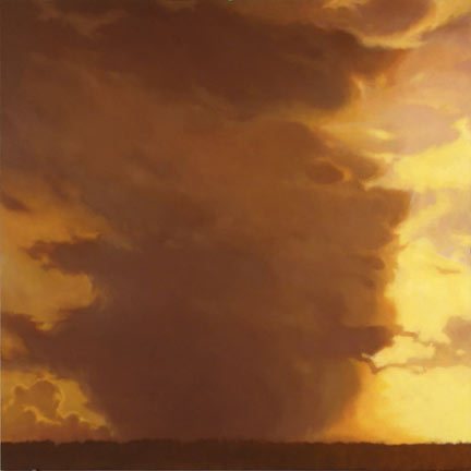
| Fifty by Mitchell Albala, 2006, oil painting on canvas. In this painting, the artist strongly distinguishes the land and sky to give a sense of vertical distance. |
||
This summer I've been traveling a bit, but of course it's never
as much as I would like. When I have
gotten to the beach or camped out over a long weekend, I've noticed that trying
to create the illusion of space—over valley peaks or a body of water—in a
landscape painting can be difficult! The distance over water is sometimes deceptive
and the atmospheric effects of air, light, and cloud cover in a valley can
really distort what I see.
Yes, you can solve some of these problems with a sound
knowledge of perspective. That is key for any sense of proportion in landscape
artwork. But you can also get a good sense of the space from where you stand to
the object in the distance a few other ways.
Reducing and massing together the forms, textures, colors,
and details you see in the distance helps make for a less fussy work, and
effectively recreates the way the eye sees.
Use scale to your advantage. This is a tried-and-true visual
cue for artist and viewer alike. I know it seems elementary, but it bears
repeating: the larger the object, the closer we think it is to us.
 |
|
| Pinnacle Peak, Last Light by Mitchell Albala, 2010, oil painting on canvas. The vastness of this mountain view is made by the overlapping of the trees in the foreground and the elimination of detail throughout the work. It is if we are seeing it from a great distance. |
|
A well-defined fore-, middle-, and background are also
really crucial when painting water or vast stretches of an object that is
fairly uniform. It might be that the texture you see in each of these areas
changes with the distance implied. But it could also be color or painting light
effects as they rest on different forms. It all depends on how you want to
breakup the space.
I got all these landscape painting tips from just one
section in Mitchell Albala's book, Landscape
Painting. I found it to be readable, with plenty of
great visual examples, and from an author who is foremost an artist-so I know
his advice is in keeping with where I want to go with my own work. I hope it is
the same with you. Enjoy!
And where have you been this summer? What challenges and
triumphs have you encountered with your painting and drawing? Leave a comment
and let me know!

SOURCE: Artist Daily - Read entire story here.