3 Thought-Provoking Questions for a Better Artist Statement

A strong artist statement is essential to the effective marketing of your art.

There’s no skating by on this one. You need at least one artist statement for each body of work you create.

Writing your statement is a process. Like any other type of writing or artmaking, you can’t expect to nail it in a single sitting. And, like all good things that take time, it will be time well spent. The process helps you gain clarity about your art.

Terri Schmitt painting

©Terri Schmitt, Lemons and Ball Jar. 16 x 20 inches.

If you can’t define your art in a statement, you will likely face difficulty marketing your work. Where else will you get language for wall labels, brochure and website text, informal presentations, and conversations?

Answering these three questions will help you write a better artist statement.

1. What, in particular, do you want people to see in your work? Is it . . .

  • Your labor?
  • A special material?
  • An emotion?
  • Color? Line? Texture?

What is important to you?

Discuss how you handle this aspect of your work. The words you choose for your statement should be clues that lead viewers to these discoveries.

Declaring “I love color” is weak language. Who doesn’t love color? Show us exactly how you respond to color and use it to transfer meaning from your head and heart to the viewer.

Vickie Martin collage

©Vickie Martin, The Organic Planet. Mixed media on canvas, 24 x 20 inches.

2. What is a distinguishing characteristic of your art?

A distinguishing characteristic might be one of the items in the list under #1 above or something else.

What makes your art different from artists working along the same lines? Emphasize this quality when you speak and write. Help us to see what makes you an original.

Part of your job is to educate others how to look at your work. Most people haven’t had a visual education. They need to be shown what to look for.

3. What do other people find delightful or surprising about your art?

If it captures one person’s attention, it will probably be fascinating to others as well. Listen to what people say about your art. Their discoveries might shock or confound you, but trying to understand where they’re coming from is part of the communication process.

You will learn a lot by listening to these insights, and I think you’ll be surprised that they pick up aspects of your work that you hadn’t consciously considered.

If you care to, please share your responses to these three questions in a comment.

sizzling-tonight-550

SOURCE: Artist Business-Building Strategies - Read entire story here.

Read More

May/September: An Interactive Wall Sculpture by Rob Ley

May/September: An Interactive Wall Sculpture by Rob Ley

Just because it’s a parking structure, doesn’t mean it has to be boring and unappreciated. Large plain expanses like that make the perfect canvas for murals and wall sculptures and Rob Ley of Urbana Studio went with the latter and designed May/September, an interactive art project that transformed the exterior of the new Eskenazi Hospital parking deck in Indianapolis, Indiana.

Using approximately 7,000 panels, in 18 different sizes/angles that range in size from 300mm tall x 600mm long to 300mm tall x 1m long, the result is a massive, interactive element for the city’s residents to enjoy.

May/September: An Interactive Wall Sculpture by Rob Ley in main art architecture  Category

They chose to keep the sculpture parts immobile, as a kinetic approach would require maintenance over the years. Besides, most people viewing the sculpture would be walking, riding their bicycles, or in a car driving by, therefore seeing how it changes depending on where they’re viewing it from. When standing to one side of the wall, you’ll spot the golden yellow panels. Move to the other side to gradually see the deep blue panels come to life.

May/September: An Interactive Wall Sculpture by Rob Ley in main art architecture  Category

May/September: An Interactive Wall Sculpture by Rob Ley in main art architecture  Category

The color and transparency shifts as you change your vantage point, giving the viewer a sense that the piece is actually changing. Depending on the angle of each panel, you get the illusion that different hues were used and not just one color.

May/September: An Interactive Wall Sculpture by Rob Ley in main art architecture  Category

May/September: An Interactive Wall Sculpture by Rob Ley in main art architecture  Category

May/September: An Interactive Wall Sculpture by Rob Ley in main art architecture  Category

May/September: An Interactive Wall Sculpture by Rob Ley in main art architecture  Category

May/September: An Interactive Wall Sculpture by Rob Ley in main art architecture  Category

May/September: An Interactive Wall Sculpture by Rob Ley in main art architecture  Category

May/September: An Interactive Wall Sculpture by Rob Ley in main art architecture  Category

May/September: An Interactive Wall Sculpture by Rob Ley in main art architecture  Category

May/September: An Interactive Wall Sculpture by Rob Ley in main art architecture  Category

May/September: An Interactive Wall Sculpture by Rob Ley in main art architecture  Category

Photos by Serge Hoeltschi.


SOURCE: Design Milk » Art - Read entire story here.

Read More

What Men Need To Understand About Everyday Sexual Harassment, In One Perfect Comic

If you've ever had a hard time explaining why a man telling you to "Smile!" on the street is harassment, this comic says it all.

Artist Robot Hugs created a longform webcomic inspired by a friend's well-meaning question about sexist treatment of women. "A friend asked why he didn't see many instances of harassment, and it led me to think about why the culture of everyday sexism and harassment is so visible and real to women and femmefolk yet so invisible to many men," the artist told The Huffington Post in an email.

The resulting comic covers everything from street harassment to legislative control over women's bodies, and offers bystanders a way to push back against harmful narratives.

"I believe it's always good when topics such as rape culture, sexism, and harassment are explored and discussed," Robot Hugs told HuffPost. "And if I can produce something that resonates with the people invested in those discussions, then I'm happy."

We're happy, too. Check out the full, amazing comic below.

sexual harassment
sexual harassment
sexual harassment
SOURCE: Arts News on The Huffington Post - Read entire story here.

Read More

Is This America’s Ideal Theater Company?

osf logo 90

“So often in my conversations with artistic directors I’m dismayed by their willingness to accept the status quo. If mindless musicals are what draws in the crowds, then mindless musical it will be … Box office becomes confused with artistic merit, making it easier to let fiscal expediency dictate taste.” But Charles McNulty has found one house that’s getting it right.

Email this to someoneShare on FacebookTweet about this on Twitter

SOURCE: ArtsJournal» THEATRE - Read entire story here.

Read More

Great Ape Trafficking and the Ebola Outbreak

0805ebola5.jpg
The excellent environmental news site Mongabay.com has a new journalism initiative, and it's producing some fascinating work. A recent post examined the potential linkages between the trafficking of great apes (gorillas, chimpanzees, and bonobos) and the current outbreak of Ebola in West Africa. It's an interesting view into the near-invisible underworld of environmental crime- export permits for bonobos, a species found only in DR Congo are found in Conakry, Guinea's capital, and dead bonobos are found in Chinese and Armenian zoos. The Ebola Zaire virus that's causing this growing epidemic is a pathogen native to DR Congo, and hasn't been previously found in West Africa. Although highly speculative, writer Daniel Stiles uses information gathered by legendary wildlife crime investigator Karl Ammann to make a compelling case for the connection. It's worth a read!

SOURCE: Justseeds: Blog - Read entire story here.

Read More

“Moonlight Daiquiri,” Barbara Tyler Ahlfield

Barbara Ahlfield moonlight_daiquiri“Moonlight Daiquiri” is a modern portrait with classical elements. The model, Ying, is a concert stage musician- harpsichord/piano. She combines elements of strength and delicacy in her music and in her persona. The background motif is suggestive of musical symbolism and her gown alluring yet celestial.

Oil on canvas; 48×60”
fashionillustrationandmore.com

SOURCE: Art Business News - Read entire story here.

Read More

New $50M Arts Center Coming To San Diego

la jolla music society

The La Jolla Music Society, the San Diego area’s leading presenter of touring classical music and dance performers, is building a two-audottoprium venue that will host films, lectures and exhibitions as well as concerts. The grand opening is planned for 2017.

SOURCE: ArtsJournal - Read entire story here.

Read More

Is there a blog in this class? 2014

Kristin here:

Once again the fall semester approaches, and educators are pondering their film-class syllabi. As always, we have prepared a guide to our blog entries from the past year, with suggestions about how some of them might usefully be assigned alongside chapters of Film Art: An Introduction. Readers who aren’t teaching could use this guide to alert them to entries they may have missed.

For the entries from past years, see 2007, 2008, 2009, 2010, 2011, 2012, and  2013.

David is at work on a book on 1940s Hollywood cinema, which he finds a strange and innovative era. Several of his entries for this past year reflect that focus.

Chapter by chapter

Chapter 1:  Film as Art: Creativity, Technology, and Business

https://www.davidbordwell.net/blog/wp-content/uploads/Cinema-theatre-with-graphic-600.jpg

Last year several of our entries dealt with the conversion of exhibition from film to digital copies. That conversion has progressed until 35mm houses are now relatively rare. We take a look at a theater still showing movies on film in “Dispatch from another 35mm outpost. With cats.”

Chapter 3:  Narrative Form
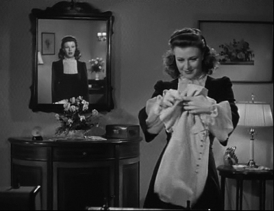
https://www.davidbordwell.net/blog/wp-content/uploads/Kitty-400.jpg

Sometimes producers force scriptwriters to change their scripts. These changes aren’t always bad. They can lead filmmakers to find ingenious solutions that actually enhance the result. We look at some examples from the 1940s in “Innovation by accident.” (As in Kitty Foyle, above.)

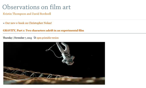
Two professors have already told me they were going to teach Gravity this coming semester, assigning our two entries on the film. These could be used for a variety of chapters: the first one, “GRAVITY, Part 1: Two characters adrift in an experimental film” is on the narrative of the film and could most obviously assist in teaching Chapter 3. It might also be a helpful reference, however, for Chapter 10, in discussing the boundaries between experimental and mainstream cinema.

The differences between suspense and surprise is a common topic in discussing narratives. We look at Hitchcock’s famous distinction between them and where he got it in “Hitchcock, Lessing, and the bomb under the table” and “Hitchcock Again: 3.9 Steps to Suspense.”

For advanced students, you might consider assigning an essay David has posted on his website proper, “Three Dimensions of Film Narrative.” He elaborates on this essay with examples from Scorsese’s The Wolf of Wall Street in “Understanding film narrative: The trailer.”

Modernism involves playing with plots, sometimes in challenging ways. In another entry for advanced students, we examine such playfulness: “Pulverizing plots: Into the woods with Sondheim, Shklovsky, and David O. Russell.”

During the 1940s, filmmakers sometimes explicitly broke their films down into chapters. That tradition has not disappeared–especially in the films of Quentin Tarantino. We explore some connections in “The 1940s are over, and Tarantino’s still playing with blocks.”

Chapter 4: The Shot: Mise-en-scene
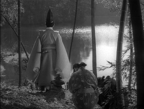
Staging is an important aspect of acting. We give some historical notes about how characters have been set up to face each other in a two-shot composition in “Where did the two-shot go? Here.”

Few directors combine staging, setting, composition and actings as brilliantly as Kenji Mizoguchi. We explore his extraordinary mise-en-scene in “Mizoguchi: Secrets of the exquisite image.” (Above)

Chapter 5  The Shot: Cinematography
In anticipation of Gravity‘s release, we wrote about long takes in Alfonso Cuarón’s earlier films and in particular Harry Potter and the Prisoner of Azkaban in “Harry Potter treated with gravity.”

Our second entry on Gravity, “GRAVITY, Part 2: Thinking inside the Box,” could be taught in connection with the entry on Harry Potter and the Prisoner of Azkaban in discussing long takes. It also, however, exemplifies cutting-edge techniques in digital cinematography, special effects, and 3D.

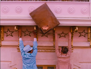
Wes Anderson’s The Grand Budapest Hotel wonderfully exemplifies variations on aspect ratios. Its style is also based on framing perpendicularly to the backs of sets (earlier explored in “Shot-consciousness”). See “THE GRAND BUDAPEST HOTEL: West Anderson takes the 4:3 challenge.” (Above)

Chapter 6: The Relation of Shot to Shot: “Editing”
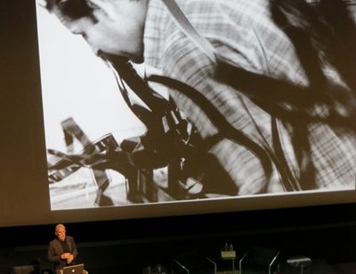
At the Vancouver International Film Festival, we caught Walter Murch’s lecture on the industry’s transition to digital editing. Here’s our write-up:  “Film-industry pros share secrets in Vancouver.”

Our two Wes Anderson blogs (here and here) discuss his customized variant of classical continuity editing.

Chapter 8: Summary: Style as a Formal System
https://www.davidbordwell.net/blog/wp-content/uploads/Nebraska-Impala-discussion.jpg

Nebraska

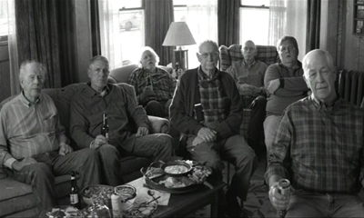
Teaching about auteurism and style? Kristin met Alexander Payne last year at Il Cinema Ritrovato. Then he came and visited Madison this past spring. We blogged about that visit and his films in “Alexander Payne’s vividly shot reality.” He was still talking to us at Il Cinema Ritrovato this year, so he must have liked the entry!

Chapter 10: Documentary, Experimental, and Animated Films
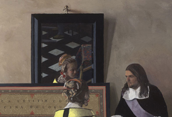
We wrote an entry on a major recent documentary film, “I am a camera, sometimes: Tim’s Vermeer.” Also quite teachable.

Chapter 11: Film Criticism: Sample Analyses

https://www.davidbordwell.net/blog/wp-content/uploads/Shochiku-logo-300.jpg

If you show Tokyo Story, or any other Ozu film, your students might be interested in Ozu’s influence up to the present day. Our entry “Look well! Look again! Look! (For Ozu)” explores this subject.

Apart from the entry on The Grand Budapest Hotel linked above, we’ve written an analysis of his previous film in Moonrise Kingdom: Wes in Wonderland.” His recent films, starting with Fantastic Mr. Fox, strike us as very teachable.

David has written several entries on some major American critics of the 1930s and 1940s–Otis Ferguson, James Agee, Parker Tyler, and Manny Farber–and their approaches to analysis and evaluation. These would be suitable for students interested in writing film criticism themselves.

“Otis Ferguson and the Way of the Camera”

“The Rhapsodes: Agee, Farber, Tyler, and Us”

“Agee & Co.: A Newer Criticism”

“James Agee: All there and primed to go off”

“Manner Farber 1: Color commentary”

“Manny Farber 2: Space man”

“Parker Tyler: A suave and wary guest”

and finally “The Rhapsodes: Afterlives”

Chapter 12  Historical Changes in Film Art: Conventions and Choices, Traditions and Trends
https://www.davidbordwell.net/blog/wp-content/uploads/Coeur-fidele-Pauls-POV-woman.jpg

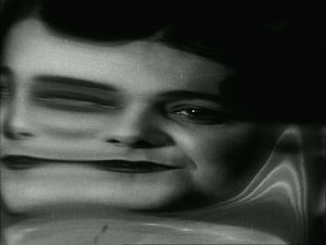
If you are looking for silent films to show as illustrations of German Expressionism, French Impressionism, silent classical Hollywood, or very early experimental cinema, try the latest entry in our surprisingly popular annual summary, “The ten best films of …1923.” Not all the films are available on DVD at this point, but the ones that are are well worth seeking out.

Examples of early film and the transition to more classical storytelling can be found in our summer entry, “What’s Left to Discover Today? Plenty.”

An update to the Hong Kong section of the chapter can be found in our entry on Wong Kar-wai’s latest film:  “THE GRANDMASTER: Moving forward, turning back.”

Further resources
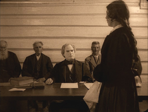
https://www.davidbordwell.net/blog/wp-content/uploads/Gipsy-Anne-courtroom.jpg

For information on some recent DVD and Blu-ray releases, see “Recovered, discovered, and restored DVDs, Blu-rays, and a book.”

We’ve put up an ebook on Christopher Nolan, based on updated versions of our blog entries, for $1.99. It includes some brief extracts from Nolan films, though you can opt for a version without the clips. For a description, see “Our new e-book on Christopher Nolan!

Don’t forget that we also have videos available for you to show or assign. For Chapter 3, on narrative, there’s “Twice Told Tales: Mildred Pierce,” including an imbedded Vimeo comparison of scenes repeating a crucial action. Chapter 6′s discussion of editing is supplemented by our most popular video, “Constructive Editing: Robert Bresson’s Pickpocket (1959).”

For the history chapter (Chapter 12), there are two video lectures: an entry on “How Motion Pictures Became the Movies 1908-1920″  and one on “CinemaScope: The Modern Miracle You See Without Glasses” (which could also be used in connection with the Cinematography chapter).
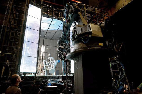
https://www.davidbordwell.net/blog/wp-content/uploads/Gravity-production-still-7-digital-trends.jpg

Gravity, production photograph

SOURCE: Observations on film art - Read entire story here.

Read More

A Shingle-Style Home in Cambridge Gets a Modern Renovation

A Shingle-Style Home in Cambridge Gets a Modern Renovation

aamodt / plumb architects were hired to renovate a shingle-style home on Professors’ Row in Cambridge, Massachusetts where they were tasked with integrating modern elements with the existing home’s historic structure.

A Shingle Style Home in Cambridge Gets a Modern Renovation in main interior design architecture  Category

Massive windows were used, along with raising the ceiling, to give the room a feeling of even more space. These in the corner fill the kitchen with light and almost make you feel like you’re outdoors.

A Shingle Style Home in Cambridge Gets a Modern Renovation in main interior design architecture  Category

The first floor kitchen was completely redesigned to reflect the homeowners’ interests, which combined both refined and rustic materials.

A Shingle Style Home in Cambridge Gets a Modern Renovation in main interior design architecture  Category

High gloss white cabinets were paired with concrete countertops and custom plywood raw steel shelves.

A Shingle Style Home in Cambridge Gets a Modern Renovation in main interior design architecture  Category

The partially open shelves provide storage for the owners’ collection of African bowls and primitive artwork.

A Shingle Style Home in Cambridge Gets a Modern Renovation in main interior design architecture  Category

Additional shelves were built, similar to those hanging in the kitchen, for extra display space.

A Shingle Style Home in Cambridge Gets a Modern Renovation in main interior design architecture  Category

A Shingle Style Home in Cambridge Gets a Modern Renovation in main interior design architecture  Category

A Shingle Style Home in Cambridge Gets a Modern Renovation in main interior design architecture  Category

A Shingle Style Home in Cambridge Gets a Modern Renovation in main interior design architecture  Category

A Shingle Style Home in Cambridge Gets a Modern Renovation in main interior design architecture  Category

A Shingle Style Home in Cambridge Gets a Modern Renovation in main interior design architecture  Category

A Shingle Style Home in Cambridge Gets a Modern Renovation in main interior design architecture  Category

Upstairs, what once was a series of small rooms, was turned into a spacious master suite hidden behind a sliding reclaimed wood barn door.

A Shingle Style Home in Cambridge Gets a Modern Renovation in main interior design architecture  Category

The hallway is lined with high gloss white cabinets on one side for storage and art work on the other side.

A Shingle Style Home in Cambridge Gets a Modern Renovation in main interior design architecture  Category

At the other end of the hallway is the master bathroom which is clad in white wood panels.

A Shingle Style Home in Cambridge Gets a Modern Renovation in main interior design architecture  Category

A Shingle Style Home in Cambridge Gets a Modern Renovation in main interior design architecture  Category

Sitting below a skylight is the new, wood enclosed tub.

A Shingle Style Home in Cambridge Gets a Modern Renovation in main interior design architecture  Category

A Shingle Style Home in Cambridge Gets a Modern Renovation in main interior design architecture  Category

Photos by Jane Messinger.


SOURCE: Design Milk » Interior Design - Read entire story here.

Read More

Works by Iranian graphic designers beelining to Moscow Golden Bee

TEHRAN Works by 37 Iranian graphic designers have been selected by the organizers of the 11th edition of the Russian international biennial of graphic design -- Golden Bee, which will be held in Moscow from October 7 to 12. Majid Abbasi, Mojtaba Adibi, Mohammad Afshar, Shokuh Ahmadi, Armin Amirian, Faramarz Arabnia, Alireza Askarifar, Reza ... (more)

SOURCE: Graphic Design News - Read entire story here.

Read More
TOP