Matthias Hollwich’s time at university was seminal, marked by his natural curiosity. He often wondered what it would be like to contribute to the creation of things that people actually use. Yet it was a summer program that changed his trajectory in a way he could have never imagined. After applying for the three-week course, and initially receiving a rejection, Hollwich convinced his professor to allow him to participate.
The classes in Venice, Italy were abstract and poetic, the antithesis of the traditional educational system in Germany, his home country. While most of his classmates spent time at the beach, Hollwich was working day and night in the studio on concepts and models, with guidance from guest instructor Ricardo Scofidio, partner at Diller Scofidio + Renfro. “He became my teacher, speaking about abstract ideas in architecture, challenging me to explore,” says Hollwich.
Just three weeks after Hollwich’s return from his sojourn, he received a phone call from Scofidi telling him to report for work at the New York-based firm (then Diller + Scofidio) in 48 hours. After additional stints at Eisenman Architects and OMA with Rem Koolhaas, Hollwich founded HWKN in 2008.
Hollwich and his team emphasize maximum human engagement, ecological innovation, and technological exploration, which includes artificial intelligence. Even with the current debate centered on AI, Hollwich is fascinated by all of the possibilities. How it may impact our lives – for better or worse – he can’t say. He is already using it to streamline everyday tasks, and is now focused on how it will shape his design process.
Not every aspect of the architect’s life is about a digital experience, however. The five acres upstate that he owns with his partner is a haven, reminiscent of the Heimat of his youth. “It is a place of untapped potential, but also of endless beauty,” Hollwich adds. “It is an ecology that was there before, and will be there for a million years to come.”
Today, Matthias Hollwich joins us for Friday Five!

Photo: Dado Ruvić; Reuters
I engage with ChatGPT to correct my grammar, provide some ideas, and reflect on the work I am doing. My appreciation for AI began in London about two years ago with tech professionals from major firms like Amazon, Google, and Apple. This meetup sparked my initial interest in AI, leading to more explorations of AI platforms and their abilities. I felt really driven by these personal explorations, and from there I’ve completely shifted my focus to integrating AI into my architectural practice. As wide as the concept goes, ChatGPT remains a loyal friend of sorts. It’s simple, practical, and gives me what I need on a daily basis.
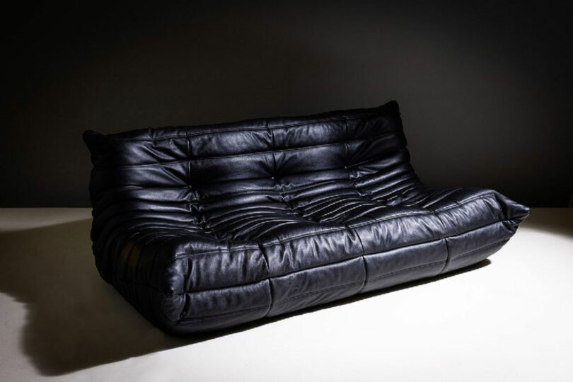
This is my Ligne Roset sofa at home, and I love seeing it and sitting on it. What really gets me is the shape. It’s low to the ground and has these deep, cozy curves that make you want to sit down and never get up. It doesn’t have a traditional frame, so it almost feels like it molds to me. Plus, the quilted design with all those folds and pleats gives it such an inviting look. I love that it is both sophisticated and super comfortable, which isn’t always easy to find in a piece of furniture.
3. Raw Nature
The Drei Zinnen near Zillertal are the mountaintops that I remember best from my youth. They stand untouched by human hands, embodying a raw, unspoiled majesty that’s hard to find elsewhere. It’s this pure, natural splendor that has shaped my appreciation for the unaltered and the authentic. Nature reminds me of the importance of preserving beauty and experiencing it in its most unrefined form.

Photo: Courtesy of Expedition Portal
The ultimate fitness and commute combo, this is a bike I use to commute from work to home and everywhere else. It is incredibly reliable, offering a smooth and steady ride whether I’m on a busy road or a more challenging trail. It also turns a typical commute into an opportunity for exercise. Riding this bike not only gets me where I need to go but also helps me stay fit and energized. It’s very thoughtfully engineered and is designed to be both rugged and versatile, yet it maintains a lightweight feel that makes it easy to handle. The ergonomic design and adjustable features ensure that it fits comfortably, making every ride enjoyable.
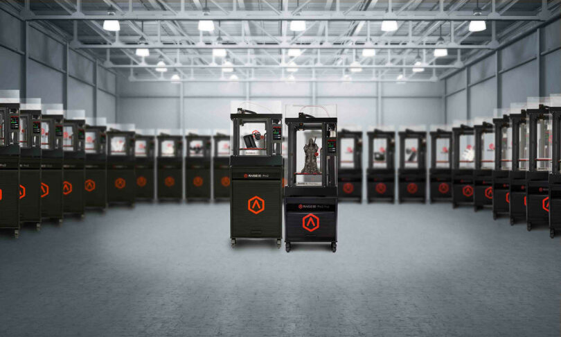
The Raise3D printer is an essential tool for us at the office, bridging the gap between our digital designs and their physical manifestations. It translates our virtual concepts into real, three-dimensional objects, allowing us to see and touch what we’ve been working on in the digital realm. This printer helps us grasp the true potential and impact of our designs. By creating physical prototypes, we can evaluate their form, functionality, and overall effectiveness in a tangible way. It’s invaluable for testing ideas, making adjustments, and fully understanding how our work will translate into the real world.
Works by Matthias Hollwich:
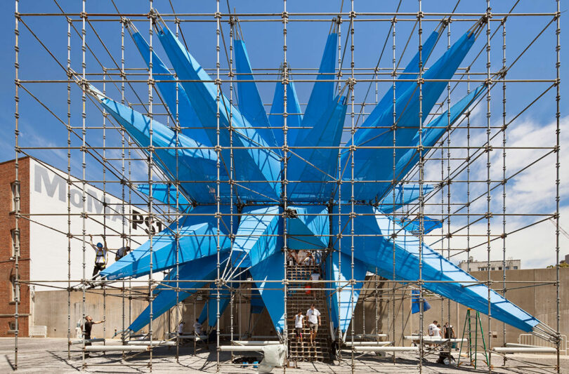
Photo: Michael Moran
Wendy Wendy is an experiential installation by the architecture firm HWKN, created for the 2012 MoMA PS1 Young Architects Program. The project is a large-scale, interactive structure made of scaffolding covered in spiky blue fabric treated with titania nanoparticles. These nanoparticles enable the fabric to neutralize airborne pollutants, effectively purifying the air around the installation. Wendy serves multiple purposes: it is an architectural experiment, an environmental statement, and a social space for public interaction. The design challenges traditional notions of architecture by integrating ecological functionality with bold, unconventional aesthetics. The installation features various interactive elements, including misting nozzles, sound systems, and lights, making it a dynamic and engaging space for visitors. Its unique form and environmentally conscious design highlight the potential of architecture to address urban environmental issues creatively.
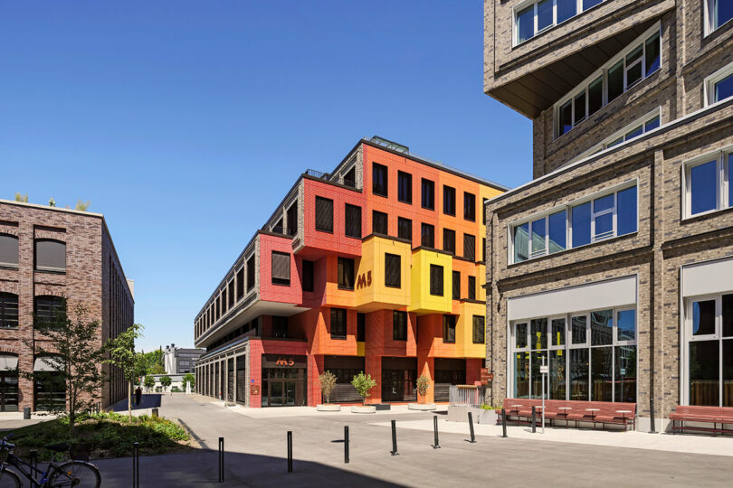
Photo: Klemens Renner
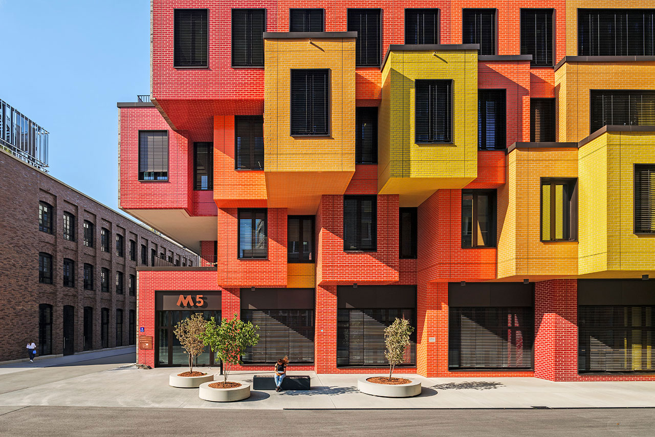
Die Macherei München Designed in partnership with the firms OSA Ochs Schmidhuber Architekten and Holger Meyer Architecture, Die Macherei München is the first LEED-GOLD neighborhood in Europe. The complex consists of six multi-purpose properties, three of which have been designed by HWKN, including the new hotel, Scandic München Macherei, and two office buildings. The Scandic München Macherei hotel features a rough, earthen-brown brick facade that appears to be in motion from a distance, with ripples across its surface. This main canyon leads to another office building and a public plaza, both clad in glossy, red-to-orange brick, reminiscent of Munich’s historic brick-making tradition, including those used in the Frauenkirche. A design breakthrough, the highly inviting complex transforms a once-barren, industrial area into a neighborhood that is welcoming, human, eventful, and filled with emotion.
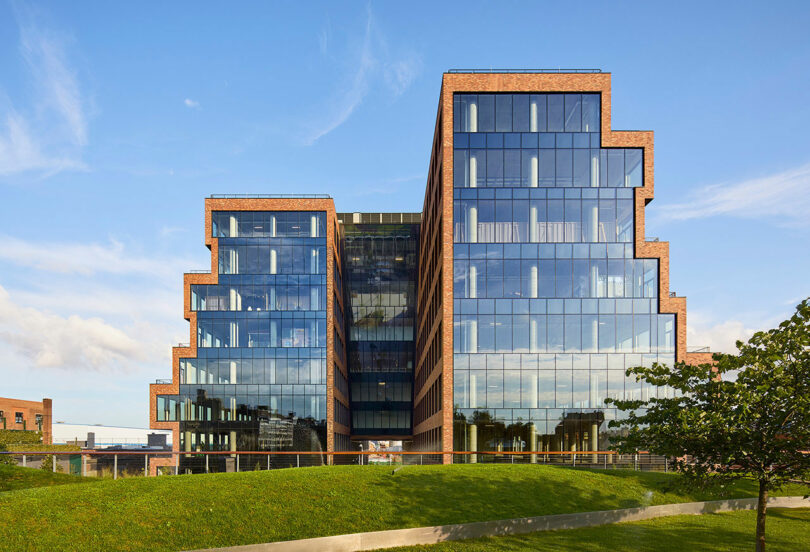
Photo: Ty Cole
25 Kent HWKN designed 25 Kent from the outside in by choosing local forces, shifts within society, and the power of creativity as guiding principles. 25 Kent is a premier office building in Brooklyn, known for its distinct architecture and vibrant location in Williamsburg. Spanning 500,000 square feet, it features floor-to-ceiling windows, terraces on each level, and an activated rooftop. The building fosters a dynamic work environment with its blend of contextual design appearing like stacked warehouses, accessible location with an open canyon passing through the building, and abundant green spaces at the recessing volumes with waterfront access, making it a preferred destination for many companies.
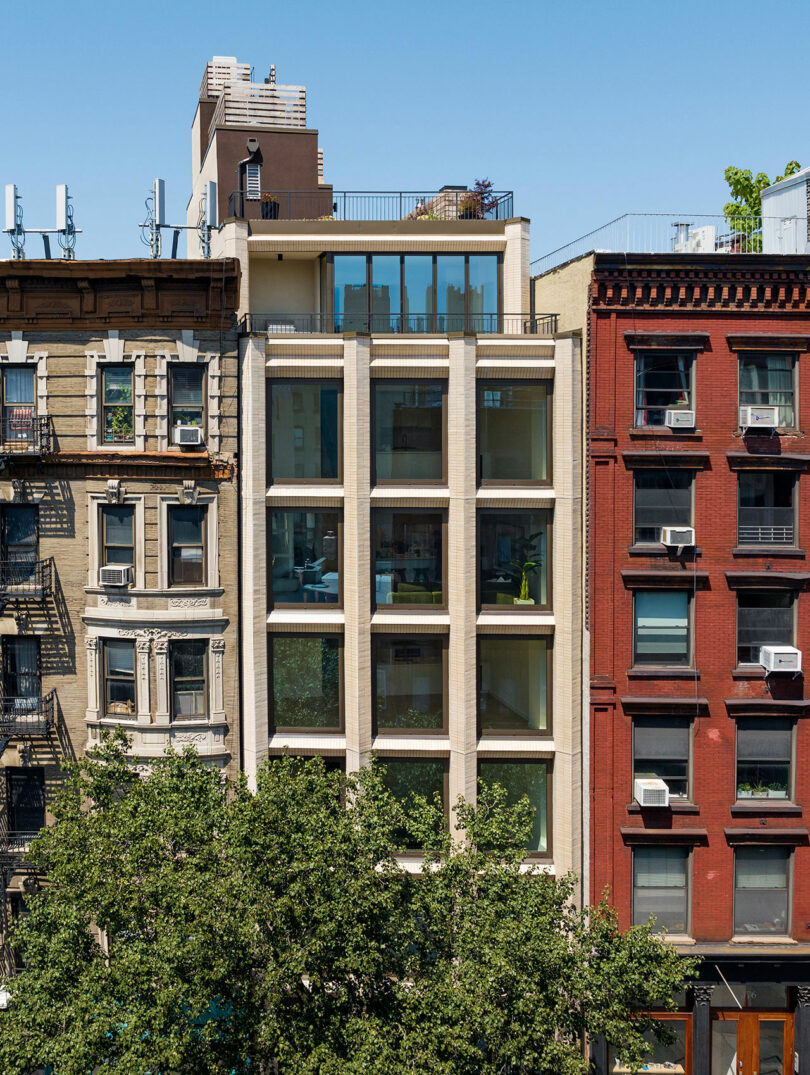
Photo: Michael Moran
378 Broome St HWKN pioneered a distinctive approach for the boutique residential building at 378 Broome Street by combining hyper-modern aesthetics with a profound respect for the local context. The seven-story townhouse-type building displays a highly distinctive façade, with sandstone-colored brick, triangular-shaped uprights, and oversized windows. HWKN’s architectural approach blends contextual design with modern updates, adhering to its surroundings while embracing contemporary aesthetics. The inside consists of four spacious residences: two large duplex apartments with two single, full-floor apartments in between. Located in one of the city’s most sought-after neighborhoods, 378 Broome offers easy access to iconic restaurants, shops, and cultural landmarks, with major subway lines nearby.
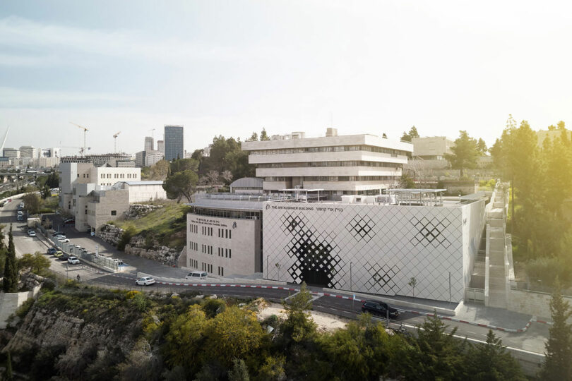
Photo: Dor Kedmi
Jerusalem Academy of Music and Dance Designed by New York firm HWKN and Tel Aviv-based practice HQ Architects, the new Advanced Inter-Arts Center building significantly expands this famed institution’s presence in Jerusalem. The Academy sought to confront a persistent programmatic flaw in its operation as a world-renowned and international institute of performing arts. While its curriculum is strong, the campus lacked a proper performance space or a stage of any kind. HWKN and HQ’s bold vision brought to life the new 2,500 m² building that sits adjacent to the original JAMD building. A contextual stone façade with a twist from HWKN now extends across the entire complex, creating curiosity while directing the flow of people into the welcoming buildings lobby.
