Category: magazine
Coloring Book Interview Series #5: Ellen Leber
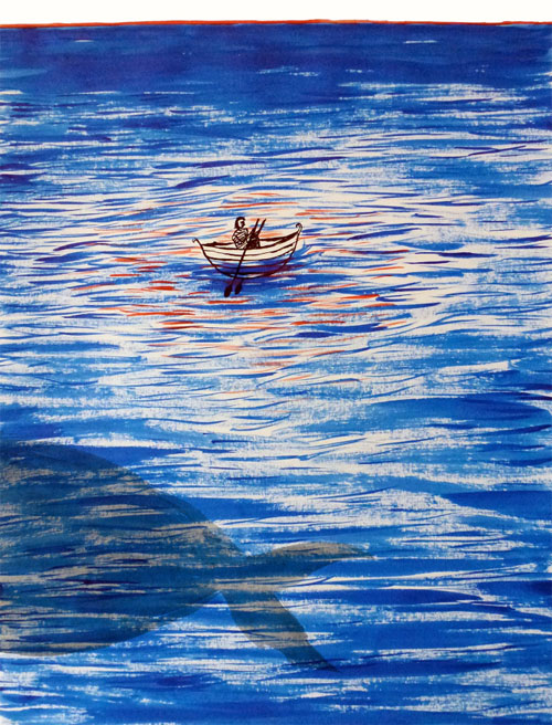

One of my favorite things about our coloring books is looking up the artist of a page I really like, because I usually end up falling straight down their rabbit hole. For example, Ellen Leber's atmospheric illustrations contain a depth that sucks me right into her world, especially since they are sometimes actually three dimensional.
DA: Hey there, Ellen! Catch me up on what you've been doing.
EL: Hi! Just recently my work has been on display and up for sale in Kahaila Cafe down Brick Lane which is pretty exciting as it's my first solo exhibition. The opportunity came around really randomly and quickly so I put it all together in a mad rush a couple days before. A couple years ago I did some artwork for the band The Sea & I, who recently got in touch and asked if I wanted to display some artwork. It's a monthly event run by Wilderthorn, a musician who performs at the cafe along with other performers and artists. It was a really nice set up, so whilst the band were playing their songs, my pairings were on the wall behind them. It created a really nice atmosphere as I like to try and create images that are quite immersive and atmospheric. I painted the images whilst listening to their music so the series that I ended up with created a visual narrative that could illustrate the songs. The work is up until the 2nd September so if you're ever around Brick , go have a look--the cafe does really good cakes and coffee too.
DA: Many of your works are inspired by novels, and even the ones that aren't seem like they could be one illustration in a larger story.

EL: I love to read fictional literature, especially fantastical and imaginative novels. Whenever I read something that I like the sound of or a sentence that sounds like it could create an interesting image, I write it down somewhere then try to paint it. I mainly paint straight from my head rather than look at other things for reference. Sometimes this is good, but I do need to try and draw from life more. I like to make images that can be perceived in different ways to different people, creating hints of narrative in different ways. I like how with books you have your own personal images of what the characters look like, what their voice sounds like, and even how names are pronounced - like the Harry Potter books and the pronunciation of Hermione's name� and then you hear how is meant to be pronounced in the film! Also, using literature as inspiration for an image means that you are creating something that is from your mind and influenced by words and descriptions rather than copying an existing image. It is really hard not to copy images that you like. Obviously my work isn't completely original, but I find just working from text forces me to use my own visions.
DA: My personal favorite pieces of yours are the three dimensional drawings, like A Paper Forest. What inspired you to explore this unique style?


EL: The Paper Forest was inspired by David Hockney's set designs. I didn't know he made stage sets and I thought they were amazing. I really like the idea of creating an atmosphere that the spectator can immerse themselves into, so I created a small scale paper forest. I wrote a short story about a man who left his village and went in search for somewhere new to live. He found a lake with Narwhales swimming in it and as he carried on he found a settlement in the forest near the lake. However, the settlement had a dark secret� Instead of painting images that tell the story I decided to make a three dimensional set of the forest settlement and the lake where the story is set. This then allowed the spectator to create their own story using the forest settlement as a base. I guess I like to encourage people to use their own imagination and I find it interesting to see how varied different individuals responses are.
DA: What memorable responses have you had to your work?

EL: When I exhibited the Paper Forest most people thought it was a boy who had done the work. People usually comment that my work is quite dark and that they don't expect it from me. I don't mean to make it dark. I just like to make it a bit more interesting and to create stuff for adults, as when you say the word illustrator people automatically think children's books. The main sort of responses I get and that I quite like are the comments about how the images tell a story, which is my main objective when I paint stuff.
DA: What is your dream project?

My dream project would be to design and make a theatre set!
DA: I would love to see how you colored your own illustration in our coloring book!

SOURCE: Doodlers Anonymous - Read entire story here.
Art Is Therapy at Rijksmuseum, Amsterdam
Shotgun Reviews are an open forum where we invite the international art community to contribute timely, short-format responses to an exhibition or event. If you are interested in submitting a Shotgun Review, please click this link for more information. In this Shotgun Review, Christina Conklin reviews Art Is Therapy at the Rijksmuseum in Amsterdam.
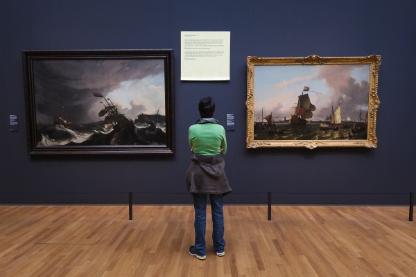
Post-it note discussing two paintings; installation view, Art Is Therapy, 2014. Courtesy of the Rijksmuseum, Amsterdam. Photo: Olivier Middendorp.
Viewers are supposed to marvel at Rembrandt’s Night Watch (1642), but do they really? Many of us have unsatisfying responses to the works of the Masters, yet we still troop through the museums by the millions. This disconnect has led Alain de Botton and John Armstrong to guest-curate a selection of 150 works at the Rijksmuseum from their pragmatic point of view.
De Botton and Armstrong assert that art’s purpose is to heal some of the pain and malaise felt in life. It would be easy to dismiss this as didactic and anodyne. But reclaiming this broad, utilitarian view of art and reconnecting with the public in an approachable way is not simplistic. It is an important critical challenge to the reductive and self-referential intellectualism that dominates much contemporary discourse.
Tagging each work with large, yellow Post-it-style notes, the curators chat with the audience about the psychological dynamics of viewing art in a large museum. The notes aim to demystify the thoughts and feelings of viewers. Some notes describe the purpose of museums (“cathedrals of art”), while others name the alienation we feel in a room crowded with strangers. Democratizing the viewing experience in this way touches the soft underbelly of art, where contemporary critique has rejected notions of social purpose, beauty, and meaning and thus alienated much of the public.
Some of the texts hit the nail just right, opening up works in thoughtful ways, while others are a bit preachy or wordy, losing people halfway through. Paired with Pieter Jansz’s Interior of the Sint-Odulphuskerk in Assendelft (1649)—a small oil painting of a sermon being preached in a bare church bathed in light—is a note describing the artist’s intent to convey a “slightly stern, but welcome message: You have to fight off distraction, it can ruin your life.” Below, in larger text, a societal “Sickness” is diagnosed: “My life revolves around business, distraction, chaos, Twitter.” It became easy to simply read the sicknesses; a more careful crafting of the text and graphics, inverting the illness and cure, would have led to a clearer curatorial statement.
Much of the art in the Rijksmuseum’s collection was created to enlighten or heal the viewer, so it is an ideal environment in which to propose that art can and should address the communal and even spiritual aspects of life. De Botton and Armstrong developed a show that engages with a general audience of families, tourists, and other “art outsiders”; may it also instigate a dialogue within the art world toward a more integrated understanding of art.
Art Is Therapy is on view at the Rijksmuseum in Amsterdam through September 7, 2014.
Christina Conklin lives near San Francisco, where she recently completed her MFA at California College of the Arts. Her sculptural and installation work examines histories, rituals, and the scale of time.
Pieter Jansz. Interior of the Sint-Odulphuskerk in Assendelft, 1649; installation view, Art is Therapy, 2014. Courtesy of the Rijksmuseum, Amsterdam. Photo: Olivier Middendorp.
SOURCE: DAILY SERVING - Read entire story here.
Read MoreSketchbook Pages to Get Lost In
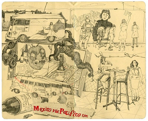


I know nothing formal about Tanxuan, except that he's from Shenzhen, China and that he's got an incredible talent for drawing, with some of the most beautiful sketchbook pages I've ever laid my eyes on.
His Instagram is a constant feed of jaw dropping inspiration with drawings ranging from seductive women to odd foods to incredible overlapping cityscapes and the people within them. 


SOURCE: Doodlers Anonymous - Read entire story here.
Curators Trash-Talking At The Smithsonian Summer Showdown

A bracket-style competition by public vote to choose the Smithsonian Institution’s “most iconic” object has led to a barrage of competitive tweeting and Photoshopping, as a Pullman train car races against the original “Star-Spangled Banner” flag, and a Tyrannosaurus rex skeleton battles the National Zoo’s young panda (“Bao Bao may be small, but at least she’s not extinct.”) and the space shuttle Discovery (“What is black and white AND has been to space? Not Bao Bao.”).
SOURCE: ArtsJournal» VISUAL - Read entire story here.
Read MoreCC Search (Copyright free images)
I am often asked to recommend a website to go to for Copyright free images. The Electronic Library at Cardiff Met offers many links to image databases that we recommend, some (marked with a black or a green copyright symbol) like Bridgeman Education and Visual Arts Data Service offer copyright free images for educational use.
I can also recommend a single page to which you can navigate on the internet which will allow you to search a whole selection of different image databases ...not just images of art and design... made available under a Creative Commons licence.
Creative Common licences all offer, as minimum, permission to copy so long as the image is marked clearly with details of who first created it (attribution). To learn more about Creative Commons licences (which are voluntarily applied by creators to their works and can apply to text, images , music and all copyrighted materials) you should go here.
To search for all those Creative Commons licensed images go here. Enter a keyword and select a source to search from the range offered ( various interesting websites ) results will bring back Creative Commons licenced images, moving images and sound.
SOURCE: Jenny's Art, Design and Architecture blog - Read entire story here.
Sneak Peek Behind The Scenes Of Josh Groban’s Summer Tour
Acclaimed recording artist Josh Groban is set to embark on a new North American tour in promotion of his chart-topping ALL THAT ECHOES album with a new East Coast Summer tour kicking off this week and a new behind the scenes teaser of what attendees can expect from the event is now available to view.
SOURCE: Arts News - Read entire story here.
Read MoreMalevich – Revolutionary of Russian Art @ Tate Modern
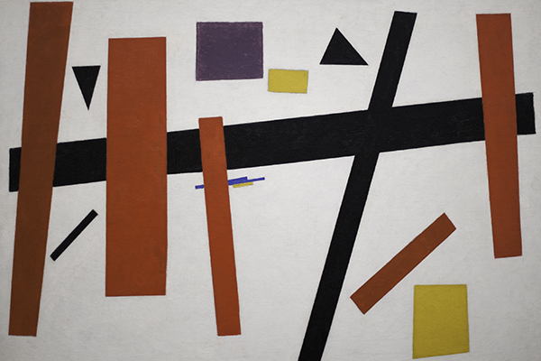
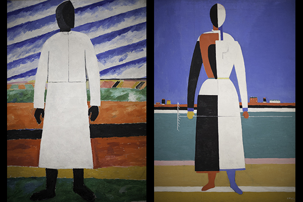
Tate Modern stages a unique retrospective of Kazimir Malevich, offering a view of the artist’s oeuvre from his early figurative paintings, through the invention of Suprematism in 1915, to a late period during which he returned back to figuration. With many of the artists’ greatest works, it offers a possibility to witness his vision and revolutionary spirit in a thorough and unprecedented way. (Photos on Flickr)
The chronological setup of the retrospective positions Malevich’s work in a direct social and political context of the late 19th and the early 20th century Russia. And what an exciting period indeed! Born under the Tsar’s regime, Malevich started his artistic career - heavily influenced by Italian futurism and French cubism – at the outset of the WWI. His proclamation of radical Suprematism movement came just before the October Revolution in 1917, a unsettling time soon to be followed by the Civil War in 1919. During this period Malevich worked as a teacher in Vitebsk and formed an artistic collective UNOVIS.
In 1924, after Lenin’s death and with Stalin in power, Russia witnesses not only forced collectivisation and wide-spread famine, but also a growing persecution of the artistic avant-garde. Socialist Realism is soon to be established as the sole style of the new USSR. Malevich answers with new figurative paintings that nevertheless clearly retain the marks of abstraction. His final works, figurative in style, are signed with a black square symbol.
Malevich’s Suprematist period is represented in the show by several surviving paintings from The last Futurist Exhibition of Paintings 0.10, a legendary show held in Petrograd in 1915. There’s also a large number of his famous geometric compositions and series of white canvases and architectons that marked “the end of a painting” era. Definitely worth a closer look is a room dedicated solely to the artist’s works on paper, which span Malevich’s entire career.
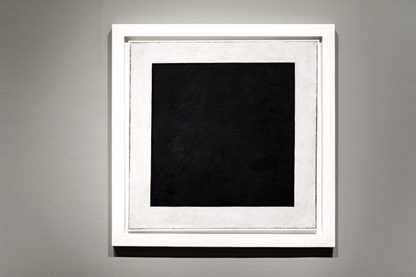
No doubt ‘though that the biggest crowd magnets will be 2 versions of the Black Square (from 1923 and 1929 – the original 1915 one being too fragile to travel from Moscow) – Malevich’s signature piece and one of the most radical statements in art history. Quite a treat to stand right in front of it!
Malevich is curated by Achim Borchardt-Hume. The show opens today at Tate Modern and will be on display till 26 October 2014.
SOURCE: Happy Famous Artists » Blog - Read entire story here.
Read MoreSpeed, Space, and Satire—Italian Futurism on the Blog
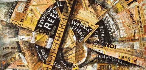 As we near the close of the Guggenheim's Italian Futurism exhibition, we revisit an array of blog posts that explored works in diverse mediums and provided a behind-the-scenes glimpse of the making of this unparalleled retrospective. Read through our Futurism series and get a chance to win a Futurism prize pack plus two admission passes to see the exhibition.
SOURCE: Guggenheim Blogs - Read entire story here.
‘Mortdecai’ Trailer Is All About Johnny Depp’s Facial Hair
Meet Charlie Mortdecai, a globetrotting art dealer who tries to find a stolen painting linked to Nazi gold. Starring Johnny Depp, Gwyneth Paltrow, Ewan McGregor and Olivia Munn, "Mortdecai" is based on "The Mortdecai Trilogy" by Kyril Bonfiglioli, a goofy spy series. The trailer features Depp's funny faces, a man-servant and Jeff Goldblum. Think James Bond meets dumb "Archer." Directed by David Koepp, "Mortdecai" is due out next February.
SOURCE: Arts News on The Huffington Post - Read entire story here.
