Category: Design
Marcel Breuer’s Wellfleet Home Needs Rescuing
[ad_1]
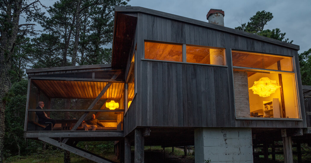
Deep in the woods of Wellfleet, on Cape Cod, down winding and rutted dirt roads, a summer home built in 1949 by the Modernist architect Marcel Breuer sits perched on stilts. Its cantilevered porch, where friends and family would spend much of their time, once had a clear view across three connected kettle ponds, but saplings that dotted the hillside today tower above the house, blocking sightlines.
The four-bedroom structure, now owned by the architect’s son, Tamas Breuer, is considered the most significant Modernist house on the Cape and was one of the first completed examples of Breuer’s “Long House” design, a simple construction that could be assembled using local materials. It has been left unchanged for decades, a time capsule of architectural history hidden in the wilderness.
But the damp New England weather has taken its toll on the cabinlike building, especially on the north side, where moss and lichen have rotted some of the white cedar cladding and porch rails. A leak in the roof has damaged the birch plywood ceilings in the main living room. And Tamas, who is 80 and likes his privacy — he declined to be interviewed but was welcoming during a tour of the house last week — spends just a month here each year and has wanted to sell the property.
The Cape Cod Modern House Trust is in contract to buy the house, and is looking to raise $1.4 million to preserve the building and its contents, including an art collection with works by friends of Breuer’s, like Alexander Calder, Paul Klee, Saul Steinberg and Josef Albers.
“In a year, if we can’t raise the money, the house could be on the market and it could be demolished,” said Peter McMahon, an architect and the founding director of the trust, which documents and restores Modernist properties on the Outer Cape.
Although most of the art and books have been removed from the house for cataloging and conservation, many personal items remain, like a woman’s yellow robe and handbags hanging on a bedroom closet door, a vintage tabletop TV set with antenna and an upright piano that Breuer’s wife, Connie (Constance Crocker Leighton), would play at parties, and that Tamas keeps in tune.
The house was built on land Breuer bought with the aim of creating an artistic community, and he soon tempted other Bauhaus friends to join him on the Cape, including the painter and designer Gyorgy Kepes, for whom he built an identical home on Long Pond. The architect Serge Chermayeff lived across the road, where Breuer’s mentor Walter Gropius would stay, while the landscape architect Charles Jencks had a home and a studio nearby.
“Breuer wanted to have an intellectual enclave with those who shared his aesthetic points of view,” said James Crump, who directed the 2021 documentary “Breuer’s Bohemia,” interviewing many of the group’s surviving family members and friends. They tell of the summers spent in Wellfleet, canoeing across the ponds, sharing meals and socializing at each other’s homes, swimming in the adjacent Atlantic waters — often naked.
The tradition of spending carefree summers enjoying nature is “a transposition of something that was part of the artistic and lifestyle culture of the Bauhaus,” said Barry Bergdoll, a Breuer expert who teaches art and architectural history at Columbia University.
Marta Kuzma, an art professor at and a former dean of the Yale School of Art, who visited the Breuer house in July, described finding a spirit of experimentalism in every room, from furniture built — and endlessly rearranged — by Breuer using cinder blocks to a necklace made from a found circuit chip. “That sense of whimsy you don’t usually get when you are looking at the Modernist period,” Kuzma said. “On Cape Cod, they were able to just have fun.”
The Wellfleet house was so important to Breuer that, after his death in 1981, his ashes were buried among the pine trees in the yard, under a stone cut from a sculpture by the Japanese artist Masayuki Nagare. An enigmatic inscription reads: “Here Marcel Breuer broke his knee entirely of his own stupidity.” Connie’s remains are also buried there (she died in 2002), along with those of her sister Elizabeth Leighton and her husband, the artist Robert Jay Wolff.
The trust maintains four other homes in the area, hosting artist residencies in them and arranging public tours. Its operating revenue comes from renting the homes out to donors. These properties are leased from the Cape Cod National Seashore, so the Breuer home would be its first acquisition. It aims to use it for an annual fellowship, housing visiting students and scholars who would be involved in archiving and preservation efforts.
The importance of saving the Breuer property is not lost on local officials. “If purchased by the trust, the [Breuer] building will be safeguarded from demolition, which would be highly likely if the property is sold on the open market,” said Lilli-Ann Green, the delegate for Wellfleet, during a Barnstable County assembly meeting on Aug. 16, when a resolution was passed in support of the restoration project. Just last year, another home built by Breuer in Lawrence, Long Island, was torn down, upsetting preservationists, and one by the architect George Nelson in the Hamptons, which was bought for $60 million in 2021, was bulldozed earlier this year.
Breuer’s house in Wellfleet sits on a hill overlooking 4.2 acres of undeveloped waterfront, and the town assessor has valued the land alone as worth $1.2 million. “It’s on a huge piece of property,” Brian O’Malley, the delegate for Provincetown, said during the assembly meeting. “If it’s sold, the impact of development is going to drastically change that entire part of Wellfleet [and] Truro ponds and woods. It would be a great, great loss to the Outer Cape, beyond the house itself.”
The surrounding forest is overgrown, and there will need to be some work done to make the site accessible, leveling the driveway, and removing dead pine trees that could fall on the house. But the landscape will most likely be left wild, drawing on Bauhaus ideals of finding inspiration from nature.
Henry David Thoreau, after all, stayed in a Wellfleet oysterman’s house across Williams Pond in 1850, during his travels through Cape Cod. And the Breuer property’s southern border is on the headwaters of the Herring River, which is currently the focus of a $60 million environmental restoration project led by the National Park Service to return tidal flow and natural salt marshes to the area, lost over the decades because of rising sea levels.
The land and the historical building are not the only things the trust will be acquiring, since the house contains Breuer’s personal art collection and more than 200 books on architecture and design, many of them inscribed to him. An atlas by the Bauhaus graphic designer Herbert Bayer, for example, includes a note that reads, in German: “For Lajko and Connie Breuer, in old friendship,” using Breuer’s nickname among friends.
“A lot of the art was exchanged when [the family] were all still there,” McMahon said, and much of it has been untouched since then. “An Albers woodblock was stuck in an envelope and mailed to [Breuer] — and it was still in the envelope.”
Breuer added a studio and a small apartment with a darkroom to the house in the 1960s, to encourage Tamas’s interest in photography. “There’s hundreds and hundreds of rolls of film,” McMahon said, documenting the home from the 1960s to the ’80s, as well as everyone who visited. Tamas is helping to put names to the faces that appear on large contact sheets printed from the scanned negatives. “It’s like somebody was making a documentary film for 30 years, with these older Bauhaus people visiting and all the local luminaries,” McMahon said, “the parties, and bonfires and openings.”
If the house were sold on the open market, not only could the architecture be lost and the art scattered through a dealer or auction house, but the new owner could decide to scrap much of this documentation. “It would really be a shame,” McMahon said. “It would disappear.”
[ad_2]
Source link
KAL builds ‘breathing beach house’ with fossilized coral in egypt
[ad_1]
a biophilic house by karm architecture lab (KAL)
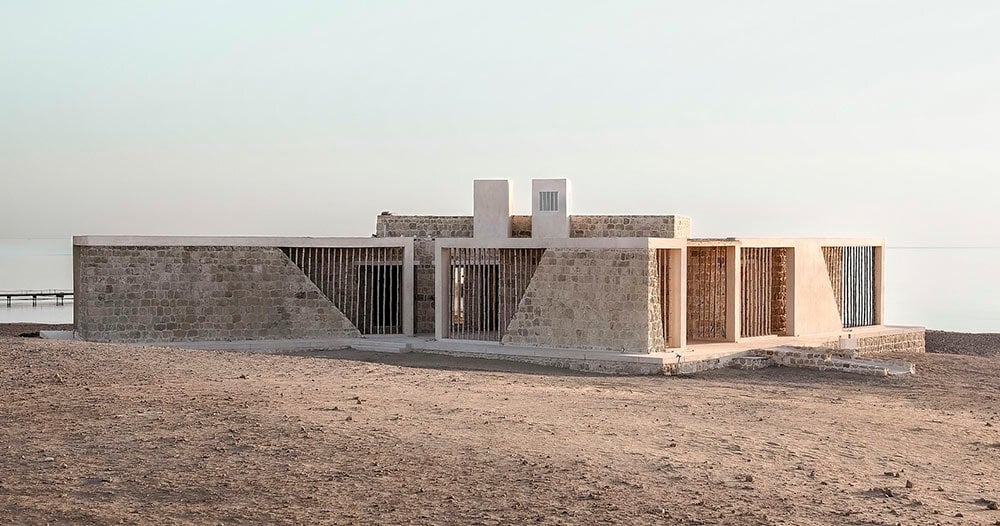
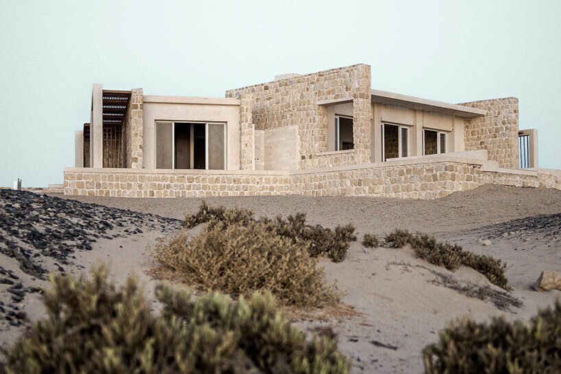
Overlooking the shores of Marsa Alam, Egypt, this so-called Breathing House has been designed by Karm Architecture Lab (KAL). The work of contemporary architecture takes shape with a palette of natural materials including coral limestone and bamboo, and seems to emerge from the sandy terrain as a natural landform. The single-story three-bedroom family vacation home celebrates both the vast shoreline and the Red Sea beyond, offering a calm retreat along the edge of the Eastern desert. The design is informed by the climatic challenges of the region, thus emerging as a living entity that harmonizes with its natural environment.
The house is designed as a response to the area’s extreme climate, with summer temperatures sometimes rising to a scorching 50 degrees Celsius (120 degrees Fahrenheit). As the team’s environmental wisdom is rooted in the philosophies of biomimicry and biophilia, the architecture embodies a symbiotic relationship with its surroundings — adapting and reacting to climatic conditions to ensure the comfort of its occupants.
images © Farah Faheem, Hala Makhlouf
fossilized coral limestone: no two building blocks alike
As the Breathing House is crafted from the very bedrock it rests upon, Karm Architecture Lab (KAL) honors the ancient desert landscape once submerged beneath the Red Sea. Fossilized coral limestone, weathered and shaped over countless millennia, forms the sturdy load-bearing walls of the home. A sustainable building block expressive of the region’s legacy, the architects sourced this material from discarded rubble found near the site, eliminating the need for new excavations. The integration of this forgotten treasure reduced construction costs significantly, while inviting the skills of local craftsmen to foster community engagement.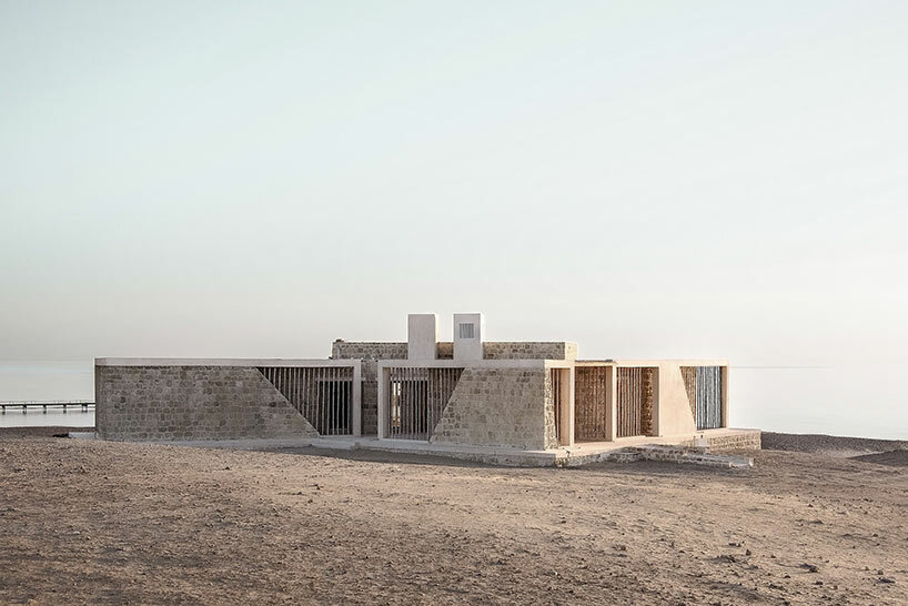
a living, breathing house
The heavy earthen walls of KAL’s Breathing House demonstrate a useful synergy with the environment. With thicknesses of 45-centimeters and 60-centimeters, the walls a capacity to absorb and release heat to create comfortable indoor temperatures. Their porous nature allows for a unique form of respiration, not unlike human skin perspiration, as they occasionally produce droplets of condensation when temperatures shift. Beyond their functional role, these walls are naturally adorned with preserved fossils of ancient sea life, expressing the desert’s history for generations to come.
passive design to fight the desert heat
To combat the unrelenting desert sun, the Breathing House thoughtfully employs passive design strategies. A second skin of coral limestone and bamboo envelops the southern elevations of the home, akin to a protective shell sheltering desert creatures. This shield deflects the direct heat of the sun, preserving the cool interiors. The home’s orientation is informed by its surroundings, with its back entrance facing the sun while the sea-facing front embraces the Northern prevailing winds. Cantilevered roof slabs and strategically protruding walls further ward off excess heat, ensuring a temperate indoor environment even during the early hours.
The layout of the dwelling evokes a crab’s form, a floor plan which lends an interplay between the indoors and outdoors. Every interior space opens out with an unobstructed, 180-degree view of the Red Sea, while the compact yet porous plan integrates pockets of lush greenery. These spaces, soon to be filled with native plant-life, will become desert oases. In addition to these natural sanctuaries, the layout is cooled by cross-breezes invited through strategically positioned windows.
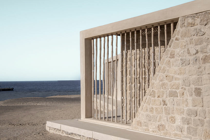
bamboo screens introduce a lightness to the otherwise heavy structure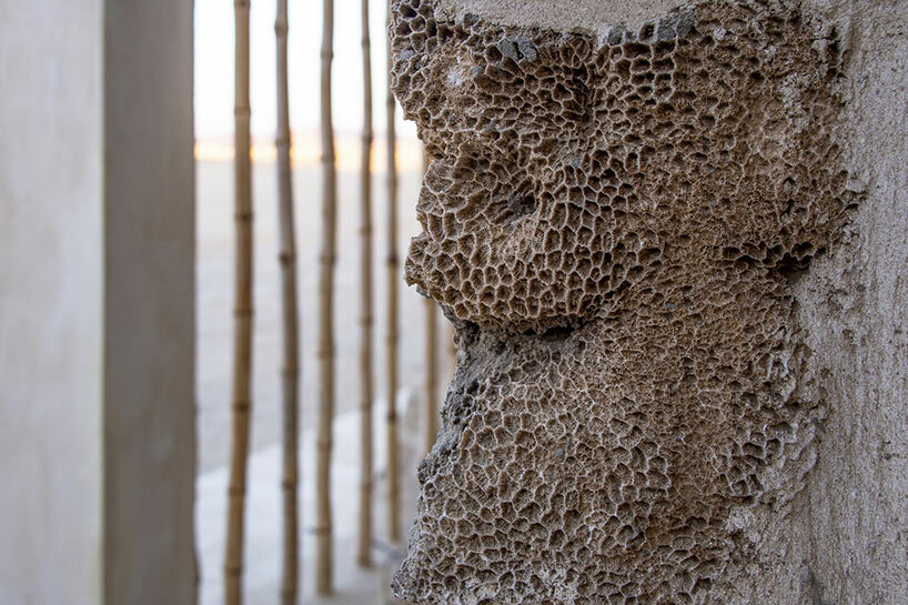
fossilized coral is celebrated as a natural and unique ornament
[ad_2]
Source link
Life Imitates Art Imitates Life in Michael Zavros’ Retrospective Exhibition in Brisbane
[ad_1]
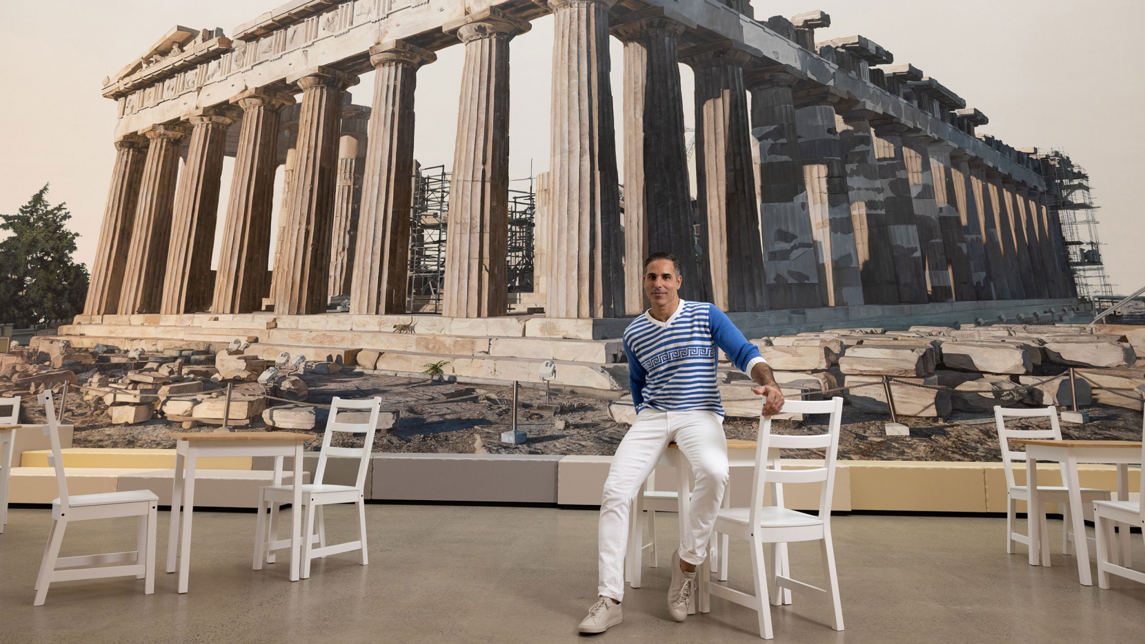
We have been fans of Brisbane-based, Greek-Australian artist Michael Zavros for more than a decade now, enthralled as much by the incredible detail of his hyper-realistic paintings as his use of humour, ambiguity and surreal juxtapositions that can’t help but entertain self-reflection. So it’s with great pleasure that we present “The Favourite”, a retrospective exhibition at Brisbane’s Gallery of Modern Art (QAGOMA) that brings together more than 100 works, primarily paintings, as well as sculpture, video, and photography, spanning Zavros’ 25-year career.
Underpinned by his abiding interest in societal symbols of beauty, wealth and status, his subjects range from high fashion, luxury cars and European palaces, to Lipizzaner dressage horses and Japanese Onagadori chickens, through to Narcissus and even his own children. Connecting such diverse thematic explorations is the artist himself, the things he loves, possesses, or aspires to. Rendered in exacting detail, the artist’s idealised imagery reflects on modern society’s conspicuous consumption and self-absorbed culture, prompting viewers to consider their own desires and values, whilst functioning as a personal diary where art and life merge in the pursuit of beauty.
[ad_2]
Source link
Spa That Merges Contemporary Amenities With Age-Old Traditions
[ad_1]
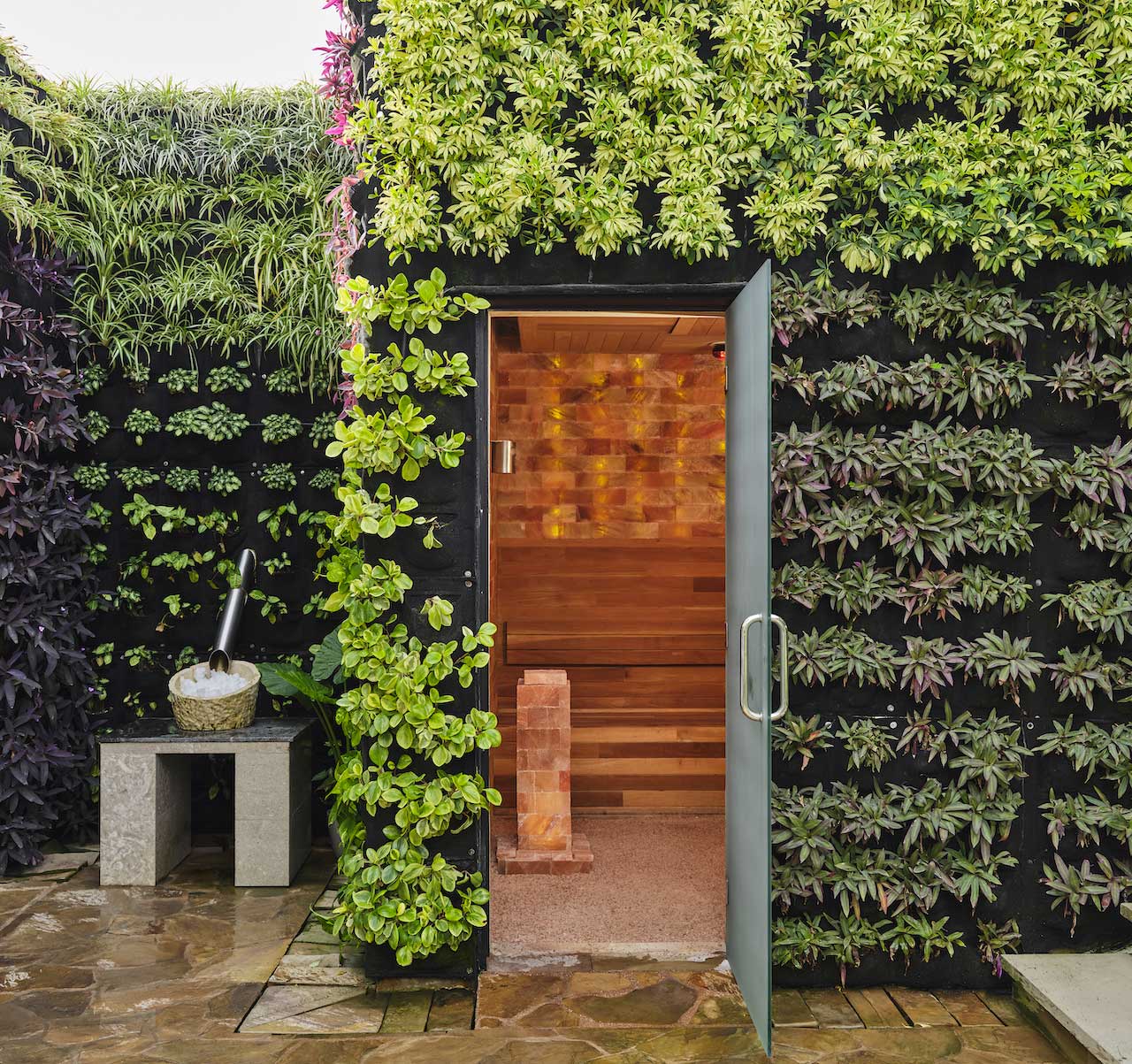
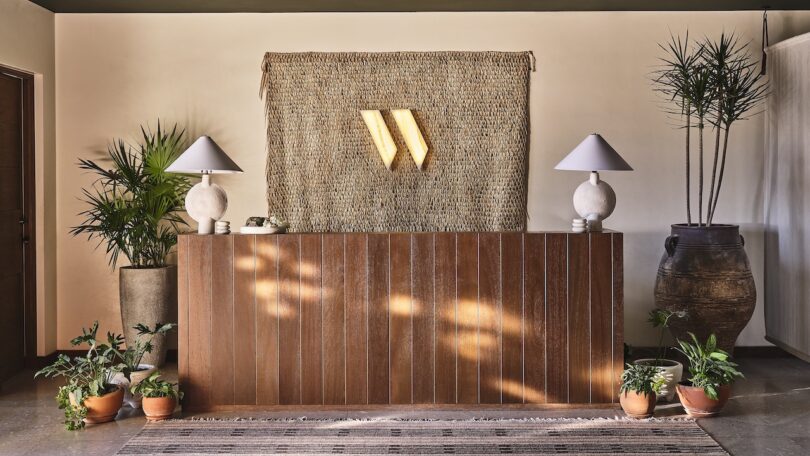
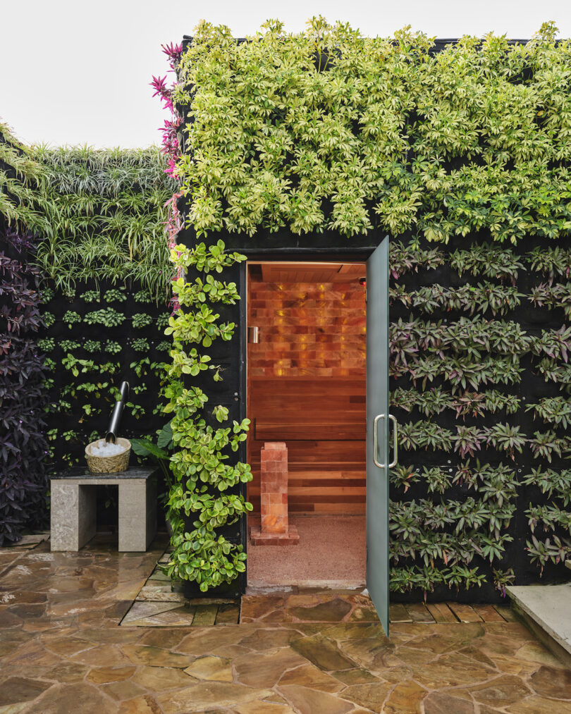
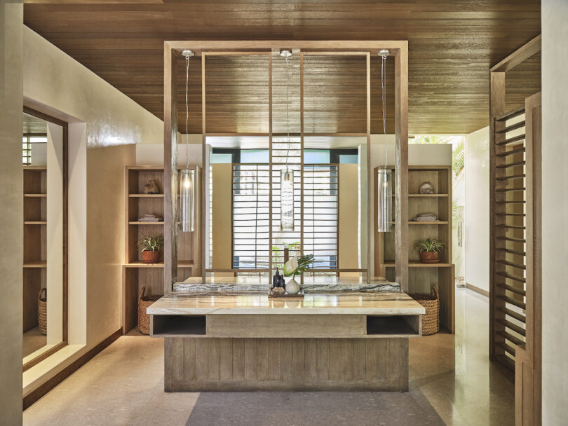
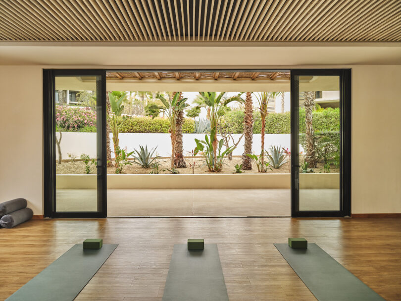
THE WELL at Chileno Bay is a spa transformation located within the Chileno Bay Resort & Residences, Auberge Resorts Collection, designed by Nina Gotlieb. This marks the brand’s first foray on the West Coast and its second on an international stage. THE WELL at Chileno Bay covers a vast 22-acre desert expanse in Los Cabos, Mexico, artfully merging contemporary amenities with age-old traditions.
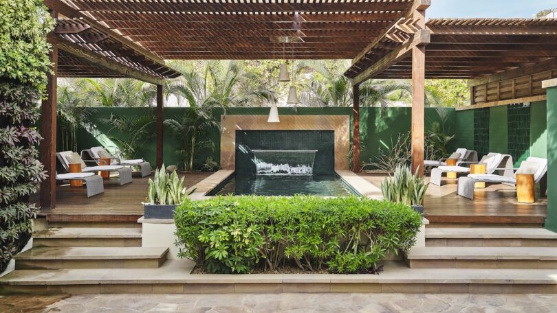
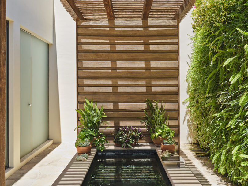
Among the attractions are a distinctive Bath House, a peaceful Nap Garden, a Reflexology Pool, and open-air treatment rooms. The Bath House offers therapeutic sessions, incorporating regional healing practices. Adjacent to it, the Reflexology Pool and Nap Garden provide a tranquil setting for relaxation, with the pool designed to stimulate reflex points.
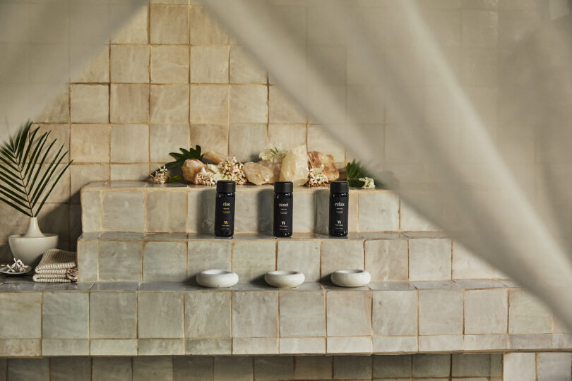
New York-based designer Nina Gotlieb transformed the interiors by drawing from Baja’s vast landscapes. The meditation lounge, equipped with suspended beds and a central fire feature, exudes a sense of calm, while the retail space showcases wellness products set against earthy textures and tones.
Photography courtesy of Auberge Resorts Collection.
[ad_2]
Source link
Prisoners, cruising and Bruce Lee: how the world caught up with artist Martin Wong | Art and design
[ad_1]
There’s a painting on show at the new Martin Wong retrospective that demands closer inspection. At first, the 1988 piece entitled Heaven depicts a circular wall, notable for the immaculate detailing on the brickwork. But gaze closer and you see a small black hole in the middle of the painting, a detail that gives the work a loaded queer subtext.

This is typical of the hidden depths to Wong’s work. A child of Chinese immigrants to America, his work explored and celebrated racial and queer identity, gleefully merged cross-cultural references and showcased Wong’s multilingual skills, including references to sign language. He has not always been easy to decode. Martin Clark, director of the Camden Art Centre, admits that there’s a certain cache that comes from being able to properly understand Wong’s work: “If you know, you know,” he says.
It’s taken a long time for people to be able to know Wong and his work. According to Clark it was the artists around him in New York, in particular the graffiti art community with which he was close, who were “holding the torch” prior to 2016, when the Bronx Museum staged a retrospective that began to shine a light on Wong’s art. Malicious Mischief, the current retrospective showing in London and a surprise hit of the summer, is the first extensive display of Wong’s work outside of the United States.
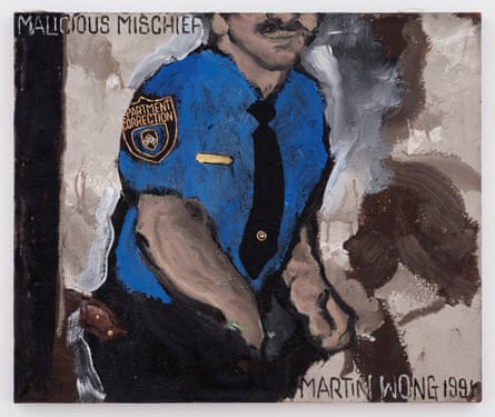
Why has it taken people so long to catch up? Clark believes the kind of work Wong was making, both in terms of the issues and the aesthetics, was out of favour during his lifetime (Wong died in 1999 from an Aids-related illness, five years after being diagnosed with HIV). “Figurative painting and identity politics was at the bottom of the agenda in a lot of ways,” says Clark.
Born in 1946, Wong grew up in Chinatown in San Francisco, a place he would return to at the end of his life to be under his parents’ care. For decades, from the late 1960s until his death, Wong’s work captured images of a changing world, filtered through a kaleidoscopic, cross-cultural vision. Whether in the intricate detail and apocalyptic landscape of Stripped Trans Am at Ave C and 5th Street (1984) that shows a vision of New York being left behind, or the intimacy of Prison Bunk Beds (1988-91), Wong creates images that at once feel like another planet, yet also appear politically prophetic.
Clark says that Wong was “an outsider in all of the communities that he was in,” whether that was hippies and queer performance groups in San Francisco, or the Puerto Rican community that he was involved with once he moved to the east coast.
Wendy Olsoff, co-founder of PPOW gallery in New York, knew and worked with Wong. She says that there’s an increasing “hunger” for his work now. When it comes to the political edge of his paintings – images of prisoners, police officers, and a rapidly gentrifying Lower East Side – Olsoff says that “at the time, we didn’t see it … his imagery was layered in such a way, that we didn’t have the skills to see what he was saying.”
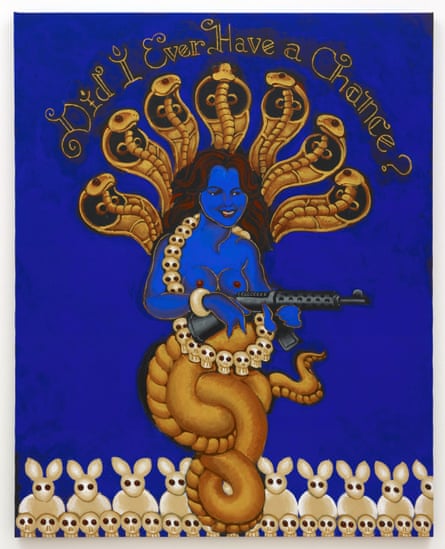
Wong’s work captures the contradictions and uncertainties of identity; both Clark and Olsoff mention the importance of Wong’s relationship with his parents, and what it meant for him to be a child of immigrants. As Clark says “America was all he knew; he was surrounded by a history and culture that was him, but that he was slightly outside of again.” Wong grapples with these cultural images in paintings like Bruce Lee in the Afterworld (1991), in which the film star is painted blue, surrounded by spirits, and even the ghostly image of Daffy Duck, with Wong’s cultural and historical worlds coming together. This is echoed in the visual language of his final painting, Did I Ever Have a Chance? (1999). Painted while Wong was hospitalised, using the same blue figuration and background as Bruce Lee, he transforms Patty Hearst into Kali, Hindu goddess of death and time.
after newsletter promotion
In describing Wong’s impact and legacy, Clark says that we now “have a language to think and talk these things through, and I think that wasn’t necessarily the case when he was making the work.” Osloff says that it’s “taken decades, and change, for people to see everything that’s there in the painting.”
Both Osloff and Clark emphasise the ways in which Wong used multiple languages – the cruising subtext of Heaven, the constellations in his landscapes, and his Painting for the Hearing Impaired series – in order to create a unique, deeply personal language of his own. Osloff says that the complexity and layers mean “you can have your own relationship” to Wong’s art, there is resonance and power in the fact that there’s no singular, simple way of reading either the art or the artist. We can only be grateful that we’ve finally found a way to speak the language of Martin Wong.
[ad_2]
Source link
What to See in N.Y.C. Galleries in August
[ad_1]
Want to see new art in New York this weekend? Check out the drawings of Kahlil Gibran in SoHo or Mire Lee’s gurgling, twitching kinetic installations on the Lower East Side. And explore some strangely winning sculptural works at a gallery in Newburgh.
Newly Reviewed
SoHo
‘A Greater Beauty: The Drawings of Kahlil Gibran’
Through Sept. 10. The Drawing Center; 35 Wooster Street, Manhattan; 212-219-2166, drawingcenter.org.
“You shall be free indeed when your days are not without a care nor your nights without a want and a grief,” the Lebanese-American author Kahlil Gibran (1883-1931) wrote in his best seller “The Prophet” (1923), “but rather when these things girdle your life and yet you rise above them naked and unbound.” Gibran’s book, a synthesis of poetry, religion and self-help inspiration, has sold more than 100 million copies. He was also an artist though, which you can see in over 100 works in this overdue show organized by Claire Gilman, chief curator at the Drawing Center.
In the same way “The Prophet” plumbed the human experience, looking for universal truths, Gibran’s artwork focuses on people. There are charcoal and graphite portraits of famous artists like Auguste Rodin, Albert Pinkham Ryder and Claude Debussy, as well as the psychoanalyst Carl Jung and unidentified mystics. In works like “The Summit” from around 1925 or “The Waterfall” (1919), bodies intertwine and earthly connection suggests uniting with the divine.
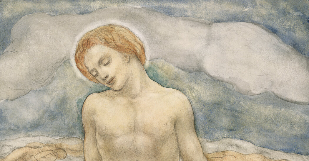
Gibran drew from a number of obvious sources: Symbolist art, with its otherworldly aims; the hazy aesthetics of Pictorialist photography; and the idealizing classicism of the Pre-Raphaelites. He mostly rejected the abstraction that reigned in 20th-century art, which partly explains why he was overlooked as an artist. But there is also an unbridled sweetness and fragility to his work that would have been deemed kitsch by many hard-boiled modernist critics (not unlike, for instance, how they viewed Marc Chagall). In our own crisis-riddled moment, Gibran’s art, like his words, is a balm and a portal for rising unbound above the daily strife. MARTHA SCHWENDENER
Lower East Side
Mire Lee
Through Sept. 17. New Museum, 235 Bowery, Manhattan; 212-219-1222, newmuseum.org.
For her first solo museum presentation in the United States, the young Korean artist Mire Lee houses her ambiguous body-horror forms in a PVC room within a room, its translucent sides cloudy with mud and curtained with tattered, clay-soaked shrouds. It’s unclear whether Lee’s bulbous, stringy kinetic sculptures are growing or dying. Electric motors and hydraulic hoses, gurgling and twitching and leaking, animate taupe gobs of silicone, hung with chains and impaled with pipes. It’s a little theatrical on one (rational) level, but on another (psychosexual?), there’s pleasure in the conceit. Like the rubbery wounds in a B horror movie, these faux viscera work on a gut level.
The New Museum show is especially effective, in its humid, muddy quarantine, at provoking the senses: the tent’s raised utility floor, crusted with mud and admitting tubes and wires, clanks under your shoes; the air tastes like sour mud; motors grind and pumps rasp. Outside the tent, along its periphery, are the routers, tanks and transformers, the electronic organs that produce the scenography inside: water periodically trickling down the crankshaft in “Black Sun: Horizontal Sculpture”; the dry suction from a pipe in a cement cauldronlike sculpture with an unprintable title. Stashed around the back of the structure are the mop and vacuum needed to keep the clay inside the tent, out of the rest of the museum. The unsettling power of Lee’s work comes from its refusal to accept boundaries — of sculpture, of obscenity. TRAVIS DIEHL
Newburgh
‘Souvenirs of the Wasteland’
Through Sept. 24. Elijah Wheat Showroom, 195 Front Street, Newburgh, N.Y. ; 917 -705-8498, elijahwheatshowroom.com.
It might take an exhibition offering more than just crafty visual trickery to pull New Yorkers from their urban warrens up the Hudson Valley in the sweaty days of late summer. “Souvenirs of the Wasteland,” a collaboration between Caitlin McCormack and Katharine Ryals at the Elijah Wheat Showroom in Newburgh is such a show, rewarding the visitor aesthetically and intellectually. It is a slightly satirical take on the universal survey museum, with a wall text by Cara Sheffler that claims the quest for knowledge is essentially “a path of infinite progress” and vitrines containing strange, hybrid creatures that may be fossils, taxidermied specimens or renderings of defunct species. There is also a celebratory nod to horror and the abject — for example, a crocheted piglike creature that sprouts mushrooms from its back, and a “shadow farmer” made of black velvet, wearing a fedora with appliquéd branches and leaves all over its body, like some ghostly goth dryad. Additionally, there is a foreshadowing of the consequences of our ecological crisis, with the depiction of various life-forms, amalgams of cheap jewelry, artificial hair, beads, microplastics and silicone, that here appear as though they have been recovered after extinction. The partnership between McCormack, who supplies the crochet, and Ryals, who does the sculptural work, makes each artist more strangely wonderful.
Since Elijah Wheat was opened in Newburgh in July 2020 by the artists and life partners Carolina Wheat and Liz Nielsen, they have consistently mounted shows that are worth the trip out of the city, especially for the perversely paradisiacal wilderness that is this show. SEPH RODNEY
Last Chance
Chelsea
‘Shrines’
Through Aug. 19. Silverlens Gallery, 505 West 24th Street, Manhattan; 646-449-9400, silverlensgalleries.com.
One of the first artworks encountered in “Shrines” is a rough-hewed wall display made from faded photos, vintage saltshakers and scrap-wood boxes: materials that might bring Joseph Cornell to mind. But it’s clear that the work’s creator, the Philippines-based artist Norberto Roldan, means to pay homage to a fellow countryman too. The piece is from a series Roldan calls “100 Altars for Roberto Chabet,” a venerated pioneer of Conceptual art in the Philippines.
Roldan’s work and the other pieces in “Shrines” — a group show featuring 16 Filipino and Filipino diaspora artists — seem to pose two questions: In the secular world of contemporary art, is there any space for reverential artworks? And who, or what, can be the object of that reverence? Spirits, people, places, memories: The show’s answers range. References to specific elements of Filipino culture abound. Still, “Shrines” is accessible to a broader New York audience. It is a show full of feeling.
While its title is devotional, no one religion gets singled out. A neon-letter sign by Lani Maestro adapts a quotation from St. John of the Cross, paying heed to a history of local Catholicism entwined with Spanish colonial rule. Southeast Asian spirit houses and prefab apartments alike are evoked in a pair of architectural scale-models by Stephanie Comilang, a talent to watch. In “God to Go,” by Eric Zamuco, even modern-day consumerism brushes up against the divine. An ornate, transparent column, on closer inspection, turns out to be a stack of carryout containers: single-use plastic made rapturous. DAWN CHAN
TriBeCA
rafa esparza
Through Aug. 19. Artists Space, 11 Cortlandt Alley, Manhattan; 212-226-3970, artistsspace.org.
The entrance to rafa esparza’s exhibition “Camino” is flanked by two paintings. In order to face either one head on, you must stand on a small, uneven platform of homemade adobe bricks. This is a message from the artist: He’s not interested in a seamless viewing experience. He wants you to think about the ground you’re walking upon.
The Los Angeles–based artist may be best known for his extreme performances. For example, at Art Basel Miami Beach last December, he turned a coin-operated pony ride into a lowrider bike outfitted for his body, so that participants rode him. By comparison, his first solo show in New York is tame. It recalls his contribution to the 2017 Whitney Biennial, where he created a room of adobe bricks. That installation was more immersive; this one is conceptually tighter.
Here, a winding path of bricks connects life-size portraits of members of esparza’s largely queer community. The paintings are also on adobe, referencing his Mexican heritage and accentuating his subjects’ brown skin. On the walls hang renderings of L.A.’s 110 Freeway, featuring concrete tunnels and embankments. This sets up a tension over how we build society — in concert with people and the earth or with little regard for them?
A striking painting at the back depicts P-22, the mountain lion that famously crossed two L.A. freeways. Its stride and stare mimic those of the human figures, all coalescing to issue a kind of challenge: What would it take to embrace a more sustainable way of life? JILLIAN STEINHAUER
More to See
TriBeCa
‘Heji Shin: The Big Nudes’
Through Oct. 7. 52 Walker, 52 Walker Street, Manhattan; 212-727-1961, 52walker.com.
More like “The Pig Nudes.” The photographer Heji Shin is known to mix high and low — gigantic studio portraits of Kanye West one minute, hard-core gay cop porn the next; as comfortable in glossy magazines as in scrappy galleries. Fittingly, this show puns on the fine-art and fashion photographer Helmut Newton’s 1980s pictures of celebrity skin (called “Big Nudes”). With titles like “Figure Standing” and “Eat Me,” several lush large-scale photographs depict fuzzy, fleshy swine in unsettling modelesque poses, complete with coquettish rows of teats and flicks of tongue. “Reclining Nude,” its peachy subject lying trotters out on a seamless backdrop, is the epitome of porcine soft-core.
Shin’s other series is more somber: Three sets of M.R.I. scans show the artist’s brain, the layers spread out for analysis. If photographs of faces and postures come with the tantalizing promise to penetrate their subject’s essence, Shin’s brain scans represent another order of portraiture. But even as a medical imaging machine lays bare the fatty seat of consciousness, the person remains opaque. The scans push the conceit of the pig pictures into comically bleak territory. “The Big Nudes” promises highbrow titillation but delivers mortality. For Newton’s exquisite models, Shin substitutes an animal similar enough to lend us its heart valves, smart enough to spice our sausages with guilt. The cosmic pun of the pig nudes, really, is to portray both species as meat, plus magic. TRAVIS DIEHL
Columbus Circle
‘Funk You Too! Humor and Irreverence in Ceramic Sculpture’
Through Aug. 27. Museum of Arts and Design, 2 Columbus Circle, Manhattan; 212-299-7777, madmuseum.org.
As a rule, contemporary art takes itself too seriously, which is why I’m delighted when I see pieces that lampoon society or make me laugh. Such work is increasingly visible today, much of it made with clay — a material whose associations with craft and childhood (and poop) are perfect for upending preconceptions of what “real” art should be.
Few exhibitions have examined the historical context for this current boom in weird ceramics. “Funk You Too!” does, and in doing so, deepened my understanding and appreciation of it.
Curated by Angelik Vizcarrondo-Laboy, the show departs from a 1967 exhibition that attempted to define a Bay Area-centered style known as Funk art. What exactly Funk was is still being debated, but based on the terrific examples here, it was strange, funny, lewd and sometimes pointed. Robert Arneson emerges as its godfather; his “Portrait of the Artist as a Clever Old Dog” (1981), the centerpiece of the current show, features a sculpture of his weary face on the body of a dog, surrounded by clumps of colorful turds.
Arneson is better known than the rest of his cohort, whose works — like Patti Warashina’s surreal stela “Pitter-Podder” (1968) — are a revelation. The show also includes contemporary artists whose identities and sensibilities are far more diverse than the older generation. From Yvette Mayorga’s disarming riff on Polly Pocket to Natalia Arbelaez’s terra-cotta sculptures with cartoonish faces, today’s artists often use Funk aesthetics for more overtly political ends. They’re a testament to how serious silliness can be. JILLIAN STEINHAUER
Brooklyn
John Fahey
Through Aug. 26. Picture Theory, Greenpoint (address available with an appointment), Brooklyn; 917-765-9762, picturetheoryprojects.com.
Apartment galleries offer intimate experiences with art that the blue-chip behemoths of Chelsea cannot. At Picture Theory in Greenpoint, a record played on a turntable in what would normally be a sitting room. The music was familiar: the distinctive fingerpicking style of the guitarist John Fahey — folk and blues flecked with traditional Indian raga — whose artwork rather than music I came to see.
The phrase “American primitive,” used for Fahey’s music, equally fits his visual art: All 17 works on paper or poster board were made in the last few years of his life when he was on the road touring or at home in Salem, Oregon. (He died in 2001.) Tempera, spray paint and markers are mostly employed to render layered fields of poured, soaked, sprayed and impressed color. Emergent forms in the compositions are occasionally outlined with a marker. Two jotted drawings, in marker only, are vaguely surrealist. The other untitled and largely undated works tend toward primary colors or, less frequently, pastel tones. Some incorporate glitter or iridescent materials.
Despite the exhibition’s title, “Fields of Reptiles and Mud,” the work is bright and joyous, a vivid and fascinating contrast with his vast body of music. The exhibition is the result of collaboration between Picture Theory’s founder, Rebekah Kim, and John Andrew, the manager of Fahey’s painting archive — two former colleagues at David Zwirner gallery who bonded over a shared appreciation for outsider art. It’s worth seeing what spills onto the page when a musical genius turns to another medium. JOHN VINCLER
East Village
Lap-See Lam
Through Aug. 27. Swiss Institute, 38 St. Marks Place, Manhattan; 212-925-2035, swissinstitute.net.
In the 1990s, a Swedish businessman, Johan Wang, opened a Chinese restaurant that was also a three-story ship, replete with dragon head and tail. The Sea Palace sailed from Shanghai to Europe, docking in various cities, but ended up shuttered in Gothenburg, Sweden. Recently, the ship was moved to Stockholm and repurposed as a haunted house.
If this sounds like a contemporary ghost story about capitalism and orientalism, it is — which also makes it the perfect starting point for Lap-See Lam’s “Tales of the Altersea,” her first U.S. solo show. Starting in 2014, Lam 3-D scanned the interiors of several Chinese restaurants in her home country of Sweden, including Sea Palace and the one founded by her grandmother, who immigrated from Hong Kong.
The glitchy ruins of Sea Palace are just barely recognizable in “Tales of the Altersea” (2023), the 10-channel video at the heart of her exhibition. Lam turns the ghost story into a fable involving twins and characters from Chinese mythology, who swim through a murky ocean to the sounds of rhyming narration and haunting music. The work unfolds as a digital shadow play projected on the walls and floor of the Swiss Institute’s basement. It’s a transportive melding of old and new stories and technologies, with what sometimes feel like too many moving parts. But just let the dazzling video wash over you. The details are less important than the outline they create: of being trapped in the phantoms of history, until you find a way to break free. JILLIAN STEINHAUER
Greenwich Village
Behjat Sadr
Through Aug. 27. Institute of Arab & Islamic Art, 22 Christopher Street, instituteaia.org.
Behjat Sadr, who died in 2009, was a prominent painter in Iran before moving to Paris in the early 1980s. Her work demonstrates how artists absorbed a dizzying array of influences after World War II. For Sadr, this meant the earthy approach of European Informel painters like Alberto Burri and Jean Dubuffet, but also the systemic geometries of Islamic architecture — and even the exaggerated, Pop brushstrokes of Roy Lichtenstein. This show at the Institute of Arab and Islamic Art shows off her range with paintings, installations and haunting collages.
Sadr studied in Rome in the mid-1950s and the canvases from that period, many painted on thick, toothy surfaces like Burri’s, are charged with carefully controlled formal energy. Later, she would scrape patterns into the “abstract” image, creating what looks like wood grain or that Lichtenstein brushstroke. The buoyant stripes in a kinetic work from the late 1960s, made with window blinds attached to the surface of a canvas, appear and disappear, depending on your perspective. The collages made in Paris feature photographs of arid Iranian landscapes, but also one of an unidentified man, seemingly silenced by a criss-cross pattern plastered over his mouth.
At root, many of the works are charged with subversive politics. Sadr left Iran after the 1979 revolution and her work reverberates with radical poetry and powerful histories. It feels vitally important now, at a moment when women are leading a protest movement in that country, to see the visionary work of this groundbreaking woman artist. MARTHA SCHWENDENER
Queens
Aliza Nisenbaum
Through Sept. 10. Queens Museum, New York City Building, Flushing Meadows Corona Park, Queens; 718-592-9700; queensmuseum.org.
Aliza Nisenbaum grew up in Mexico and now lives in New York. So do many of the people in Corona, Queens, whom she’s spent years painting in their homes and workplaces, in her studio at the Queens Museum or while they were enrolled in a class she once taught called “English Through Feminist Art History.” The museum’s wonderful “Queens, Lindo y Querido” (Queens, Beautiful and Beloved), a wide-ranging show of her work, includes portraits of Delta Air Lines and Port Authority employees; of Hitomi Iwasaki, the show’s curator, in her plant-filled office; and of an art class that Nisenbaum offered to food pantry volunteers at the museum, displayed along with a selection of the volunteers’ own works (“El Taller, Queens Museum”).
It’s worth mentioning all of this because Nisenbaum’s interest in people, her need to connect with them, doesn’t just provide content for her paintings — it comes through in their form. Realistic but with heightened colors and flattened planes, they’re homey and glamorous at once, capable of absorbing any number of idiosyncratic details. “El Taller” (The Workshop) presents 10 budding artists, five working on self-portraits with the aid of small mirrors, against the unreal purple mists of Flushing Meadows Corona Park. And then there are the paintings-within-the-painting, each with its own distinctive style, not to mention 19 naïve, multicolored games of “exquisite corpse.” It’s a tribute to Nisenbaum’s generosity — and to her skills with composition — that it all inhabits a single room in harmony. WILL HEINRICH
Closed Shows
Chelsea
‘Schema: World as Diagram’
Through Aug. 15. Marlborough, 545 West 25th Street, Manhattan; 212-541-4900, marlboroughnewyork.com.
When the paintings of the blockbuster Swedish artist Hilma af Klint, who died in 1944, were first shown publicly in the 1980s, some critics argued that the works looked more like diagrams illustrating occult ideas than abstract paintings. Later audiences and critics disagreed. Tastes have changed perhaps — but so has our relationship to diagrams, as John Bender and Michael Marrinan asserted in their book “The Culture of Diagram” (2010).
“Schema: World as Diagram” focuses on artists — mostly painters — who use the diagram in formal, conceptual and sometimes playful ways. Some use it to describe social, political and personal structures, such as Mike Cloud, Alan Davie, David Diao, Thomas Hirschhorn, Mark Lombardi and Loren Munk. Grids, networks and circuit boards appear in works by Alfred Jensen, Paul Pagk, Miguel Angel Ríos. Maps are a touchstone for Joanne Greenbaum and the aboriginal painters Jimmy and Angie Tchooga. More cosmic diagrams appear in paintings by Chris Martin, Karla Knight, Paul Laffoley, Trevor Winkfield and Hilma’s Ghost (the artists Dannielle Tegeder and Sharmistha Ray), who take af Klint as an inspiration.
For Raphael Rubinstein, who organized the show with his wife, Heather Bause Rubinstein, the diagram, which only became important in the 20th century in European and American art, closes the gap between abstract and representational art. Maybe this rich, dense show signals a shift, though: Who cares about abstraction anymore? Viva the diagram! Like painting itself, diagraming is a way of thinking and organizing information — speedier than the written word, more graphic and visual. In a chaotic, overstimulating world, no wonder diagrams are so popular. MARTHA SCHWENDENER
Upper East Side
Catharine Czudej
Through Aug. 12. Meredith Rosen, 11 East 80th Street, basement level, Manhattan; 212-655-9791, meredithrosengallery.com
It doesn’t take much for clowns to be creepy — the unnatural colors and rictus grins do the heavy lifting — an effect that’s been exploited by schlock horror for eons. Happily, the clowns in Catharine Czudej’s installation here never materialize, but one gets the sense, descending to a fluorescent-lit basement gallery, of entering the lair of some sinister Bozo who’s just stepped out for a smoke.
The dread never relents, not that it would have anywhere to go; color-wheel parachute tarps assault the walls and blanket the floor, strewn with bottles of irradiated-purple soda, giving the whole space the claustrophobic toxicity of a Chuck E. Cheese fever dream, or a house under a fumigation tent.
Puffy, cast-aluminum daisies and attenuated balloon animals creep along the floor, their color drained into cold gray. It is as if Giacometti did birthday parties, or if Jeff Koons stopped smiling. Elsewhere, two glittering wall works make up the deficit. Czudej melts down bismuth and lets it act on an aluminum frame, producing craggy accretions of stunning color. They mimic the shape of paintings, mocking the form: They look acid-eaten in places, or perhaps in revolt, returning to nature. An overly chirpy ad for a smoking cessation pharmaceutical plays on an upturned screen, its deranged tenor contributing to the deadpan darkness. Czudej’s fun house might be a place where only she’s having fun, but maybe that’s all right. Her berserk immersive environment taunts our endless consumption — of art, amusement, drugs, aspartame — our constant need for yucks. MAX LAKIN
Chinatown
Rachel Rossin
Through Aug. 11. Magenta Plains, 149 Canal Street, Manhattan; 917-388-2464, magentaplains.com.
The ground floor gallery at Magenta Plains is configured as a chapel — but of what faith? The New York artist Rachel Rossin is as much a programmer as a painter, and her exhibition embroiders the boundaries around “the human” with knowing reverence. On a round LED screen mounted to the ceiling, the video “The Maw Of” pans and zooms through 3-D renderings of disembodied nerves and skeletons, glowing networks, and the orange and blue blobs of bodies viewed in infrared. It’s a celestial tondo of the posthuman, a portal to the angels or their digital avatars. It turns the room red.
On the curved back wall hang five portraits of “mechs” — robotic suits of anime armor. Their purplish, blurred silhouettes seem printed on top of the ridges of milky paint depicting pale, layered figures and puddling abstractions. In “Just like Velveteen Rabbit, Mech Standing,” the largest and center panel, the mech’s beatific pose echoes an obscure, winged shape sketched into the pulsing lavender shadows in butter yellow and grass. Several, such as “SCRY. 1 Corinthians 13:12.,” a picture in minty pastels where the mech’s pilot’s face punches through the haze, incorporate line drawings of dragons labeled Bad or Good in a naïve hand; others feature angels. The apostle Paul had heaven in mind when he wrote, in 1 Corinthians, that “now we see as through a glass darkly”; Rossin’s cyborg icons hold out that true vision might require a higher power, a congestion of human and machine. TRAVIS DIEHL
Lower East Side
‘Luxe, Calme, Volupté’
Through Aug. 11. Candice Madey, 1 Rivington Street, Manhattan; 917-415-8655, candicemadey.com
For many young artists in the cash-poor, art-rich East Village of the 1970s and very early 1980s, bathtub-in-kitchen tenement apartments were also studios. You get an immediate sense of forced spatial economy in “Luxe, Calme, Volupté,” a salon-style group show of some 70 works from that time and place, each small enough to have been done on a kitchen table.
The show is a piquant tasting menu of a moment when realist art was suddenly in high flood after a long Minimalist/Conceptualist-induced drought. For a sense of new possibilities explored, or revisited, check out a 1981 Times Square cityscape by Jane Dickson, or Thomas Lanigan-Schmidt’s 1986 altar boy valentine, or a sculpted pair of spike heels (real spikes!) by the great Greer Lankton, or a companionable 1988 trifecta in the form of Gail Thacker’s photograph of Mark Morrisroe photographing Rafael Sánchez.
More than anything, this is a portrait show, of artists’ lovers and friends, almost all artists themselves. Together they define a brief, bright community occupying a gentrifying bit of turf, and a dolorous passage in time: Several of the artists represented here would die of AIDS, with Richard Brintzenhofe, Luis Frangella, Peter Hujar, Nicolas Moufarrege and the experimental photographer Darrel Ellis among the early losses. (The Madey show has been organized by Antonio Sergio Bessa and Allen Frame; the Darrel Ellis retrospective, now at the Bronx Museum of the Arts, was curated by Bessa and Leslie Cozzi.) Happily, illusions of “luxe, calme and volupté” were still possible when much of what’s here was made. HOLLAND COTTER
Hudson Yards
‘Reclamation’
Through Aug. 11. Sean Kelly Gallery, 475 10th Avenue, Manhattan; 212-239-1181, skny.com.
For the concluding exhibition of NXTHVN’s graduating fellowship cohort, the artists in this program founded in 2019 by the painter Titus Kaphar and two partners in New Haven, Conn., have produced work that is visually arresting, materially inventive, and takes real risks.
In the group show, “Reclamation,” Donald Guevara has fashioned collages of human limbs, animal appendages and bits of popular iconography mounted amid a rabble of multicolored shards titled “Glitches” (2023). His installation, which reads as a stop-motion blur of activity, brings to mind Sylvia Plath’s line from “Elm”: “a wind of such violence will tolerate no bystanding.” Another highlight is Anindita Dutta’s assemblages that combine black boots and shoes in which the heels are replaced by cruelly curved horns paired with sumptuous leather, cloth and feather textiles. Her series “Sex, Sexuality, and Society” (2023) finds that sweet seam between the phallic and the feminine, making it obvious that clothing really is talismanic conjuring in disguise.
Edgar Serrano’s paintings flirt with horror, but with a light, comical touch. The red-eyed ghoul shrieking underneath a Stahlhelm military helmet in “Doctor Hardcore” (2023) seems both silly and disturbing. Lastly, in the downstairs gallery, Ashanté Kindle’s circular paintings of hairstyling strips and acrylic on wood panel expound on her fascination with Black people’s hair. Her previous work was mostly obsidian, but now has added variegated pigmentation and objects such as hair bows and beads that give the paintings more visual voltage. The entire exhibition is like this work: sensuality embedded in intellectual curiosity. SEPH RODNEY
Tribeca
Graham Anderson
Through Aug. 11. Klaus von Nichtssagend, 87 Franklin Street, Manhattan. 212-777-7756; klausgallery.com.
Oranges are uniquely at home in the imagination. You can easily look past their surface texture and treat them simply as shapes, and they share their name, if not their very identity, with a color. There’s also their history as symbols of exotic luxury. In other words, they’re the perfect subject for “Mirror Grove,” the latest seminar in perception and design from the Brooklyn-based painter’s painter Graham Anderson.
In eight modestly scaled paintings with evocative titles like “Masks Without Owners” and “The Chimeric Mesh,” Anderson makes oranges look like hazy spotlights, paper cutouts, hovering planets, bouncy Art Deco ornaments, office-supply stickers, glowing buttons and elements of ancient Roman frescoes. He does all this with a combination of flat, saturated color, trompe l’oeil shadows and tiny, overlapping daubs of paint that split the difference between TV static and Ben-Day dots.
In “Advice From the Sun,” an enormous disc hangs like Pharaoh Akhenaten’s abstracted sun god between two gently rolling spheres. A smaller disc, nearby, is adorned with a sprig of schematic leaves. The fact that each of these planetlike orange circles is itself made up of tiny orange circles makes clear that the music of the spheres is also the music of atoms, and vice versa. But Anderson isn’t using his painting to illustrate this familiar, if always mind-boggling, truth. He’s using the truth to adorn his painting. WILL HEINRICH
TriBeCa
‘No Title’
Through Aug. 4. Chapter NY, 60 Walker Street, Manhattan; 646-850-7486, chapter-ny.com.
Two drawings by Lee Lozano, both untitled from 1964 and 1969, anchor this group show, which consists otherwise of recent paintings, sculptures, installation pieces and photographs by living artists. Lozano’s drawings of abstract but vividly spatial forms vibe with Philip Guston’s cartoonish figurative style from the same period.
At the gallery’s entrance, cameron clayborn’s sculpture “a short list of grievances” (2022), a gathering of dyed and stuffed muslin like oversized sausages, hangs above the wood floor feeling bodily, akin to Louise Bourgeois. The carbine red of two works by the Beirut-based artist Dala Nasser frame the back and a side wall. Hung like paintings, the large cloth-based works are like skin grafts of a landscape, as the artist exposes her materials outside to the elements before bringing them back inside to be hung. Here the landscape conjured is American. The works, “Cochineal I” and “Cochineal II” (both 2023), are named for the beetle, found on prickly pear cactus, used to make red dye.
The five silver gelatin photographs by Sam Moyer (all 2023) give the exhibition serious heft. Four depict giant slabs of composite stone, perhaps segments of an eroded sea wall, the fifth a field of long undulating grass — all in concrete frames inset with Long Island beach stone aggregate.
Summer group shows often feel motivated more by a desire to gather the participating artists together for the opening night party, but here the works cohere: a weighty whole, a sustained event. JOHN VINCLER
Queens
Edgar Calel
Through Aug. 7. SculptureCenter, 44-19 Purves Street, Long Island City, Queens; (718) 361-1750; sculpture-center.org.
In important ways the New York contemporary art world was a much bigger place three decades ago than it is today, not in size but in its thinking. For a few multiculturalist years our smaller, adventurous art spaces experimented with bringing spirituality into their premises, not just as an object of study but as an active practice, a way to think about what art is, or can be.
The first institutional solo show of the artist Edgar Calel, titled “B’alab’äj (Jaguar Stone),” is a reminder of this. Born in 1987 in Guatemala, where he lives and works, Calel is of Mayan Kaqchikel ancestry and that heritage shapes the character of his monumental SculptureCenter installation of raw earth, rough stone and fire in the form of burning candles. In appearance, the piece suggests an altar, a memorial, and mazelike garden. Its content interweaves cultural, political and personal histories.
Obliquely, poetically, Calel refers to Mayan views of the earth as a dynamic, responsive, sacred being. He offers a lament for an Indigenous people historically persecuted in their own land. And he presents a tribute to continuity in the form of family, his own. (Sections of molded soil spell out the syllable “tik,” the sound he remembers his grandmother making to call wild birds for feeding.) The resulting SculptureCenter piece, beautiful to see, isn’t a “religious” work in any narrow sense. It’s a spiritual charging-station, multipurpose, real. HOLLAND COTTER
[ad_2]
Source link
luminous casa zibu unfolds around series of courtyards in mexico
[ad_1]
an immersive retreat by di frenna arquitectos
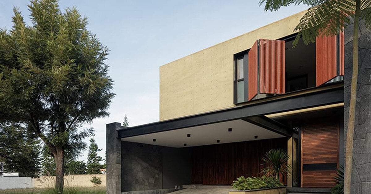
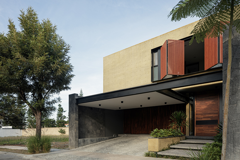
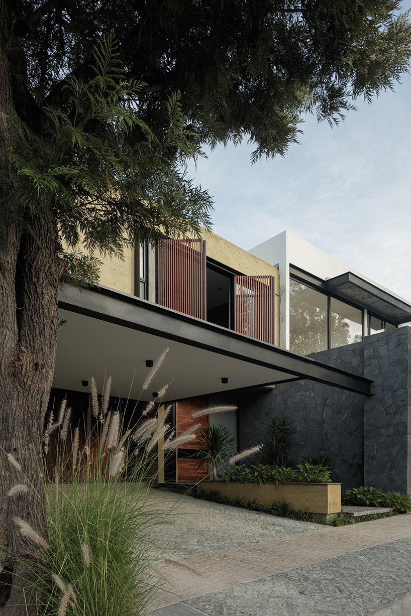
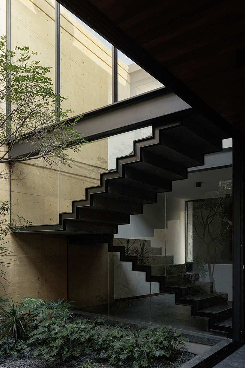
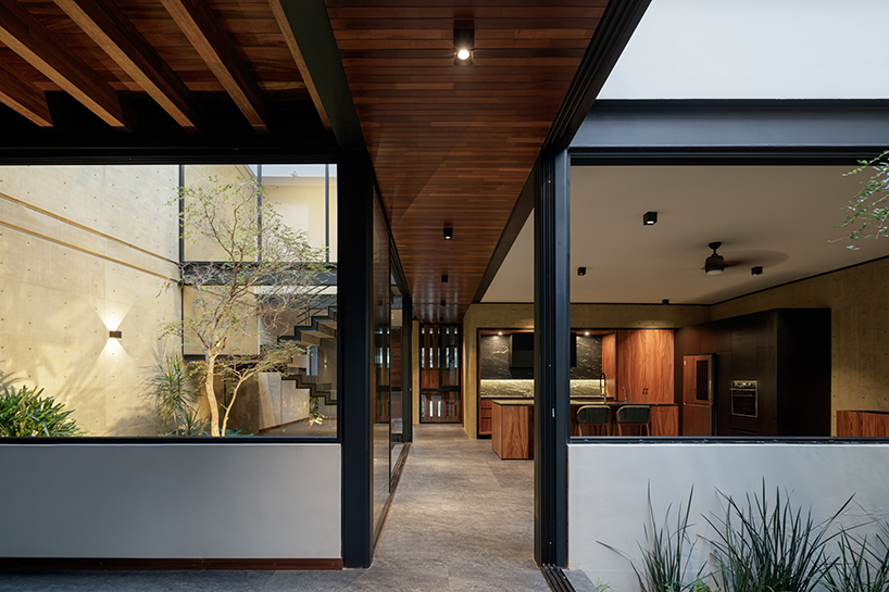
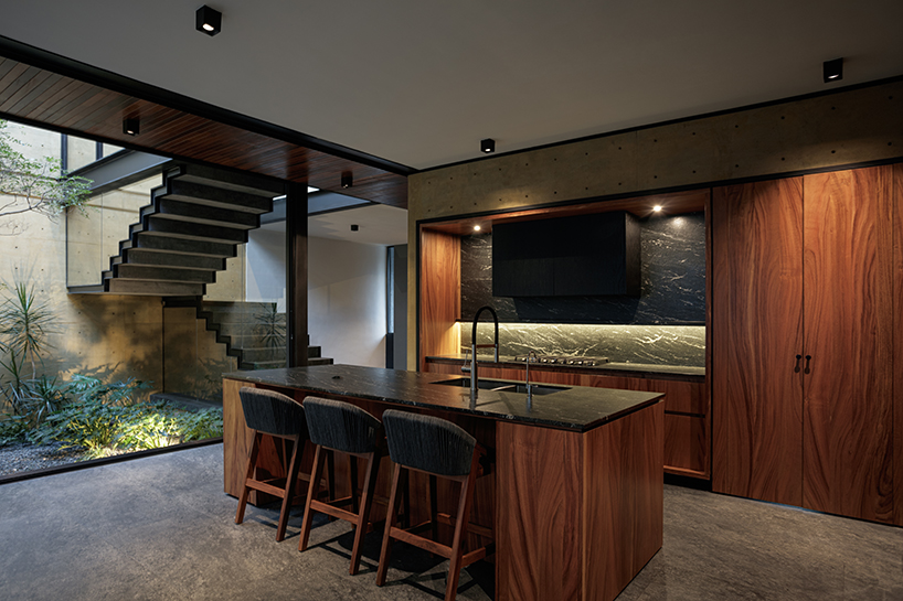
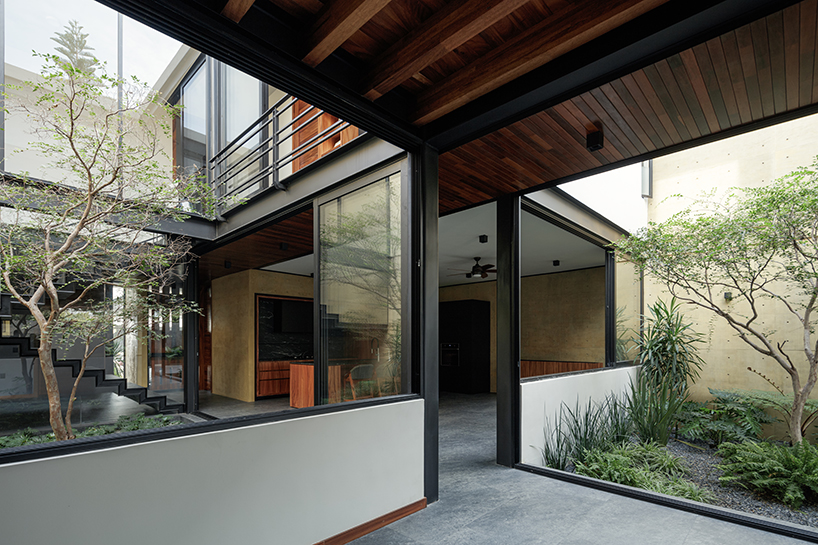
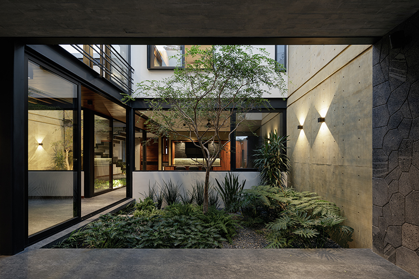
Di Frenna Arquitectos’ Casa Zibu is a secluded retreat in Mexico that immerses its inhabitants in a series of visual and sensory spatial sequences. At its core, the dwelling is organized around central guiding axes spanning its upper and lower levels, each of which are framed by black steel columns serving both as load-bearing structures and also visual demarcations that accentuate key elements along their trajectory.
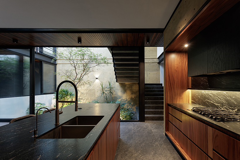
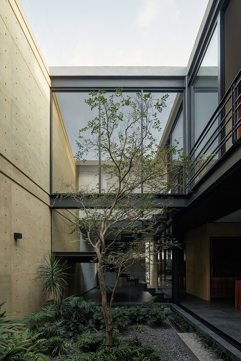
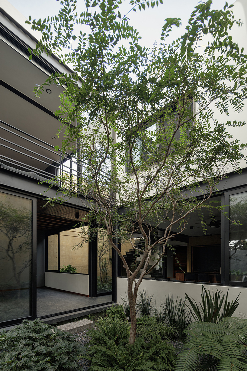
In its program, the project’s volumetrics are fragmented into four courtyards, with two positioned in the center of the house and two in the front and rear. These green enclaves, marked with abundant vegetation and guayabillo trees, introduce pockets of natural light and shadow and generate a distinct atmosphere throughout the dwelling.
all images courtesy of Di Frenna Arquitectos
retractable louver system floods casa zibu in light
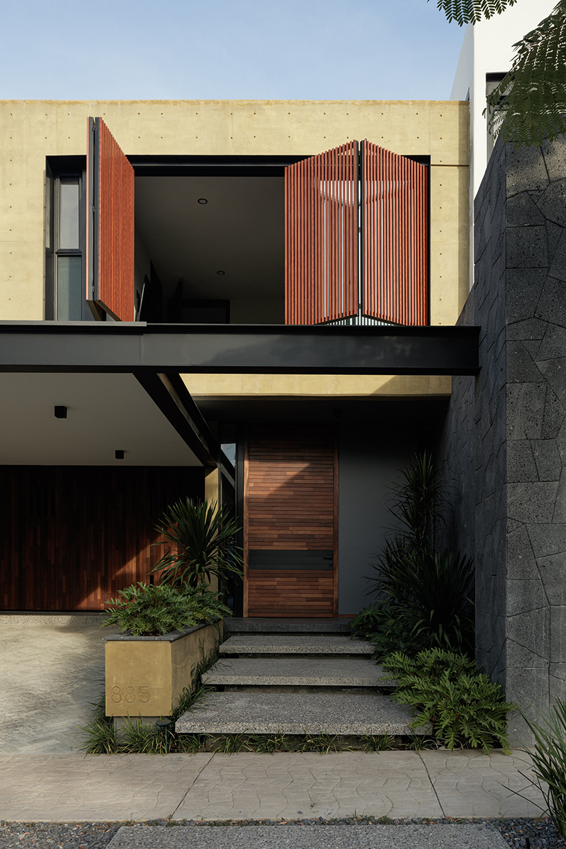
Despite the limited land footprint, Di Frenna Arquitectos conceals Casa Zibu behind reserved facades to provide seclusion for its occupants. Upon entering, the transition from exterior to interior offers an immersive refuge where a retractable louver system with vertical wooden slats enables residents to modulate their level of connection with the surrounding environment. This feature ensures a degree of control over privacy and interaction with the surroundings, depending on the user’s requirements.
Within, the program is divided into two symbolic levels, with the ground floor housing communal areas and the upper floor accommodating private domains. Cantilevered stone staircases welcome visitors, gradually leading them through the home’s various zones and fostering a sense of discovery. Materiality remains a hallmark of the architects’ design where exposed black-painted steel beams introduce a contemporary aesthetic, accentuating horizontal lines within the structure. While only subtly present on the ground floor, these columns assume a central role on the upper level, crowned by a wooden bridge that adds a sense of warmth and serenity.
Complementing this, grooves and joints in the concrete provide visual continuity, while the presence of stone elements offers rough textures inviting a tangible connection to the natural world. The choice of pigmented yellow concrete further tactfully plays with light reflection to ensure a consistently illuminated ambiance within selected spaces.
project info:
name: Casa Zibu
architecture: Di Frenna Arquitectos
location: Mexico
designboom has received this project from our DIY submissions feature, where we welcome our readers to submit their own work for publication. see more project submissions from our readers here.
edited by: ravail khan | designboom
[ad_2]
Source link
Maiami: A Brasserie/Artist’s Studio in Crete Celebrates Art, Food, Wine and Good Company
[ad_1]
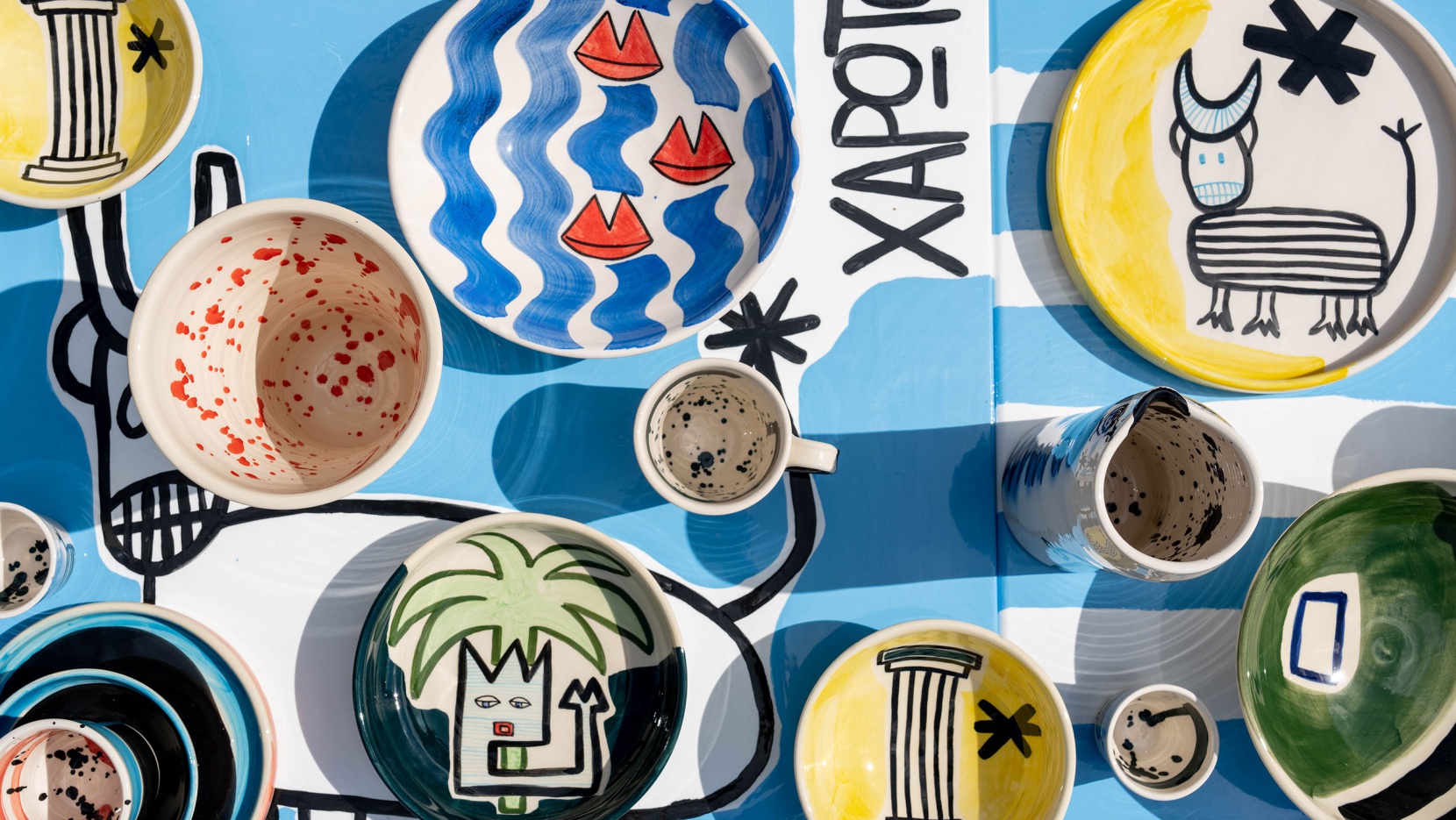
Ask anyone who has visited Crete and they’ll tell you that gastronomy plays an oversized role in both the island’s culture and lifestyle. So it makes sense that when artist Alexandra Manousakis was looking for a new creative space in Chania a few years ago she ended up opening a brasserie that also functions as an artist studio. Alexandra herself is no stranger to bold moves—born and raised in Washington, D.C., she left a successful marketing career in Manhattan in 2007 to take over the family winery in the village of Vatolakkos, her ancestral home in Crete. A winemaker as well as a painter and ceramist, her diverse interests converge in Maiami, a hybrid space where guests can eat, drink and be merry as well browse her latest ceramic works and, if they’re lucky, see the artist at work.
Taking over a 1950s building in Koum Kapi, a charming, less touristy neighbourhood near Chania’s Venetian Harbor, the all-day venue is awash in vibrant pops of colour in reflection of the artist’s colourful, abstract art, serving an unpretentious, soulful menu with Persian, Greek, Italian and Jamaican influences that embody Alexandra’s experience of growing up in an international world. With an emphasis on local ingredients, plus wines from the family’s winery, the art-filled brasserie is as much a paean to the Cretan way of life as a portrait of the artist’s inner life.
[ad_2]
Source link
Futurism + Primary Colors Join in This London Gamer’s Apartment
[ad_1]
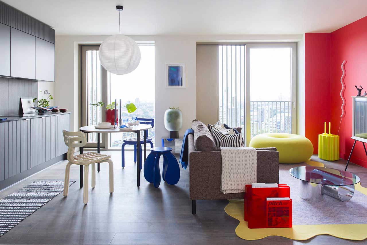
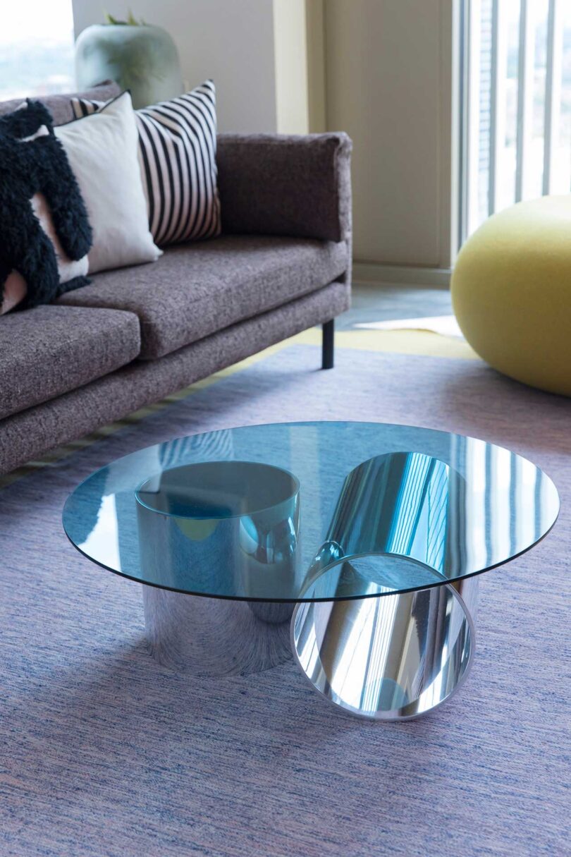
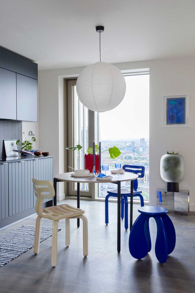
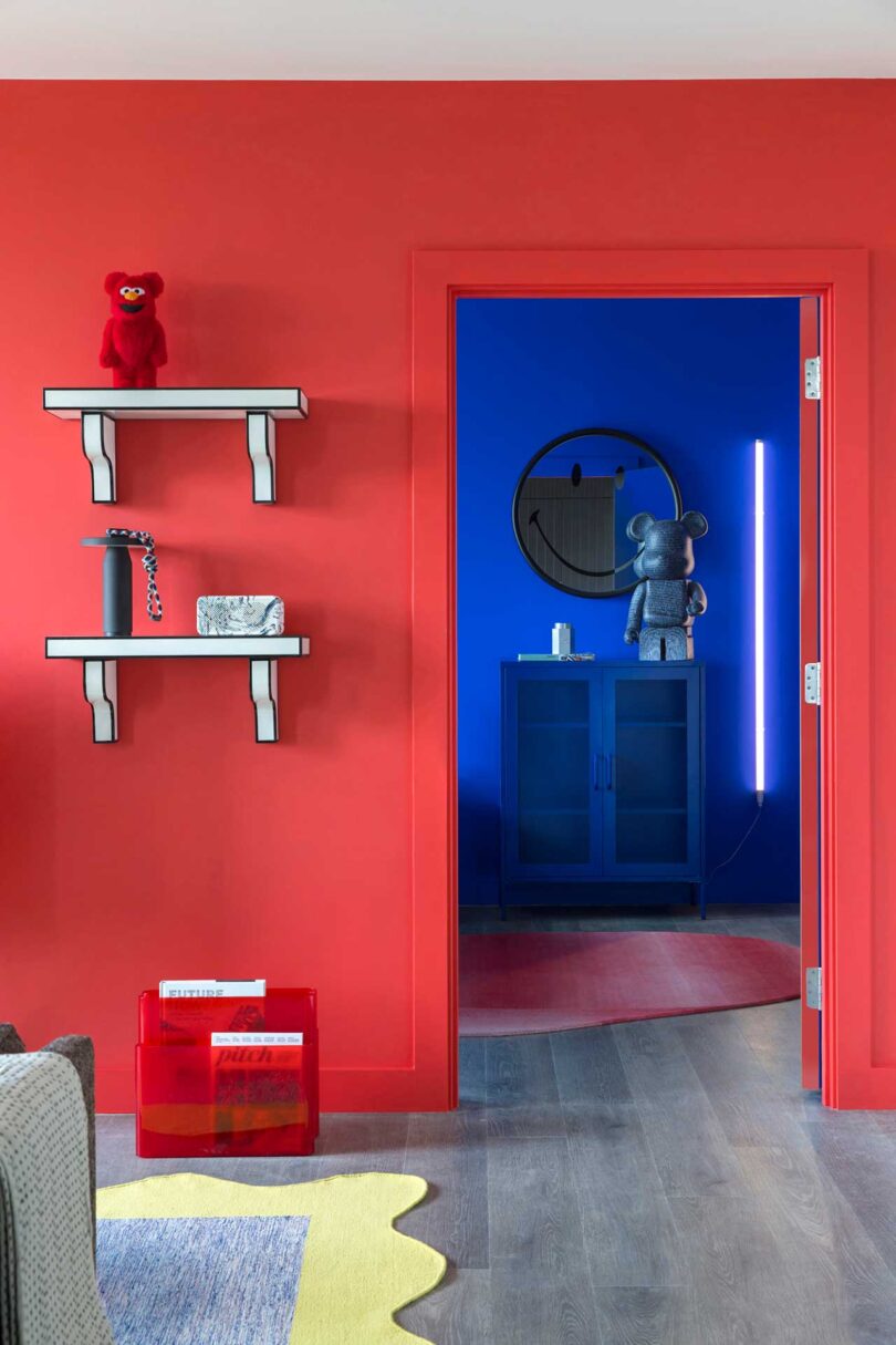
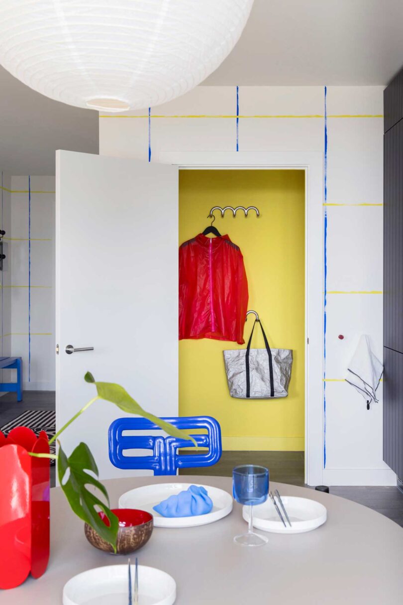
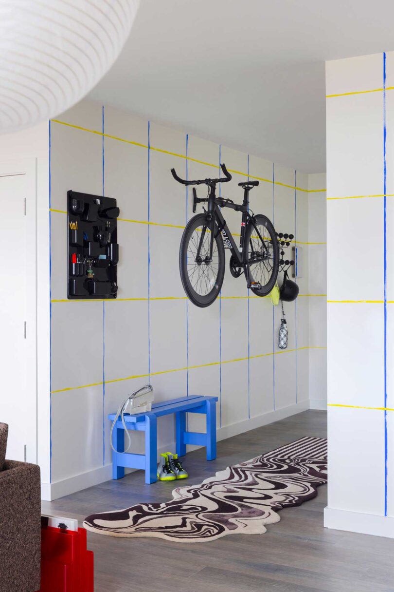
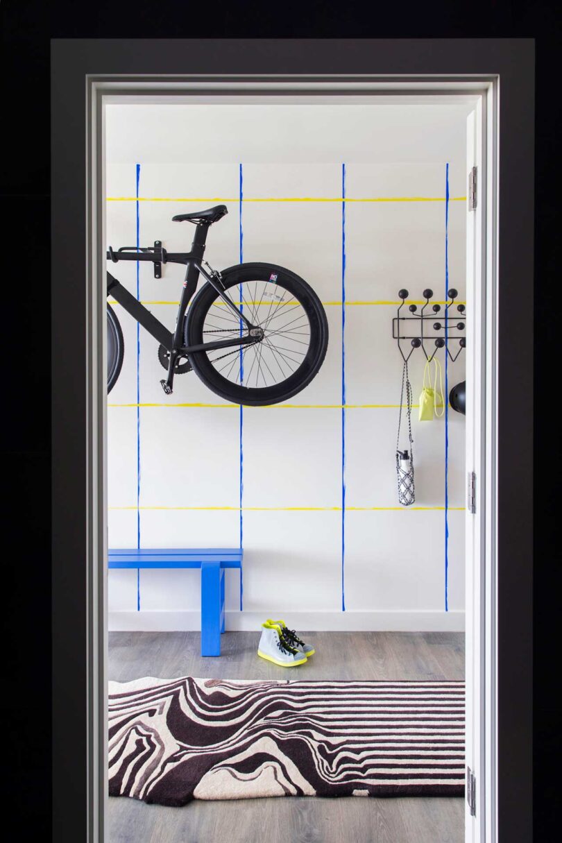
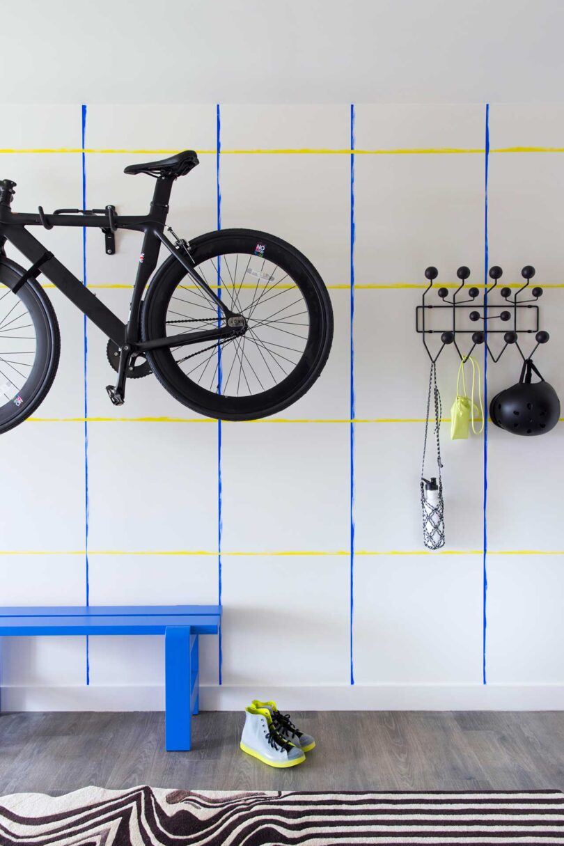
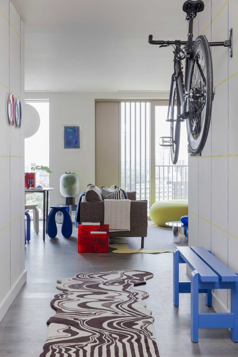
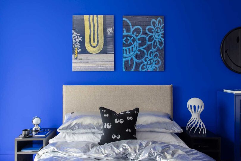
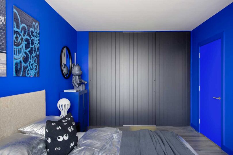
In the heart of East London’s vibrant landscape, a lively apartment has emerged, seamlessly blending futuristic design and vibrant colors. Part of luxury development Coppermaker Square, this striking one-bedroom apartment is tailor-made by 2LG Studio for an active gamer and bike enthusiast. The visionary project offers a luxurious yet playful haven for a young professional.
Large windows flood the space with natural light, allowing 2LG Studio’s design to effortlessly pull in the city’s vibrancy to create a seamless connection between the indoors and outdoors.
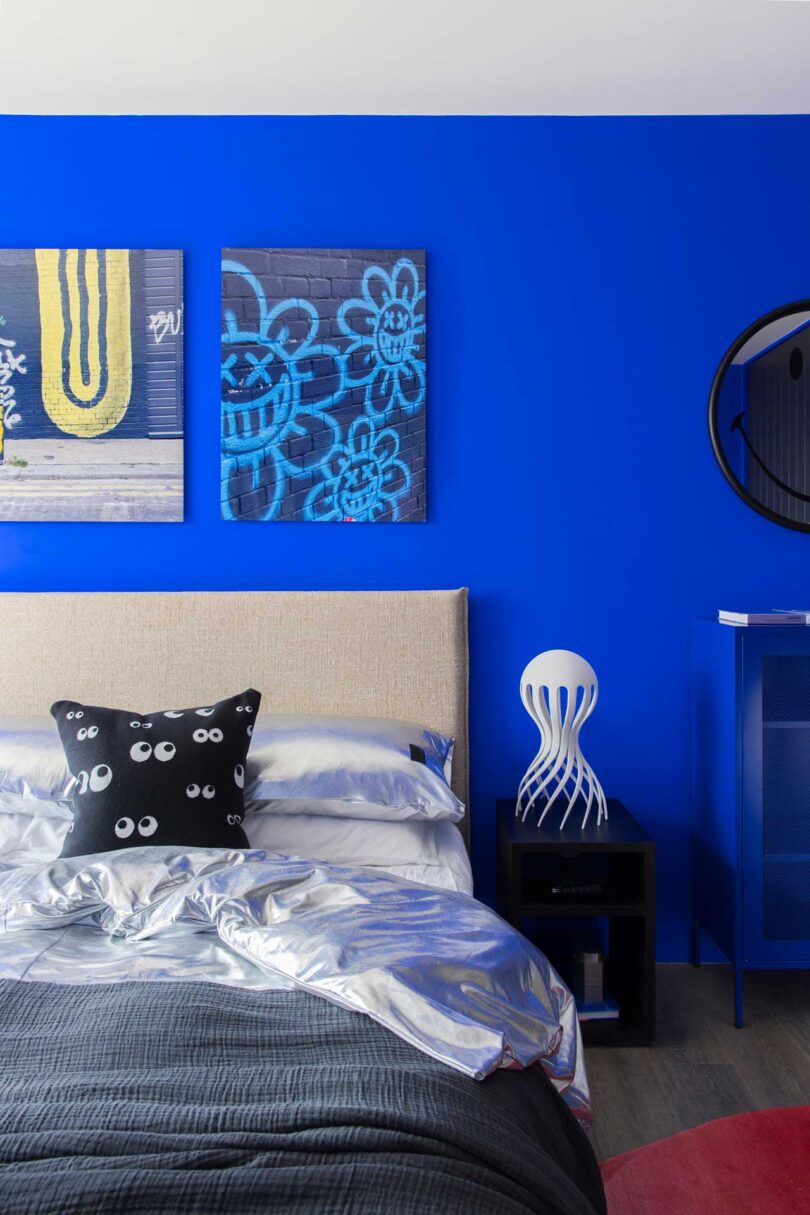
The flat evokes a sense of futurism, shown through the black details and silver metallic accents. These elements don’t just add visual interest – they transport you to a realm where modern technology and aesthetics intersect, inviting you to embrace the potential of what’s to come.
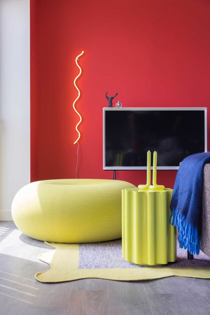
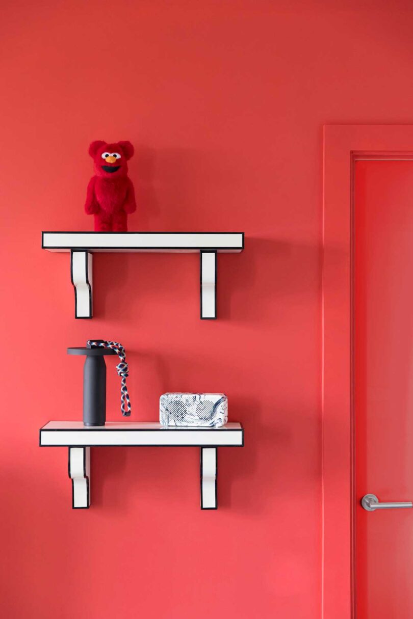
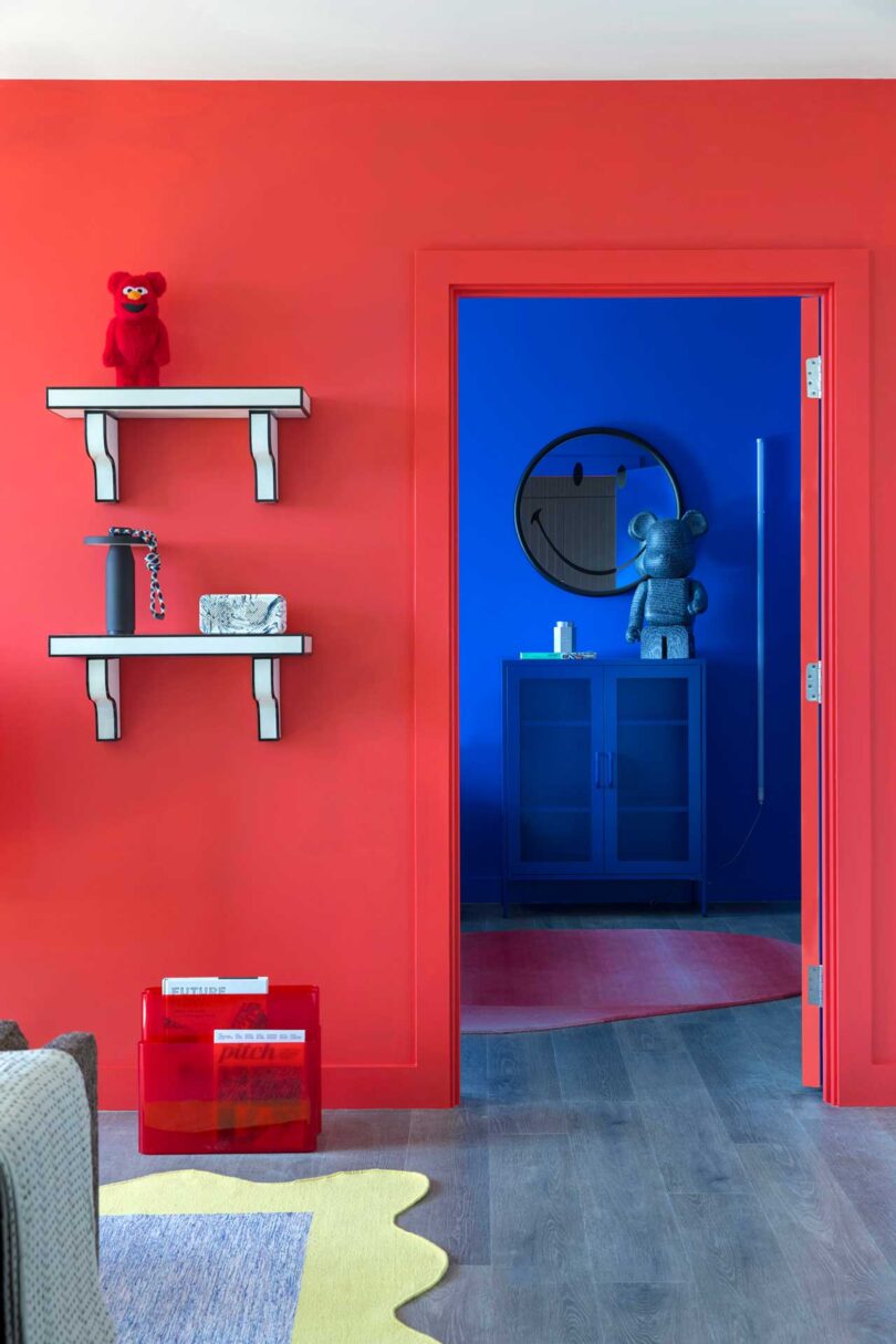
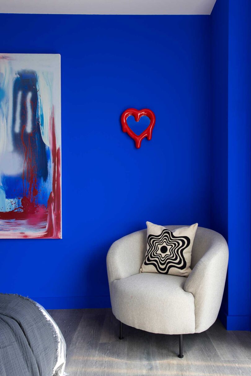
The apartment’s quirky personality shines through in its curated design elements. From the neon lights to the donut-like pouf, the cartoonish shelving to the metallic bedding, every detail has been meticulously selected to spark joy and creativity. Collectible toys and graphic rugs add an artistic statement that’s not just visually appealing but also speaks to the interests of the gamer occupant. It’s a testament to the idea that a living space should reflect one’s individuality and passions.
From every vantage point, primary colors make the cut, from painted walls to seating to accent pieces, to create a cohesive design that’s bold and playful yet livable.
Photography by Megan Taylor.
[ad_2]
Source link

