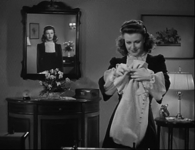
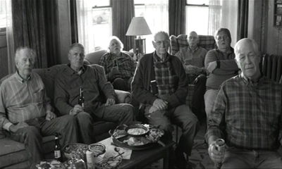
Why I’d like to be Jennifer Connelly in Labyrinth

Goblins, animatronics and David Bowie's trouser bulge aside, Jim Henson's adventure is really a universal coming-of-age tale, and a reminder to persevere when life gets tough

Why I'd like to be John Cusack in Grosse Pointe Blank
Why I'd like to be Dan Aykroyd in The Blues Brothers
Why I'd like to be Scarlett Johansson in Lost in Translation Continue reading...
SOURCE: Film | The Guardian - Read entire story here.

Read More

Notes From Experimenta 2013

Experimenta 2013

By the time I got to know the details, I’d already missed half of this year’s Experimenta, India’s most prominent experimental film festival founded by Shai Heredia in 2003. This year’s edition was impressive not only in its expansiveness, being categorized into competition section, country focus, artist talks, live performances and artist profiles, but also given that it was entirely crowd-funded, which surely calls for some cheers. I congratulate Experimenta and wish them bigger successes in the years to come. Here are some notes on exactly one half of this year’s fest.

INTERNATIONAL COMPETITION

(Curated by Anuja Ghosalkar)

MOUNT SONG (Shambhavi Kaul, India, 2013, Video, 9min)

Burning StarShambhavi Kaul’s elusive, melancholy and richly atmospheric film starts with images of storm inside an artificial jungle. We don’t see the storm, just the idea of a storm, which is befitting for a film that traces the elements that constitute a sensorial experience, as when watching a film. Gliding through what looks like haunted, dilapidated sets for a Chinese martial arts movie, Kaul’s film preoccupies itself with pure form, such as the amorphous outline a wisp of synthetic smoke, visceral, staccato edits between shots and the mysterious interplay of light, dust, colour and camera movement, under the veneer of an abstract genre piece located somewhere between Masaki Kobayashi and Tsui Hark.

BURNING STAR (Joshua Gen Solondz, USA, 2012, Video, 4min)

Burning StarModest in scope yet hypnotic in effect, Solondz’s 4-minute animation in colour is admittedly a dedication to the artist’s father who apparently wanted him to “make a more colorful work”. Colourful, it certainly is. We see a twelve-sided star, alternatively imploding and exploding in dazzling primary colours, with spiky patterns that complement its periphery moving towards and away from the star’s pulsating core, which serves both as the visual and true center of the symmetric image. The soundtrack dominated of what sounds like radio interference, reminiscent of Peter Tscherkassky’s work, attains a musical regularity that makes the film easy to groove to.

PLAY LIFE SERIES (Ella Raidel, Germany, 2012, Video, 11min)

Play Life SeriesRaidel’s four-part study of performativity in the visual media begins with a rigged-up sword fight between two actors suspended on ropes in the woods – a scene that is soon revealed to be a part of a film shoot, prompting us to reflect not only on the artificiality of the fight, but also the film crew itself. This Brechtian gesture of exposing the inescapable element of performativity that marks all filmmaking becomes the organizing principle for the rest of the film, which emphasize the artificiality of earnest forms – melodrama, music videos and even everyday confrontations – by creating an ironical distance between them and the audience through the presence of a film crew – hardly experimental.

PARTY ISLAND (Neil Beloufa, France, 2012, Video, 9min)

Party IslandPerformativity and ritualized interaction are also at the heart of Beloufa’s raunchy video work that is set in an artificial, back-projected beach, where a bunch of actors stiltedly playing vacationers go through the codified rituals of vacationing, socializing and seducing. More interesting than its ham-fisted, part-Surrealist illustration of the sexualization of images and the subliminal representation of sex through phallic imagery are its formal pleasures – its tableau-like arrangement of actors in a claustrophobic setting, the equally suffocating chopped, restrictive images, the double framing of actors through geometric shapes, the intuitive, tactile editing pattern and the intriguing interaction among multiple visual planes.

BLACK POT AND MOVEMENT (Chaoba Thiyam, India, 2013, Video, 13min)

Black Pot And MovementA simple, direct and even schematic equivalence characterizes Thiyam’s modestly but precisely named film – that between the fabrication of the eponymous black pot and the formulation of a new movement by a pair of dancers. However, like its title, Thiyam’s sepia-tinted film is entirely materialist in approaching this comparison, striking an equation between the pliant material using which the pot is made and the equally malleable bodies of the performers. The juxtaposition between the rhythm of repetitive labour and dance movements also attempts to collapse the gap between the artist and worker figures – a chasm that artists have always struggled with.

ASHURA (Köken Ergun, Turkey, 2012, Video, 22min)

AshuraOne of the more assured and less academic entries in the programme, Ergun’s compilation of vignettes from Ashura Day – the annual commemoration of the martyrdom of Hussein, the grandson of Prophet Mohammad, in the Battle of Karbala by minority Shia population in the outskirts of Istanbul – is a sketch of collective mourning, a reflection on the cultural regulation of expression of grief. Through an unforced collocation of theatrical religion and religious theater, the film demonstrates how heightened, artificial, popular forms become the most cathartic form of communal grieving and, in a general sense, how art’s purpose of embodying and representing collective apprehensions still remains central.

BLOOD EARTH (Kush Badhwar, India, 2013, Video, 40min)

Blood EarthSquarely located in the now-too-recognizable genre in Indian documentary of partisan filmmaking against the repercussions of globalization, Badhwar’s film is an account of the reactions of the residents of Kucheipadar village in Odisha to the acquisition of their bauxite-rich land by mining corporates. Shinsuke Ogawa it isn’t, but Blood Earth’s documenting of the often-glossed-over fault lines in a popular movement gives it a transparency frequently absent in its contemporaries. Its best moments, however, are completely apolitical: a protracted, fixed-camera shot of a room full of noisy, convening villagers that results in strange visual patterns over time and a Daïchi Saïto-esque tracking shot of roadside plants that delightfully takes the film for two minutes into a non-representational realm. Winner of the Adolfas Mekas award of the fest.

A+ (Nobu Adilman, Canada, 2012, Video, 6min)

A+Commissioned by the Liaison of Independent Filmmakers of Toronto, Adilman’s charming, humourous and even suspenseful short video, scored to a guitar solo, presents us glimpses from the meticulously maintained, hand-written film-viewing diary of super-cinephile Moen Mohammed spanning the year 2011 (inferred from an entry on Trash Humpers), consisting of movie names, year of release, director name and grades. The result is not only a straightforward documentation of the tastes of one Antonioni-loving, Godard-disliking film buff, but also an indirect snapshot of the boons of new millennial cinephilia which facilitates the viewing of such a vast, variegated repertoire of films within a short period of time.

TRAVELS ABROAD (Karl Mendonca, USA, 2013, Video, 7min)

Karl MendoncaMendonca’s petit film diary was shot in 8mm apparently over six years (go figure!) and charts the filmmaker’s return home from New York to India. We see the filmmaker’s ride back home through the eyes of an outsider, his (grand?) parents and his trekking into the local woods presented in a typical home video aesthetic, sometimes presented in time lapse. Marked by circular motifs, Travels Abroad is a self-proclaimed exploration of themes of migration, identity and belonging, but, in actuality, it never rises about its home movie banality and accomplishes little more than what any everyman equipped with a video camera flying back home would have shot.

PULSE (Anuradha Chandra, India, 2013, 16mm, 15min)

A sketch of Rotterdam in 2008, Chandra’s 16mm project presents out-of-focus, low frame rate, time lapse images of the city and its environs that are abstracted till the limits of perceptibility. Owing to high exposure times, people, vehicles, seasons and the time of day are abstracted out and the residual record of static structures underscores the strongly geometrical nature of urban constructions. These images, frequently dominated by a single saturated colour, carry a tension between movement and stasis. On a level, Chandra’s film is an Impressionistic portrait of a city (with pointillist images) that explores how far a geographical entity can be visually abstracted so as to retain its identity.

DAYS OF FUTURE PAST (Joe Hambleton, Canada, 2012, Video, 8min)

One is reminded of Chris Marker, especially the melancholy Level Five (1997), while watching Hambleton’s refreshingly widescreen structural film that employs a repeating element – the camera looking through the windshield of a car rolling on a highway before slowly zooming out and refocusing onto an object fixed to the car ceiling – while a voiceover recites what sound like diary entries of a gamer wandering internet message boards. We are in the far future, it would seem, and the current day objects – joysticks, electronic toys and other curios – in the car appear like shards from a past. The result is a meditation on memory, a reflection on how geography and everyday objects bear the trace of history.

ANOTHER COLOUR TV (The Youngrrr, Indonesia, 2013, Video, 9min)

The Youngrrr Collective’s simple and amusing critique of the isolation of the middle class from history would perhaps have been more effective as an installation, wherein the contrast between the two sections of the screen we see – a mute assortment of various local TV telecasts serious and frivolous and the reverse-shot of a middle-class household hooked to soap operas, ‘reality’ television and religious sermons and literally imprisoned within the frame of the television – would have been even sharper when placed face-to-face. Nevertheless, by locating tawdry television productions alongside their passive consumption and internalization, the film brings to surface the artificiality of the family’s time together and the ideological-mediation of their private conversations.

NEW HARVEST (Pallavi Paul, India, 2012, Video, 11min)

A discordant combination of talking-heads interview of a politically dissident poet, educational documentary about the desire of scientists to alter nature’s rhythm of day and night and morsels of letters real and imagined between two writers shot in digital video with harsh light sources that form deep chiaroscuros, Paul’s project revolves around things utopian – ideal yet impossible – images unmade, roads not taken. The segments or the fragments of narratives within each are linked by a dream-logic which suggest a impossibility but seem to look forward to a future where these dreams might be realized. The outcome is a set of vague stabs at anarchist political hopes.

ARS MEMORATIVA (Scott Miller Berry, Canada, 2013, Video, 20min)

Ars MemorativaArs Memorativa – Art of Memory – refers to the methods and techniques we use to remember things, but in Berry’s four-part examination of audiovisual media as incubators of personal memory, it also points to cinema as the preeminent art of memory, of remembrance. Amalgamating analog and digital video, celluloid and audio recordings, whose scratches, smudges and crackling noises, in their own way, act as traces from the past, the film partly ruminates on the purpose of cinema as an authentic document, as evidence of a person’s existence. Berry’s film is a modest reflection on how home movies, music records and photographs, after a person’s passing, develop the quality of preserving the history of the person’s life.

SPECIAL FOCUS: JAPAN

(Curated by Chris Gehman)

GESTALT (Takashi Ishida, Japan, 1999, 16mm, 6min)

With a beguiling organ-driven soundtrack, Gestalt impresses us with the transparency its of intention, as the title makes clear, and the single-mindedness of its approach. Ishida’s delectable study in 16mm of the malleability of our perspective of space, apparently achieved by continuously repainting the walls of a room, founds itself on the interaction of various geometric and non-geometric motifs that make the space appear alternatingly two and three-dimensional. The effect is to continually keep altering our impression of the room space, and in critical theoretical terms, to undermine the artwork’s interpellation of the viewer as a subject and to destabilize the Albertian perspective on which his/her relationship with the image is based.

A FEATHER STARE AT THE DARK (Naoyuki Tsuji, Japan, 2003, 16mm, 17min)

In the dream-like way normally unrelated objects segue into each other, Tsuji’s hand-drawn illustration of a made-up Creation myth reminds one of the Surrealist game of Exquisite Corpse, and perhaps even the works of Dali. Tsuji’s method involves drawing with charcoal on paper, photographing the result, erasing the plate and redrawing the next frame. The result is that the each frame carries a trace of the previous and, consequently, the film chronicles its own history, its own making. Tsuji’s drawings are unrealistic, disproportional, undignified and composed of fluid forms that throw his method into sharp relief. The outcome is closer to sand animation than traditional drawing

YELLOW SNAKE (Nobuhiro Aihara, Japan, 2006, Video, 10min)

Pitched between non-representational and traditional 2D animation, Aihara’s purposefully unwieldy video work, made 5 years before his demise in 2011, consists of two distinct visual planes – a periodic flux of semi-representational figures (bottles, fingers, planets, doughnuts) progressively growing in size to give an appearance of coming out of the screen (and hence the appearance of three-dimensionality) and a realistically drawn two-dimensional yellow hand with a pointed index finger that keeps poking into this swarm of monochrome objects – laid over a discordant soundscape. Mischievous and gleefully indulgent, Yellow Snake, if not anything else, is a reflection of the artist’s own playful relationship with his drawings.

MY TOWN (Tomomichi Nakamura, Japan, 2007, Video, 17min)

A mélange of even wider variety of animation techniques marks the quasi-Cronenbergian My Town, which draws from low-resolution photography, stop-motion animation, commercial anime drawing and video game graphics on which rudimentary pencil sketches without much foreshortening are overlaid, which, in essence, inscribes two-dimensional objects in three-dimensional space. Nakamura’s part-science-fictional part-fantastical narrative seemingly about a virus outbreak, an ensuing nuclear war and the eventual wiping out of humanity is distinguished by its soundtrack – a combination of drum beats, electronic music and low-frequency noise – and its cinematic approach to space – its simulation of film camera and its depiction of flat objects in three-dimensions.

SPACY (Takashi Ito, Japan, 1981, 16mm, 10min)

Intermittently stitched together from hundreds of photographs taken inside a gymnasium exhibiting these very photographs, Spacy is a structural study of cinematic space that creates a mise en abyme of photographed spaces into and out of which we move until we are no longer sure of which ‘level’ we are in. Despite the rapid stream of images shot at us, our focus remains firmly fixed at the geometric center of the image around which the configuration of represented space changes continuously. This trait, along with the absence of any vertical camera movement and the many levels of space negotiated, places the film alongside contemporary First Person Shooter games like Doom.

ZONE (Takashi Ito, Japan, 1995, 16mm, 13min)

Ito’s intense and claustrophobic piece, positioned between postmodern music videos and generic horror, shows the reanimation to life of a headless man wrapped in gauze and tied to a chair in a room populated by mirrors, a bandaged toy truck, a masked figure with light sources on him and framed photographs of eerily empty locations. Rife with movement – pleasing lateral tracking shots, time-lapse photography, reverse video and stop-motion animation – Zone plays on Kracauer’s idea of cinema as resurrection of dead objects from the ghastly stillness of photography. Ito’s psychologically motivated film is closer to classical Expressionism than his earlier structural work.

JAPANESE KITCHEN: THREE STORIES (Tabaimo, Japan, 2000, Video, 9min)

Japanese KitchenA more traditional style, closer to commercial Japanese animation, marks the three-episode Japanese Kitchen, which presents sketches of a housewife trying to imitate recipes shown on daytime television. The manner in which the banality of the situation is superimposed over chilling body horror – beating small men and women in a mixer to produce babies, deep frying the male brain and seeds that have people crawling out when soaked in water – betrays a trace of populist horror cinema, television and literature. Tabaimo’s tongue-in-cheek triptych – commissioned for television whose audience is the very subjects of her film – proposes tantalizingly easy and morbidly humorous solutions to the demographic problems of Japan.

INCH-HIGH SAMURAI (Tanaami Keiichi and Nobuhiro Aihara, Japan, 2007, 16mm, 8min)

Inch-High SamuraiOne of Aihara’s last films, Inch-High Samurai is admittedly a tribute to and a re-imagination of a popular manga series the directors used to read as kids that presented the adventures of a Samurai measuring an inch in height. The difference is that this film taps directly into the libidinal foundation of the manga and crystallizes the sexual and violent forces brimming beneath. Hyper-kinetic, raunchy and decidedly over-the-top, the film opens with drawings of various body parts floating on the sea from where the little phallic Samurai begins his extremely telescoped set of frenzied adventures that is, quite literally, the stuff of wet dreams.

CHILDREN OF SHADOWS (Naoyuki Tsuji, Japan, 2006, 16mm, 18min)

A ghastly spin on Western fairy tales, especially Hansel and Gretel, Children of Shadows is a tale of survival and growing up that is constructed with fluid, curvy and continuous forms that facilitate and highlight Tsuji’s charcoal on paper approach. The artist uses his POV like a moving camera and negotiates a three-dimensional space even when he abstains from providing a stable reference as in traditional drawings which makes it tougher to judge location or proportion. The movement of characters is slowed down, as though traversing an oneiric space, there is an affinity for closed forms and the humour is black and the drawings joyfully vulgar.

GOD BLESS AMERICA (Tadasu Takamine, Japan, 2002, Video, 12min)

Takamine’s God Bless America gives us the artist and his female assistant sojourning inside a red-walled studio while working on a massive lump of clay present in the center of the screen and the room. We see them pass 18 days working, eating, socializing and having sex in time lapse while the clay head is moulded in such a way that it appears to sing the titular hymn in real time. If this construction of twin time frames within a single film derives from music videos, the integration of the work of art into lived-in space derives from architecture, where it becomes an object to be experienced intuitively by habitude instead of through active contemplation.

ARTIST PROFILE: JACK CHAMBERS

(Curated by Lauren Howes)

HART OF LONDON (Jack Chambers, Canada, 1970, 16mm, 79min)

Stan Brakhage called this final film of Canadian visual artist Jack Chambers, who died of leukemia in 1977, one of the greatest films ever made. Chambers’ predominantly found-footage film exhibits touches of Brakhage’s own work, especially Dog Star Man (1961-64), in its use of roving secondary exposure, image overlaps, negatives, faster frame rates and high-velocity montage and its partly phenomenological approach to images. Opening with footage of a deer hunt – an event that would haunt the entire film – the first section of Hart of London is scored to the sporadic sound of the elements of nature and engages with visuals of architecture and everyday life in London, Ontario, superimposed with a negative that results in stereoscopic images at certain points, and, at times, abstracted away from photorealism to the point where we only observe black dabs on a white screen. Towards the midpoint, the film moves away from superimposition towards montage as the primary technique for meaning creation. It is from hereon that the film crystallizes its exploration of the cycle of life. Images from a slaughterhouse are intercut with those of a baby, dead sheep fetuses are juxtaposed with a human newborn. The architectural marvels of the first segment are responded to in the second by destruction and demolition of buildings, which become as much a spectacle as the former. On one level, the film is certainly an indictment of human egotism, which places humanity at the center of the universe and deems it as being the prime mover of all things. But it is also a meditation of humanity’s ceaseless capacity to learn, endure and survive and the film abounds with symbols of birth, rebirth and resurrection. This view of humanity from a detached, godlike-perspective takes the film closer to the oeuvre of Artavazd Peleshian, whose ultimately hopeful view of life, Hart of London echoes, however less emphatically.

ARTIST PROFILE: PANCHAL MANSARAM

(Curated by Shai Heredia)

INTERSECT (Panchal Mansaram, India, 1967, 16mm, 6min)

Panchal Mansaram was already established as a collage artist when he came to cinema and this transition is evident in the approach to his material in Intersect, which mashes footage shot during his interactions with Satyajit Ray, Ravi Shankar and Marshall McLuhan with excerpts from TV and radio commercials. “East and West are becoming like each other” goes one stray audio bite. Evocative of the many fine experiments at Films Division – yet not as pointed or as rigorously thought out – Intersect was completed after Mansaram’s emigration to Canada and reflects the director’s own transnational status – an autobiographical element which he explored further in his mixed-media installations.

DEVI, STUFFED GOAT AND PINK CLOTH (Panchal Mansaram, Canada/India, 1967, 16mm, 16min)

An assortment of impressionistic vignettes from the city of Bombay – a place that Mansaram calls “collage in motion” – strung together by the pervading presence of the beautiful lady of the title, her stuffed goat and a piece of pink cloth, this 16mm quasi-Nouveau Realist project tries to comprehend a city partly through its extraordinary human specimen, decrepit objects and familiar images. Some passages of the film, scored to a mix of flute, trumpet and percussions, seem straight of a René Magritte tableau in the way they piece together completely dissociated commonplace objects, even though this disruption of everyday logic seems less like an ideological intervention than a gleeful vagrancy of a mischievous imagination.

REAR VIEW MIRROR (Panchal Mansaram, Canada/India, 1966-2011, 16mm, 13min)

45 years in the making, Rear View Mirror spans the entire career of Mansaram as a filmmaker and opens with the voice of the artist reciting a piece of autobiographical information. Seen through the eyes of two young tourists entering a city on a horse cart, the film unfolds as a kind of ‘re-entry’ into and ‘looking-back’ at his life in India, especially his early years in his hometown of Mount Abu in Rajasthan, suffuse with reds, yellows and browns. The images of the convivial atmosphere at the local fete is complemented by sundry images – spiritual and profane – from the city linked together by the director’s characteristic sense of humour.

ARTIST PROFILE: AKBAR PADAMSEE

(Curated by Lalitha Gopalan)

SYZYGY (Akbar Padamsee, India, 1970, Video, 6min)

Bombay-based abstract artist Akbar Padamsee made his transition to cinema with the help of ace cinematographer K. K. Mahajan and was apparently held in high regard by Mani Kaul. A product of the short-lived Visions Exchange Workshop (VIEW) founded by Padamsee as a platform for enabling interaction between painters and filmmakers, the soundless animation Syzygy begins with basic geometric figures moving on the screen in regular patterns. With mathematical regularity, these figures morph into word grids and number lines representing distances, which in turn, gradually, give way to more complex intersection of line segments – mazes, meshes and networks. The resulting images bear similarity to the works of Mondrian and Kandinsky and serve to illuminate emotional correlatives to purely aesthetic forms such as the sense of spaciousness and liberation offered by a diagonal line slashing across a matrix of verticals and horizontals. Despite its ostensibly stream-of-consciousness approach, all the images have a regularity, harmony, and balance which throw light on Padamsee’s structured and perhaps even classicist thinking process.


SOURCE: The Seventh Art - Read entire story here.
Read More

Comic-Con: The end of an era, and other highlights

Kristin here:

Long-time readers of this blog may recall that in 2008 I went to Comic-Con for the first time. I can’t recall exactly what led me to take the plunge. It may have been that by that time it was evident that the con had grown into a major opportunity for Hollywood studios to publicize their upcoming blockbusters to their core audience and I wanted to witness the process in person.  Until this year, I hadn’t returned to Comic-Con. I was motivated in part by the fact that this was the last big promotional event for a film in the Lord of the Rings/Hobbit franchise. I had briefly discussed Comic-Con in relation to LOTR in The Frodo Franchise, but I had not witnessed any of the appearances of cast and crew promoting the first trilogy. This was my final chance, the end of an era.

I blogged about my first visit four times. I wrote about the LOTR/Hobbit presence on the Frodo Franchise blog. On this blog I gave an overview of the Comic-Con experience, analyzed why Hollywood poured so many resources into an event nominally about comic books, and posted a conversation between Henry Jenkins and me. Henry, who had helped found the area of fan studies back in the 1990s with such widely cited publications as Textual Poachers, was also a Comic-Con newbie that year, and we shared our reactions. (This year Henry was on a panel, “Creativity Is Magic: Fandom, Transmedia, and Transformative Works,” one of a number of panels on fan culture. I missed it because I was in line for Hall H. More on that below.)

A friend of mine who has a press pass assured me that they were not as hard to obtain as I had feared, so, based on my collaboration on this blog and my position on the staff of TheOneRing.net, I applied. To my delight, I was granted one, so I set out to cover Comic-Con more officially.

Going to Comic-Con alone isn’t nearly as fun, and I was lucky enough this year to meet up there with my friends, Professors Jonathan Kuntz and Maria Elena le las Carreras and their irrepressible daughter Rebecca, who are always terrific company.

Preview night

On the Wednesday evening before Comic-Con begins, there is a preview. This means that people with various special passes can get into the big exhibition hall where most of the booths are set up. These range from dealers in rare comic books to the biggest entertainment companies, like Warner Bros. and Lego. Many of them offer unique items only for sale or give-away at Comic-Con.

Many attendees have realized this, and they buy tickets that include the preview evening. The floor was much more crowded than when I attended the preview night in 2008. There were lots of lines with people trying to get those unique collectibles.

Others were there to look at comics. Yes, there are still plenty of comics at Comic-Con. There are dealers offering rarities, as in the image above. There are comics publishers with their latest offerings.

A particular favorite of ours is Fantagraphics, which specializes in reprinting comics. They’ve launched a set of hard-cover volumes of Walt Kelly’s syndicated Pogo strips. They also, I discovered, are doing a series of Don Rosa comics, also in hardback. In fact, when I was strolling around the booth, I realized that Rosa himself was signing autographs until 8 pm. It was then 7:59, so I grabbed volume 1 and was the last person to get my copy signed. By the way, it includes “Cash Flow,” one of the Uncle Scrooge stories I mentioned in our first blog entry on Inception. Volume 1 hasn’t actually been published, but it’s available for pre-order on Amazon.

The big moment of my evening, entirely by chance.

My first press conference

Once you’re granted a press pass, your name is put on a list made available to the exhibitors and publicists planning events. Companies big and small send you announcements about signings, press conferences, swag available at booths, parties in downtown venues, and so on. Many of these events promote video games, graphic novels, and television, but one sounded intriguing to my film interests: a press conference for Penguins of Madagascar, an entry in Dreamworks’ animated Madagascar franchise. The odd thing was that the event was scheduled in the morning at 11:15, fifteen minutes before the DreamWorks panel in Hall H. If we came to the conference, we couldn’t get into Hall H–unless the PR people reserved seats there for us. The big attraction was that some of the voice talent, including Benedict Cumberbatch and John Malkovich, as well as the two directors would be there.

I showed up and got a front-row seat off to the side. The room filled up (right).

The event itself started somewhat late, and two gentlemen who were not Benedict Cumberbatch or John Malkovich appeared and answered some questions. (I would give their names, but the usual signs put on the table in front of guests were not in evidence.) We were approaching 11:25. John Malkovich and another gentleman appeared. Another couple of questions were asked, and someone announced that Benedict Cumberbatch’s plane had gotten in late the night before and besides we had to leave to make room for the next event scheduled in the room. We were not escorted to reserved seats in Hall H, where I hear that Benedict Cumberbatch did appear.

I can only trust that this is not how most press conferences turn out. Perhaps I will be invited to another one and find out.

Bill Plympton in person


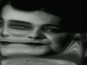
Given that I had no option to go to the Hall H DreamWorks Animation presentation, I sought out an alternative among the several items offered during the noon slot. I had had my eye on a panel which had as its guests the well-known animator Bill Plympton, as well as Jim Lujan, the co-director of the feature-length Revengeance, in progress. David and have long been fond of Plympton’s work, especially his laugh-out-loud classic, Your Face (1987), which was nominated for an Oscar. It’s just a series of distortions of a man’s face as he sings an utterly wimpy love ditty (above).

Plympton continues to be remarkably prolific. He has worked on fourteen episodes of The Simpsons, including doing twelve couch gags. Now he has a feature, Cheatin’, which will be shown for a week starting on August 15 at the downtown independent in Los Angeles. (Earlier this year it played at Slamdance, but I can find no theatrical release date.) You can see a short appeal animated by Plympton for the film’s Kickstarter appeal; its quite informative about the animation techniques used. The campaign itself is over, having raised $100,916, exceeding the goal of $75,000.

Apart from clips from Revengeance, Plympton also showed a brand new short, Footprints, a charming tale of a man’s search for a mysterious house invader. It will be shown on August 14 as part of the Hollyshorts Film Festival, which will honor Plympton with the Indie Animation Icon Award. The film was entirely hand-drawn in black and white and then colored digitally.

During the panel there was a contest for a T-shirt. The question was: What is Bill Plympton’s middle name? Despite a plethora of cell phones, laptops, and tablets in the audience, no one could come up with the right answer. A second question was put forth: what was Plympton’s first theatrically released film? “The Tune,” came a cry from the audience. It was Sam Viviano, art director of Mad Magazine; he walked off with the shirt. Plympton then sheepishly confessed that his middle name is Merton.

Plympton’s films have been hard to find online, but this fall they will become available on Source HD: “It’s the entire catalog, everything I’ve ever done.” That includes about 60 shorts. As a result of this online exposure, he says, “I expect that when I come back to San Diego next year they’re going to have to give me one of those huge 2000-seat rooms.” I hope so, and I hope it will be filled–but not so jammed that I could not get a seat.

Plympton offered all attending his panel a free autographed drawing. I went to collect mine at his booth in the exhibition hall and found him drawing (right), as he must constantly be doing. Note the Cheatin’ poster behind him at the left and the usual bustle of Comic-Con in the background. He paused to dash me off a delightful image of his famous Dog character. (An animator who doesn’t use cels has to be really fast at drawing.)

Plympton DVDs are not all that easy to find, though you can get them and other merchandise at his website’s shop. If you don’t know his work, it’s time to start catching up.

A new experience: The Indigo Ballroom

Seeking to accommodate more fans without violating fire regulations, Comic-Con has expanded into nearby buildings. One of the facilities utilized this year was the Hilton San Diego Bayfront, just across from the Convention Center on the Hall H end. That’s where the DreamWorks press conference sort of took place. Its biggest room was the Indigo Ballroom. I’m not sure it had 2000 seats, but I wouldn’t be surprised.

My colleagues at TheOneRing.net have been presenting panels on the Hobbit series for several years now. In fact, my visit to Comic-Con in 2008 was as a participant on one of those panels, speculating much before the fact on the shape that the Hobbit project would take. At that point the cast hadn’t even been chosen. I suggested that Wisconsin’s own Mark Ruffalo would make an excellent Thorin. I still think he would have, but Richard Armitage has gained a large fan following in that role. I’m not sure that at that early stage Martin Freeman was everyone’s favorite candidate for Bilbo, but he soon became so–including mine. The man is a born hobbit.

That 2008 panel took place in a relatively small room in the Convention Center. In more recent years, the TORn panel has been joined by such luminaries from the filmmaking team as Richard Taylor. It has gained such a following that this year it was booked into the Indigo Ballroom.

Then we learned that George R. R. Martin was booked into the same room in the time-slot directly before TORn. (I’m sure you all know who he is, but for the few who don’t, I’ll just say, he’s the author of the “A Song of Fire and Ice” series, of which Game of Thrones is the first book.) We were all convinced that Martin’s session would be jammed and furthermore that an overlap in fandoms would mean that the audience there for Martin would stay for the TORn panel, excluding those who showed up just before the TORn session. There was much discussion as to how TORn staff not on the panel (like me) could get in and be sure of a seat. How many seats could be reserved? We didn’t know.

I determined to support my colleagues and attend the TORn panel. The question was, how many sessions would I have to sit through to make sure I could get a seat? (Rooms are never cleared between sessions at Comic-Con, since doing so would take too much time and would mean that people in one room for a session would not be able to get in line for the next session in that room. Hence the strategy of sitting through multiple panels in the same room to guarantee a seat at the one you really want to see.)

I arrived early in the afternoon in the middle of a session about some show on Comedy Central. This finally ended and the George R. R. Martin panel began. To my surprise, it was only about two-thirds full. I learned later that Martin often attends Comic-Con. Moreover, this time he wasn’t talking specifically about Game of Thrones. The session was billed as “George R. R. Martin Discusses In the House of the Worm.” The title in question is a new comic-book series that Martin is involved with. (Above, William Christensen, publisher at Avatar Press, interviews Martin.)

I had expected to sit through Martin’s session merely waiting for the TORn one to begin. I had read Game of Thrones, widely assumed to be heavily influenced by The Lord of the Rings. Game of Thrones was entertaining, but by the end I found it repetitious. I figured that the series could only become more so, so I quit there. I haven’t seen the TV episodes. Yet Martin turned out to be quite entertaining. He is a long-time fan, and his reminiscences about fandoms during the 1960s and onward were fascinating. He’s a lively, knowledgeable,  and entertaining speaker with a wide experience in both reading and creating fantasy works in those days. His presentation made me wish that I liked that first book better.

The next session was “An Unofficial Look at the Final Middle-earth Film: The Hobbit: The Battle of Five Armies.” (Actually in the program the title said “Final Middle-Earth Film,” but I’m sure my colleagues did not make that capitalization error when they proposed the panel.)

The panel consisted of, from the left, Chris “Calisuri” Pirotta, a TORn co-founder; John Tedeschi, long-time staffer; Cliff “Quickbeam” Broadway, frequent contributor to the site; Kellie Rice, staffer and half of the “Happy Hobbits” fan duo; and Larry D. Curtis, another long-time staffer and frequent contributor. Chris and Cliff were among several TORn interviewees when I was researching The Frodo Franchise.

TORn has made annual appearances at Comic-Con, usually speculating in expert fashion on what might be included–or not–in the next film. Staffers comb the previous films, trailers, Peter Jackson’s production diaries, publicity photos, and cast and staff interviews, seeking for clues. While presenting their findings, they point out things in the earlier parts that people might not have noticed or may have forgotten.

The first line in the Powerpoint image above refers to widespread fan annoyance that Bilbo seems to have been pushed to the periphery of his own story in The Desolation of Smaug. This is a topic of frequent comment on the website. The TORn panel was held on Thursday, two days before any of us had a chance to see the first teaser-trailer’s premiere on Saturday in Hall H. (More on that below.) Although there are shots of Bilbo in that trailer, they mainly show him staring offscreen and reacting. I was left hoping that this is not an indication of more sidelining of our protagonist. In Tolkien’s book Bilbo decides to sit out the Battle of Five Armies and gets knocked unconscious early in the fighting; given that he’s our point-of-view figure, the battle is mainly told through other characters describing it afterward. No one expects Peter Jackson to stay true to that action and sacrifice the chance for another epic battle scene, so maybe Bilbo will get to do his share of fighting.

This year’s celebrity guest made an appearance at the end and took a few questions: Jim Rygiel, multi-Oscar-winning visual effects supervisor for The Lord of the Rings (and more recently Godzilla and The Amazing Spider-Man):

Whether the panel members were right in their speculations will not be known until December 17 (in the USA). Right or not, it was an entertaining and informative session.

What were they really there to see?

There are  many rooms devoted to Comic-Con events, not to mention the various open-air booths and attractions set up in open spaces near the convention center. Room 25ABC is fairly large, but it’s considerably smaller than the Indigo Ballroom, 23ABC, and of course, Hall H. I was not alone in being puzzled as to why the panel “Fight Club: From Page to Screen and Beyond,” was scheduled in 25ABC at 7 pm on Saturday evening. Sure, the topic was an older film, and the panel was largely devoted to a forthcoming graphic-novel sequel to the story. Still, the participants included David Fincher, making his first Comic-Con appearance. I can only suspect that Fincher was a late addition to the panel’s line-up and it was too late to change the venue.

The result was that anyone determined to hear what Fincher had to say was bound to line up for the panels just before the Fight Club one and sit through them in order to see it. I decided to line up for “Disney’s Gargoyles 20th Anniversary” at 5 pm, having no idea what the Gargoyles are, and “Publishing 360: Building a Bestseller” at 6 pm, having no intention of trying to build a bestseller.

I got into a line that looked fairly short and was defined by lines of tape laid down on the carpets in the broad corridor outside 25ABC. It turned out to be one of those Disneyland-style ribbon-candy set-ups, where the line folds back on itself time after time, and you end up walking in one direction, turning around to walk in the opposite direction, only to realize that there is another group of people doing the same thing ahead of you in the same line. Fortunately most people seem to stick to the rules pretty closely, perhaps being aware of the wrath they would call down upon themselves by attempting to cut ahead of others.

I ended up about ten people back in line when the room was full. I never did learn what the Gargoyles were, but I suspected some people behind me had been hoping to get into that panel and were not there for the Fincher event. Indeed, as it became clear that no seats were going open up, a small number of people departed, leaving me about six people back from the front. It was looking good for me to get into “Publishing 360.”

At this point, from behind me I heard “Pardon me, but are you Kristin Thompson?” or words to that effect. Thus I met Ryan Gallagher, one of the stalwarts of The Criterion Cast, which describes itself as “A podcast network and website for fans of quality theatrical and home video releases.” (It is not officially associated with The Criterion Collection.) I recognized his name because he has sent many a reader to Observations on Film Art. Ryan’s latest podcast is a preview of Comic-Con, and I expect he will add one looking back on his experiences there.

What are the odds, I thought, and still think, that with 125,000+ visitors to Comic-Con, I would end up in line next to someone who recognized me? Turns out Ryan had been in line for the Gargoyles panel, so after a brief conversation, he departed. Eventually I was among the first into the room for the Publishing 360″ panel, though there were people already there who didn’t leave, and I suspect the audience for Gargoyles doesn’t overlap all that much with the audience of people longing to write a bestseller. The procedure for building a bestseller, by the way, seems to consist primarily of getting the best agents and editors in the world. Aspiring writers, take note. Before the session began, I located an unoccupied electrical outlet and recharged my recorder. (This is a serious business at Comic-Con. The convention center is full of cell phones, tablets, and cameras dangling from outlets.)

The panel as pictured above consists of, from the left: moderator Rick Kleffel, Doubleday executive editor Gerald Howard, Fight Club author Chuck Palahniuk, David Fincher, and three artists and/or editors from Dark Horse Comics, which will bring out the Palahniuk-penned ten-part sequel starting in May, 2015.

A lot of the panel was about the graphic-novel sequel, of course. The main bit of new information about the film was that although it didn’t do particularly well at the box-office, Fincher finally got 20th-Century Fox to give him figures on how many DVDs were sold. Sales totaled around 13 million, so Fincher reckons the film must have made a profit in the long run. Probably the quotation from Fincher that will be remembered is: “My daughter had a friend called Max. She told me Fight Club is his favorite movie. I told her never to talk to Max again.” Fincher may not have been to Comic-Con before, but he knows how to please the fans.

Check out the Film website for an audio recording of the panel.

Hall H: Getting in

Hall H tends to draw much of the attention accorded to Comic-Con in the media. It’s the largest venue, with 6500 seats–including a large number reserved for representatives of the studios presenting publicity events there. That’s a big venue, but compared to the roughly 125,000 people attending the con each day, it’s not big enough. Although not everyone at Comic-Con wants to get into Hall H, most days the lines snake down and across the street, along the sidewalks. (A video moving along an entire Hall H line at a walking pace was posted on Youtube last year. It runs for over fourteen minutes, despite the fact that the people toward the front of the line are walking forward past the camera; if they were standing or sitting still, it would have run even longer.) In previous years the only way to guarantee getting into the hall for the first events of a day was to get there the previous evening and stay in line overnight. Short departures were possible if someone held your place, but basically you were there for the duration.

I was lucky enough to benefit from the innovation of a new policy on Hall H admissions. Color-coded wristbands would be handed out as the line formed, pausing at 1 am and resuming at 5am. The first portion of the line got a red band, with other colors for the next portions. The purposes were 1) the management could gauge how many people were lined up; 2) those in line could know whether they would get in or not; and 3) for the first time some people could leave for longer stretches of time than required for a rest-room break, as long as someone from their group with the same color wristband remained.

At least, that was how it was described in the online announcement. Those charged with distributing the bands and keeping order informed us that “a majority” of the group had to remain. To what degree that was enforced, we never learned. Fortunately that worked for Jonathan, Maria Elena, and I, since Rebecca had formed a “Hall H-line” group on Facebook and assembled a bunch of friends to camp out in line together. We adults, with our less flexible bones, departed for dinner and some sleep at our hotel. The next morning when we came to rejoin our group, the people in charge of keeping order asked if we had been to the rest room. Yes, we had. That and other things. Apart from everything else, the parking garage under the convention center has to be cleared after 10 pm, so the Kuntzes had to leave to get their car out. Clearly some clarifications of the guidelines are in order, but based on our experience the new wristband policy has improved the Hall H-line experience considerably.

The announced wristband-distribution schedule also had to be adapted. In the past, the Hall H line has started forming in the late afternoon or early evening, depending on the popularity of the first event scheduled for the following morning. Jonathan presciently went and got in line at 2:30 pm, and he was far from the first. Our party gradually grew as other members arrived, and inevitably groups ahead of us also swelled. Soon the line was very, very long. (A small portion of it is pictured above; the line had taken a U-turn a few hundred feet behind us, off right here.) Somewhere around 6:00 the wristbands started to be handed out, and small groups were escorted across the street to line up in the relatively luxurious area on the grass near the entrance to Hall H. There were white canopies overhead and the inevitable red plastic barriers dividing the area into rows approximately one reclining person wide. Those further back in line were less fortunate, having the sidewalk to call their bed. Our group of young stalwarts settled in for games, sleep, and an endless supply of trail mix and donuts. Rumor has it that anyone who arrived after about 9:30 pm didn’t get in. The last wristbands were handed out at around 2:30am. Presumably the handout did not pause at 1 am as planned, since clearly everyone who was going to get in when the hall opened was already there.

The next morning we received a call from Rebecca saying the group had been moved into the “chutes,” a process which had started at 7 am. These are slightly narrower strips of grass with the same plastic barriers; the chutes are opened one at a time, allowing the people in each to go in before the next chute is opened. More people are moved into the emptied chutes, and the process continues until the hall is full.

Although the handlers had said we would be let in at 9:30 for a 10:00 start, they got the process going at 9 am. By 10 we were all seated and ready for the Warner Bros. extravaganza to begin. There I am, wearing my vintage licensed Fellowship of the Ring T-shirt and the crucial pink wristband:

Expensive flash

Warner Bros. had two hours in Hall H on Saturday morning to promote their films. The full program is not announced in advance. People were assuming that The Hobbit: The Battle of Five Armies, as the biggest item on tap, would be saved for the end. That turned out to be correct.

The event started with curtains sliding back to reveal a long, panoramic screen on either side of the big central one. This surrounded about the front half of the audience in a U-shaped set of images. Warners installed these screens at a cost of hundreds of thousands of dollars; naturally no other studios were allowed to use them.

Some short presentations opened the program, beginning with Zack Snyder coming onstage. He introduced Ben Afleck, Henry Cavill, and Gal Gadot, none of whom spoke. We saw a very brief clip from Batman vs. Superman. The two lead characters’ first meeting had them glaring at each other with glowing eyes, white and red respectively. (Naïve me, wondering why if they’re both good guys, they don’t just join forces to fight evil.) My main impression was that Batman looks like he’s wearing a small tank turret on his head. The fans were apparently pleased with what they saw.

The moderator then introduced Channing Tatum, who stood below the screen as a montage of footage from Jupiter Ascending was shown. This made no impression on me, and I have no memory of it, except that the big action scene looked pretty conventional.

The event really got going with a much longer promotion with George Miller talking about Mad Max: Fury Road. This used the side panels to good effects (above). David and I have been fans of Miller and the Mad Max series ever since Mad Max II (aka The Road Warrior in the USA) appeared. It was a treat to hear him talk about the new film, though what he said is pretty much what he has said in other interviews: there’s little CGI in the film, he storyboarded the whole thing rather than writing a script, it’s an attempt to do a continuous chase sequence for an entire film, etc.

Miller presented a montage of quick scenes from the film. It looked good but familiar. There’s Max, chained up on the front of one of the villains’ vehicles, as were some of the captives in The Road Warrior. A lot of the minor characters recall those of the same film. The digital image looked brighter and sharper than the previous films–not necessarily a good thing, since the three first films were muted, conveying a sense that everything and everyone was coated with dust. Unseasonal rains in Australia forced the new film’s shoot to move to Namibia, which looks like it stands in for the Outback pretty well. We must trust that, just as the first three films were significantly different from each other, this fourth film will have a unique flavor not apparent in the footage shown.

This was, by the way, the second preview I’ve seen recently of a film that imitates the awesome (in the old and literal meaning of that word) dust-storm in this well-known National Geographic clip online. And why not, though CGI can never equal the real thing in this case.

Hall H for Hobbit

Quasi-Spoilers ahead:

The second half of Warners’ slot was given over to The Battle of Five Armies. An opening blast of music accompanied the appearance from left to right of a panorama of images from all three Hobbit films:

Even this fairly comprehensive view of the screens leaves out two or three images on the far right. The most revelatory of these shows Galadriel, Elrond, and Saruman at Dol Guldur, rescuing Gandalf. The panorama stayed up throughout the presentation. (A rather juddery pan around the whole things can be seen on Youtube.)

Steven Colbert, widely known as a devoted and highly knowledgeable Tolkien fan, MCed the panel, dressed in his costume from the third film, in which he has a nonspeaking bit part. He expressed his love for Tolkien and the films and showed the brief scene in which he appears. Then he introduced the impressive ten-person panel Warner Bros. had managed to assemble:

From the left, Colbert, Peter Jackson, Philippa Boyens, Benedict Cumberbatch, Cate Blanchett, Orlando Bloom, Evangeline Lilly, Luke Evans, Lee Pace, Graham McTavish, Elijah Wood, and Andy Serkis

Of course, most of us couldn’t see them this clearly with the naked eye. Seated about a third of the way back in the auditorium, my view was as shown in the image at the top of this entry. Peter (that’s he in the lower left corner) looked mighty small in reality, but in Hall H three large screens magnify the proceedings for the crowd. (Similar video screens are used in the other very large auditoriums, notably the Indigo Ballroom.)

One highlight was the first screening of the long-awaited teaser trailer. This was released online two days later; the best place to see a large, sharp image that starts streaming almost instantly is on Peter’s Facebook page. I have to say that it looks pretty promising, apart from the continued presence of the distracting and tedious Azog and Bolg.

I won’t give a complete run-down on this panel, since a good video of it has been posted on Youtube (with the two screenings of the teaser trailer cut out).  Much of it consists of typical star chit-chat. The most interesting thing said came from Peter. There has been considerable speculation among fans as to whether the filmmakers will stick to the book and let some characters die during the battle. Peter stated that the grim parts of the book are being retained and implied that several characters will indeed die. (This should mean that here will be much lamentation among the “hot Dwarves” aficionados.)

There has also been much speculation as to whether Peter Jackson or anyone else will be filming other adaptations of Tolkien’s work. This question wasn’t addressed during the panel, but the obvious answer is no. The production and distribution rights to The Hobbit and The Lord of the Rings were sold by Tolkien and his publisher Allen and Unwin to United Artists in 1969. Rather than placing a time limit on the rights, as is customary, they sold them in perpetuity, and any control over the use of those rights forever passed out of the hands of Tolkien and subsequently of his estate. His son Christopher Tolkien has objected to the films that have been made, and he quite possibly will find a way to prevent any sale of film rights relating to the other books, even after his death. The Silmarillion, which takes place primarily in the First and Second Ages of Middle-earth, is, I think, virtually unfilmable. The most filmable single work, The Children of Hurin, is unremittingly grim and would be unlikely to attract any support within the industry. Apart from all that, Peter probably has no desire to prolong the franchise, either as a director or a producer.

In short, we have almost certainly seen the final “Middle-earth” presentation at Comic-Con. I’m glad I was there to see it. The franchise as a whole will undoubtedly have a presence at Comic-Con for years to come. Weta Ltd. has become a major force in the world of film and its future seems assured in a way that it did not a decade ago, when Peter Jackson’s projects were its main customers. Weta Workshop now has taken over making the collectible figures not only for Peter’s work but for other films, and it develops its own original projects for collectibles, television, and publishing. Its booth this year (below) was considerably bigger than the one I saw in 2008. (See the top image here.) It was doing very good business every time I passed by. The full-size Smaug head (above right) attracted considerable attention.

It’s still the case that the vast majority of Comic-Con attendees are not in costume.


All photos down to the one of George R. R. Martin, plus the two of lines for Hall H and the Smaug head on the Weta booth were taken by me.

My camera failed me during the Fight Club panel, so I have borrowed one from Anie Bananie’s Tumblr site, “David Fincher Stole My Life.” The photo of the panoramic screen with the Mad Max image is by Albert L.Ortega for Getty Images and  illustrates the Variety story linked as “Warners installed …” in the second paragraph below it.

I mentioned that I was at the con with my friends Jonathan, Maria Elena, and Rebecca. Jonathan and Rebecca provided all the photos taken inside Hall H. (That’s Maria Elena’s TA James Shetty beside me in the green shirt.) Rebecca took the photos of the TORn panel, and Jonathan the ones directly above and below.

Many thanks to Jonathan for booking me a San Diego hotel room while I was in Egypt this past spring, and to Rebecca and her Facebook group for heroically camping out and holding our place in the Hall H line.

The San Diego Convention Center: an escalator’s point of view

SOURCE: Observations on film art - Read entire story here.

Read More

Marion Cotillard’s finest role?

The Dardenne brothers’ Two Days, One Night stars the Oscar-winner as a woman facing a terrible ordeal. Film critic Nicholas Barber gives his review.
SOURCE: BBC Culture - Film - Read entire story here.

Read More

Ellipsis #74

Paradies: Glaube (2012) (Paradise: Faith)
Ulrich Seidl
German/Arabic

Paradise - FaithUlrich Seidl’s Paradise: Faith (2012), the second film in the Paradise trilogy, could be seen as a complement to its predecessor Paradise: Love (2012). While in Love, Klara (Margarethe Tiesel) tries to overcome a spiritual crisis through sex, here Anna Maria (Maria Hofstätter, in an intensely physical performance that rivals Tiesel’s brilliant portrayal) supplants physicality with Faith. What the previous film did with love, Faith does with religious belief, charting one person’s attempt to find Faith in a world that increasingly thwarts it. More precisely, the film refracts this quest through an Existentialist prism, producing a portrait of the search for meaning through Catholic values in a world where they have been rendered invalid.  Like Klara, Anna Maria discovers that Faith, which is considered a private commitment, is invariably shaped by the social and political systems they are practiced within. Seidl’s film subtly plays with our judgment of the central character and dodges any easy association of her character with her belief system. The contradiction between her catholic principles and her demeanour with her estranged Muslim husband (Nabil Saleh) is less an indication of the fickleness of her Faith than a demonstration of the difficulties of having Faith in our times. The film has been characterized as a comedy in some critical quarters and that very classification speaks volumes about our Enlightened epoch, in which irrational faith can’t be anything but a fodder for laughter. Seidl’s clinical detachment – typified by his head-on compositions where characters come across as subjects in a behavioural study – from Anna Maria’s rituals is genuine neutrality rather than condescending irony. For an unprejudiced eye, all her actions – be it the self-flagellating routine or her insistence that non-Catholics are leading a sinful life – would appear as gestures as valid, understandable and worthy of empathy as Klara’s attempts at finding love.


SOURCE: The Seventh Art - Read entire story here.

Read More

What’s left to discover today? Plenty.

Der Tunnel (William Wauer, 1915).

DB here:

Being a cinephile is partly about making discoveries. True, one person’s discovery is another’s war horse. But nobody has seen everything, so you can always hope to find something fresh. There’s also the inviting prospect of introducing a little-known film to a wider community–students in a course, an audience at a festival, readers of a blog.

A festival like Bologna’s Cinema Ritrovato (we covered this year’s edition here and here and here) offers what  you might call curated discoveries. Expert programmers dig out treasures they want to give wider exposure. Such festivals are both efficient–you’re likely to find many new things in a short span–and contagiously exciting, because other movie lovers are alongside you to talk about what you’re seeing.

A year-round regimen of curated discoveries is a large part of the mission of the world’s cinematheques. This is why places like MoMALACMAMoMIBAMTIFFICA, and other acronymically identified showcases are precious shrines to serious moviegoing.

But other discoveries are made in a more solitary way. Film researchers, for instance, ask questions, and some of those can really only be answered by visiting film archives. Sometimes we need to look at fairly obscure movies. And despite the rise of home video, there are plenty of obscure movies that can be seen only in archives. It’s here that the programmers of Ritrovato and Pordenone’s Giornate del Cinema Muto come to select their featured programs.

Archive discoveries aren’t predictable, and many are likely to be of interest only to specialists. Such was the case, mostly, with our archive visits this summer. But as in years past (tagged here), all our archive adventures yielded pure happiness.

This time I concentrated on films from the 1910s-early 1920s films because I hope to make more video lectures about this, the most crucial phase of film history. (One lecture is already here.) In our archive-hopping, we saw films I was completely unfamiliar with. I re-watched some films I’d seen before and found new things in them. I detected some things of interest in films I hadn’t known. Most exciting was our viewing of a major film that has gone unnoticed in standard film histories.

In the steps of Jakobson and Mukarovský

Love Is Torment ( Vladimír Slavínský, Přemysl Pražský, 1920); production still.

First stop was Prague, where I was invited to give two talks. At the NFA we saw two films on a flatbed: a portion of Feuillade’s Le Fils du Filibustier (1922) and a cut-down version of Volkoff’s La Maison du mystere (1922), the latter a big gap in our viewing. The expurgated Maison came off as rather drab, lacking nearly all the big moments much discussed in reports like James Quandt’s from a decade ago.  So we search on for the full version. . . .

As for the Feuillade: Le Fils du Filibustier was his last “ciné-roman.” Our two-reel segment, which seemed fairly complete, confirmed his late-life switch to fairly fast, Hollywood-style editing, with surprisingly varied angles.Again, though, we yearn to see the entirety of this pirate saga.

On another day the archive kindly screened several 1910s-early 1920s Czech films for us. Our hosts Lucie Česálková and Radomir Kokes translated the titles and provided contexts. Among the choices were Devil Girl (Certisko, 1918), with a protagonist who’s more of a tomboy than a possessed soul; and the full-bore melodrama Love Is Torment (Láska je utrpením, 1919). The plot, outlined here, involves scaling and jumping off a tower, twice. Once it’s a stunt for a film within the film, the second time (below) it’s the real thing.

Radomir explained to us that one of the co-directors,  Vladimír Slavínský, seemed in his 1920s films to specialize in building two reels (often the third and fourth) in a “classical” fashion before letting the other three become more episodic. And indeed, most of the late 1910s-early 1920s films we saw were up to speed with other European filmmaking, in their staging, cutting, and use of intertitles.

We look forward to viewing more Czech films as the opportunity arises. A culture that gave us Prague Structuralism is definitely worth getting to know better. In the meantime, the journal Illuminace, edited by Lucie, is injecting a great deal of energy into local film studies, and the archive is entering a fresh phase with its new director, Michal Bregant.

3D excavations

Der Hund von Baskerville (1914).

In Munich, we reconnected with our old friends Andreas Rost, now retired from administering the city’s cultural affairs, and Stefan Drössler, director of the Munich Filmmuseum. We also reunited with the stalwart archivists Klaus Volkmer, Gerhard Ullmann, and Christoph Michel. Talking with them, we realized we hadn’t been back for over ten years. Klaus and Gerhard were warm and helpful during our earlier visits.

One rainy afternoon, Stefan shared his research on the history of 3D. He presented a spectacular PowerPoint, with rare images and some truly startling revelations. He has given this talk at intervals over the years, but it grows and deepens as he discovers more. Accompanying it, he screened some Soviet 3D films, including the 1946 Robinzon Cruzo. This mind-bending item was made with diptych images, so that the projected image turned out to be slightly vertical. The soundtrack runs down the middle.

The director, Aleksandr Andriyevsky, made excellent use of 3D to evoke the stringy vines and protruding leaves of Crusoe’s island. Amid all the talk today about glasses-free 3D, it’s interesting to learn that Soviet researchers prepared such a system. Stefan’s archaeology of 3D, for me at least, was a pretty big discovery.

At Munich we also saw three silent German titles. Two were associated that resourceful self-promoter Richard Oswald. Sein eigner Morder was a 1914 version of Dr. Jekyll and Mr Hyde, directed by Mac Mack from Oswald’s screenplay. Shot in big sets, it spared time for the occasional huge close-up. The other film was Oswald’s semi-comic adaptation of The Hound of the Baskervilles (Der Hund von Baskerville, dir. Rudolf Meinert, 1914), which he had already turned into a play. The sleuth isn’t exactly our idea of Holmes (see above), and he isn’t as quick-witted, I thought, but it was an enjoyable item. Dr. Watson has a sort of tablet which picks up messages;  Holmes’ orders are spelled out in lights on a grid. Stefan rightly called it a 1914 laptop

As for the third film: More about that coming up.

The shadow of Hollywood

Les Deux gamines (1921).

At Brussels, thanks to the cooperation of the Cinematek, I was able to see several items for the first time, and two held considerable interest. The short The Meeting (1917), by John Robertson, showed a real flexibility in laying out the space of a cabin both in front of the camera and behind it. Most interior scenes in 1900-1915 cinema bring characters in from a doorway in the rear of the set (as Feuillade does in his 1910s films) or straight in from the sides, perpendicular to the camera (as Griffith tends to do). The Meeting shows that the diagonal screen exits and entrances that we see in exteriors were coming into use in interior sets as well.

Another 1917 film, Frank Lloyd’s A Tale of Two Cities, was further support for the idea that American continuity filmmaking was well-established and already being refined at the period. Dickens’ classic tale is handled with dispatch–rapid exposition, smooth crosscutting to set up the plot lines–and the film makes dynamic use of crowds surging through well-composed, starkly lit frames. There are also some remarkably expressive close-ups, evidently made with wide-angle lenses.

To clinch a plot point, the resemblance of aristocrat Charles Darnay to British solicitor Sydney Carton, the star William Farnum plays both characters. Not much of a problem if you keep the characters in separate shots; the good old Kuleshov effect (aka known as constructive editing) makes it easy.  At this period, though, filmmakers were perfecting ways to show  one actor in two roles within a single shot. The most famous examples involve Paul Wegener in The Student of Prague (1913) and Mary Pickford in Stella Maris (1918).

Cinematographer George Schneiderman contrives some really convincing multiple-exposures showing Farnum as both Darnay and Carton. There are some standard trick compositions putting Farnum on each side of the screen, but several images take the next step and let the actor cross the invisible line separating the two halves. At another point, we get a flashy passage showing the two facing one another in court, followed by a “Wellesian” angle of the two characters’ heads in the same frame.


Hollywood’s pride in photorealistic special effects, so overwhelmingly apparent today, has deep roots.

Part of my Brussels visit involved checking and fleshing out notes on certain films I saw many years ago. Some were wonderful William S. Hart movies like Keno Bates, Liar (1915; surely one of the best film titles ever). There was, inevitably, Feuillade as well. The influence of Hollywood was powerful in the ciné-roman Les Deux gamines (1921). This baby, released in 12 parts originally, runs nearly 27,000 feet. At 20 frames per second, it would take six hours to screen. What with changing reels, making notes, counting shots, pausing to study things, and taking stills, Kristin and I took about ten hours to watch it.

Was it worth it? An adaptation of a popular stage melodrama, it can’t count as one of Feuillade’s major achievements. Two girls are left alone when their mother is reported dead. They are adopted by their gloomy grandpa and tormented by his overbearing housekeeper. They become the target of kidnapping by gangster pals of their father, who has divorced their mother and turned to a life of petty crime. Their allies are their young cousins, a wealthy benefactor, and their godfather and music-hall star Chambertin. Everything ends happily, if you count the father’s redemptive sacrifice on behalf of  a pregnant woman.

Les Deux Gamines is determined to delay its ending by any means necessary. Form here definitely follows format; Feuillade fills out the serial structure with plots big and small. (Shklovsky would love it.) There are incessant abductions, escapes, rescues, coincidental meetings, and timely reformations, plus at least three cases of people wrongly assumed to be dead. All of this is accompanied by an endless exchange of telegrams and letters. People are forever piling into and out of carriages, train cars, and taxis. Such material serves as makeweight for some genuinely big moments, including a cliff-hanging scene and a stunning climax in a smuggler’s warehouse stuffed with gigantic bales of used clothing.

Like Le Fils du Filibustier, this film shows Feuillade trying to change with the times. The supple long-take staging of Fantômas and Les Vampires and Tih-Minh mostly goes away, to be replaced by rapid editing. Feuillade employs standard continuity devices, as when the grandfather discovers that the kids have sneaked out at night and are trying to return by scaling the gate.


Feuillade varies his angles and lighting to accentuate the moment of visual discovery. Elsewhere, some appeals to “offscreen sound” (cutaways to doorbells and telephones) built up to a surprise effect.

But by the energetic standards of, say, Robertson or Lloyd several years earlier, Les Deux gamines is fairly timid. Feuillade doesn’t explore editing resources very much here, not even as much as in Le Fils du Filibustier. The fairly quick cutting pace stems partly from the stratagem of having dialogue titles interrupt static two-shots of characters talking to one another. This sort of proto-talkie-technique yields efficient storytelling but not much visual momentum. Feuillade tried flashier things in other films of the period (see here).

Hours and hours of nothing but Bauers

The Alarm (1917).

Yevgeni Bauer, one of the master directors of the 1910s, remains lamentably unknown. About two dozen of his over seventy films survive, but many of the ones we have lack intertitles. A few of his films are available on DVD (most obviously here; less obviously here). He died of penumonia in 1917, between the February revolution and the Soviets’ coup d’état in October. He was only 52.

My first archive-report entry back in 2007 recorded my interest in Bauer, and I’ve returned to his films over the years. Now here I was watching some again, confirming things I found of interest then, and discovering (that word again) new felicities. I hope to say more in those short video lectures on the 1910s, but I can’t leave without giving you a taste of his qualities.

Two of the films I saw this time were from 1917. The Alarm (Nabat) came out in May 1917, just before Bauer’s death in June. Originally running eight reels, it was cut down after the initial release, and that’s evidently the version we have. For Luck (Za Schast’em, September 1917) was directed by Bauer from his sickbed. Both films are fairly hard to follow. The Alarm lacks intertitles, and For Luck has many fewer than it had originally.

The two films are of exceptional interest, though. For one thing, there’s  the involvement of Lev Kuleshow, who at the age of eighteen served as art director for the earlier film and, apparently reluctantly, as an actor in the later one. More important, the films remain as beautifully designed, staged, and acted as ever.

The Alarm is a wide-ranging drama set before the February upheaval. The drama involves romantic intrigues among the upper class, interwoven with a workers’ rebellion against a master capitalist. The millionaire Zeleznov holds court in a vast office with chairs bearing ominous spires and spiky arches; the windows open onto a view of his factory. A long-shot view is above; here’s a sample of how Bauer shows off his decor in something akin to shot/ reverse-shot.


The idea of capitalism as an overreaching religious striving is evoked by turning Zeleznov’s headquarters into a Symbolist cathedral. And looking at the second shot, you wonder whether Kuleshov’s inclination to stage his own scenes against pure black backgrounds has its source in his work for the man he called “my favorite director and teacher.”

As ever, Bauer makes fluid use of depth. He choreographs meetings of Zeleznov’s brain trust in ever-changing arrangements, and he eases a man out of a boudoir through a mirror reflection over a woman’s fur-draped shoulder.


Compared to the scale of The AlarmFor Luck is decidedly low-key–a bourgeois melodrama that extends barely beyond an anecdote. Zoya has been a widow for ten years, and she hopes to marry the loyal family friend Dmitri. But Zoya’s daughter Lee hasn’t yet reconciled to losing her father. The couple hope that Lee has worked out her grief during her dalliance with a young painter (played by Kuleshov), but she reveals that all along she has hoped to marry Dmitri.

The Alarm used some extravagant sets, both for interior and exterior scenes, but a good deal of For Luck takes place in parks and terraces. The sincere Enrico sketches Lee in front of swans, and they steal some moments in a bower.


Still, there are some interiors boasting Bauer’s famous pillars and columns, which create massive, encapsulated spaces. Here Zoya looks off, in depth, at the ailing Lee, in bed on the far right.

Sharp-eyed Bauerians will notice the mirror set into the left wall, reflecting Zoya. Kuleshov, who did art direction on this as well as The Alarm, worried more about the trumpet-blowing Cupid floating between the pillars on the left. (“It turned out bad on the screen–incomprehensible and inexpressive.”) He did think that the tonalities of the set worked well: “As an experiment, I put up a set painted in shades of white that were ever so slightly different from one another.”

“Ever so slightly different” isn’t a bad evocation of the tiny variations of shape and shade, light and texture, that characterize Bauer’s ripe, sometimes overripe, imagery. This is a social class on the way out, but it leaves behind a great glow.

Tunnel: Vision

The Tunnel (1915).

In 1913, the popular novelist Bernhard Kellermann published Der Tunnel. It’s not quite science-fiction, more a prophetic fiction or realist fantasy in the vein of Things to Come. The book became a best-seller and the basis of a 1915 film directed by William Wauer.

The plot would gladden the heart of Ayn Rand. A visionary engineer persuades investors to fund building an undersea railway connecting France to the United States (specifically, New Jersey). No meddling government gets in the way of this titanic effort of will. Mac Allen buys land for the stations, hires diggers from around the world, and risks everything he has. The obstacles are many. An explosion scares off workers; there is a strike; impatient stockholders raid and burn the company headquarters.

Mac Allen moves forward undeterred, though he hesitates when his wife and child are stoned to death by a mob. After twenty-six years, the railway is opened. Mac, along with his new wife (the daughter of his chief backer), proves it’s safe by taking the first transatlantic train. The event is covered by television, projected on big screens around the world (above). In the original novel, a film company was commissioned to document every stage of work.

The book skimps on characterization, and the film is even less concerned with psychology. Once the character relations are sketched, Wauer goes for shock and awe. The Tunnel‘s thrilling crowd scenes of work, fire, devastation, riots, and panic look completely modern. Bird’s-eye views of stock-market frenzy anticipate Pudovkin’s End of St. Petersburg, and Wauer creates an Eisensteinian percussion of light and rushing movement as workers flee the tunnel collapse.


For the sequences showing the tunnel construction, Wauersupplies violent alternations of bright and dark as men, stripped and sweaty, attack the rock face. The variety of camera positions and illumination is really impressive.


Comparisons with The Big Film of 1915 are inevitable. The intimate scenes of The Tunnel are far less delicately realized than the romance and family life of The Birth of a Nation, and the battle scenes in Birth have a greater scope than what Wauer summons up. But Wauer’s handling of crowds is more vigorous than Griffith’s riots at the climax of Birth, and his pictorial sense is in some ways more refined, even “modern.” There’s little in Birth as daringly composed as the static long shot surmounting today’s entry.

Wauer can handle small-scale action very crisply. The opening scene in an opera house creates low-angled depth compositions more arresting than Griffith’s depiction of Ford’s Theatre. Mac’s wife, in one box, is watching his efforts to attract funding from the millionaire Lloyd. Wauer constantly varies his camera setups to highlight Mac’s wife in the background studying Lloyd’s daughter, sensing in her a rival for her husband. Whether the angle is high or low, the wife’s presence in her distant box is signaled at the top of the frame.


The second and third shots above present similar but not identical setups, adjusted to reset the depth composition.

It was at Munich’s Filmmuseum a decade ago that I first encountered the brooding power of Robert Reinert’s Opium (1919) and Nerven (1919), the latter now available on DVD. I was convinced that Nerven was as important, and in some ways more innovative, than the venerated Caligari. Now the conviction grows on me that in The Tunnel we have another galvanizing, outlandish masterwork of the 1910s. I hope it will somehow get circulated so that wider audiences can discover it. Yeah, that’s the word I want: discover.


Without archivists, no archives. We’re grateful to Michal Bregant, head of the Czech Republic’s archive, for access to films and for his companionship during our visit. Thanks as well to Lucie Česálková, our host; her knowledgable colleague Radomir Kokes (who kindly corrected the initial version of this post); Petra Dominkova, our Czech translator; and Vaclav Kofron, editor of the Czech versions of our books. Lucie supplied the frame enlargement from Love Is Torment. As well: Good luck to the Kino Světozor!

In Munich, we owe a huge debt to archive chief Stefan Drössler, for his generous sharing of information and his and Klaus Volkmer’s rehabilitation of The Tunnel. Stefan also provided the images from Robinson Crusoe and The Hound of the Baskervilles. Coming up is his work for the annual Bonn International Silent Film Festival, 7-17 August. Thanks as well to Gerhard Ullmann and Christoph Michel.

In Brussels, as ever, the Cinematek has made us welcome, and we thank archive director and long-time friend Nicola Mazzanti and vault supervisor Francis Malfliet. Over the last thirty years, a great deal of our research has depended upon the cooperation the Cinematek leadership: Jacques Ledoux, Gabrielle Claes, and now Nicola.

My quotations from Kuleshov come from Silent Witnesses: Early Russian Films, 1908-1919, ed. Yuri Tsivian and Paolo Cherchi Usai (Pordenone: Giornate del Cinema Muto, 1990), 388-390.

There’s a chapter on Feuillade in my Figures Traced in Light, where Bauer is discussed as well. My essay on Robert Reinert is in Poetics of Cinema. 

Thanks to Antti Alanen for correction of a misspelled title. Speaking of discoveries, you’ll find plenty on his wonderful Film Diary site. During his recent trip to Paris, he’s writing about art exhibitions, Dominique Paini’s Langlois exposition at the Cinémathèque, and Godard’s Adieu au langage.

Screening at the Czech Republic’s National Film Archive. From left: Michal Večeřa, Tomáš Lebeda, Radomir Kokes, Lucie Česálková, and Kristin.

SOURCE: Observations on film art - Read entire story here.

Read More

East meets West in new film

Dame Helen Mirren’s new movie features a clash of cultures in the south of France. How easy is it to interest audiences all around the world in the same story?
SOURCE: BBC Culture - Film - Read entire story here.

Read More

China’s Sex and the City?

With their mood of decadent excess, the Tiny Times films reflect the country’s growing materialism. But not everyone is pleased about the values they represent.
SOURCE: BBC Culture - Film - Read entire story here.

Read More
TOP