Anand Sheth is the man creating a sense of discovery through the design process at Studio Anand Sheth, which opened its doors in 2021. The San Francisco-based architecture and interiors firm practices holistic design that’s strong in concept and artful in point of view. From arts-driven hospitality spaces to gathering-focused residences to localized workplace environments, Anand’s work is resourceful and inventive, reframing our perspective by focusing on changemaking. The result is that each project adds energy to – and shifts the dynamics of – our every day.
“The architectural process has been a part of my entire life. My dad is a construction manager, and a former engineer, and I was surrounded by dozens of copies of old school blueprints at home,” Anand shared. “One of the tasks that folks in the industry will know well is “clouding changes” on multiple copies of drawings – and that’s something I helped him do when I was a kid. Not sure if that was my “hobby,” but I definitely enjoyed spending time doing it.”
He continued: “Design, as opposed to the process of architecture, came to me in waves afterward. I recall sketching floor plans of homes for my childhood friends based on their personalities – indoor pools for the athletes, an entire floor of guest rooms for the social ones, etc. As a teenager, I observed the diverse built environment between South LA and the beach cities. And my career in design formally began after I graduated high school and moved to San Francisco to study architecture.”
Anand’s process is cohesive and very communicative, beginning with hand sketches, architectural drawings, and diagrammatic design representations. These phases work together to establish the intent of each project and fuel it to the finish line. It’s through a clarified aesthetic vision and what his clients value individually that allows the individual narratives to emerge.
That narrative is hugely important to Anand, and leads to what he might do professionally in a parallel life. “I would be a writer. I like to see my architectural work as narrative-rich, and I’m often searching for the “story” behind the spaces and objects I encounter. But there’s something very satisfying about literal storytelling. It’s hard work, and I hope I get there one day, to achieve a direct connection with the reader.”
Anand has created numerous hospitality spaces, including Bar Part Time, Hi Felicia, Sluts the Wine Bar, and Popi’s Oysterette, and several private residences in the Bay Area and Los Angeles. Throughout his career, Anand has strived to balance architecture with service, having served as the Design Lead for GROUND, the non-profit urban platform for activating formerly vacant lots and buildings to restore Black use, an artist-in-residence with Ruth Asawa School of the Arts, and a mentor through CCA and NOMA’s Project Pipeline.
We’re happy to have Anand Sheth join us for today’s Friday Five!
1. “La Folie” by Tarek Shamma
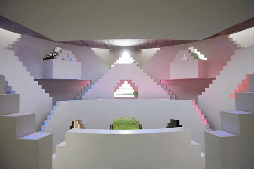
I’m uncharacteristically satisfied, and mildly obsessed, with “La Folie,” a gathering structure designed by Tarek Shamma in Melides, Portugal, for his client Christian Louboutin. It’s inspired by dozens of art and cultural themes including James Turrell, Rajasthani stepwells, the Jantar Mantar observatory in Jaipur, Carlo Scarpa, and more. Perhaps my favorite aspect is the radically honest name, La Folie, or The Folly, “because it’s just for fun.”
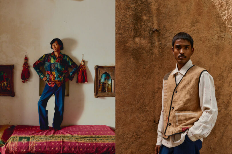
Photo courtesy Karu Research
2. Contemporary South Asian Embroidery
Emily Bode popularized eastern embroideries in contemporary western menswear, and deserves credit for that, but it’s abundantly clear that she’s tapped into a craft that is centuries old, sacred, and not coincidentally ancestral to her Indian-American spouse. I’m thrilled to see how many South Asian fashion companies are coming online in recent years, focusing on intricate narrative-rich embroidery that transcends boundaries. Fashion brands like Karu Research, Adish, Aomi, Harago, Two Point Studio, Rastah, Darwaza, Wunderhaus, and Johargram. I’m lucky to own some pieces from this emerging movement of designers and they are some of my favorite things to wear.
3. Miguel Adrover’s Instagram
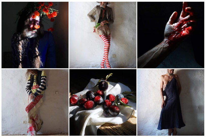
I have no idea how or when I stumbled upon the Instagram page for fashion designer Miguel Adrover, but it hasn’t disappointed. The artist’s compelling and confronting self-portraits amaze me – his proportions, age, and fearless costuming are superb. He’s been ahead of his time since he rose to fame in the aughts. Adrover has an urgency to his aesthetic that is impossible to unsee.
4. “Sarcophagus” Ceramic Sculptures by Jeff Martin
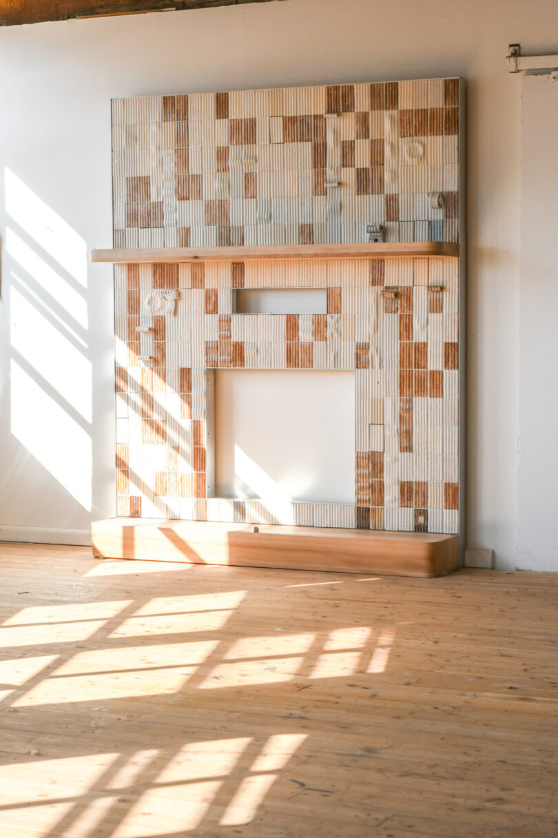
Jeff Martin Joinery has recently produced a series of ceramic sculptures featuring an evocative dimensional tile that appears almost soft, like extruded dough. He’s calling everything “sarcophagus“ (table, console, etc.) and I’m impressed by the volumes and colors that seem to pull together architecture, textiles, ceramics, and viennoiserie.
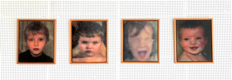
Photo courtesy Mooni
5. Ángela Leyva’s Portraits
I first discovered Ángela Leyva’s portraits this spring at Salon Acme, the art fair in Mexico City. Their work scares me, honestly. I’m frightened to see beyond the familiar lines and curves of the human face and into the abject psyche, but not necessarily the psyche of the subject – it’s reflecting onto me as if I’m the only one with this visual perspective. I find myself considering what’s hidden in plain sight. It’s a smash hit and I purchased a piece for my San Francisco flat this year.
Work by Anand Sheth:
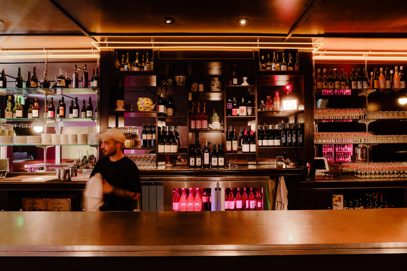
Photo: Ulysses Ortega
Bar Part Time is a visionary wine bar in the Mission District of San Francisco. Three friends and wine nerds ganged together to create something special – a vinyl-driven community dance hall, natural wine dive bar with an eclectic aesthetic honoring all the places and people they love. Together, we took over an abandoned dive bar where we all spent our early 20’s; strategically repairing what worked and replacing what didn’t.
Studio Anand Sheth assembled a team of favorites, including millworker extraordinaire Brandt Hewitt (Medium Small) and go-to hospitality contractor Cookline Construction. We sourced vintage light fixtures from eBay and Stuff (a vintage store around the corner), power-clashed patterns in the flooring and restrooms, and enlisted Meryl Pataky to create the perfectly nostalgic neon pieces above the bar and in the window.
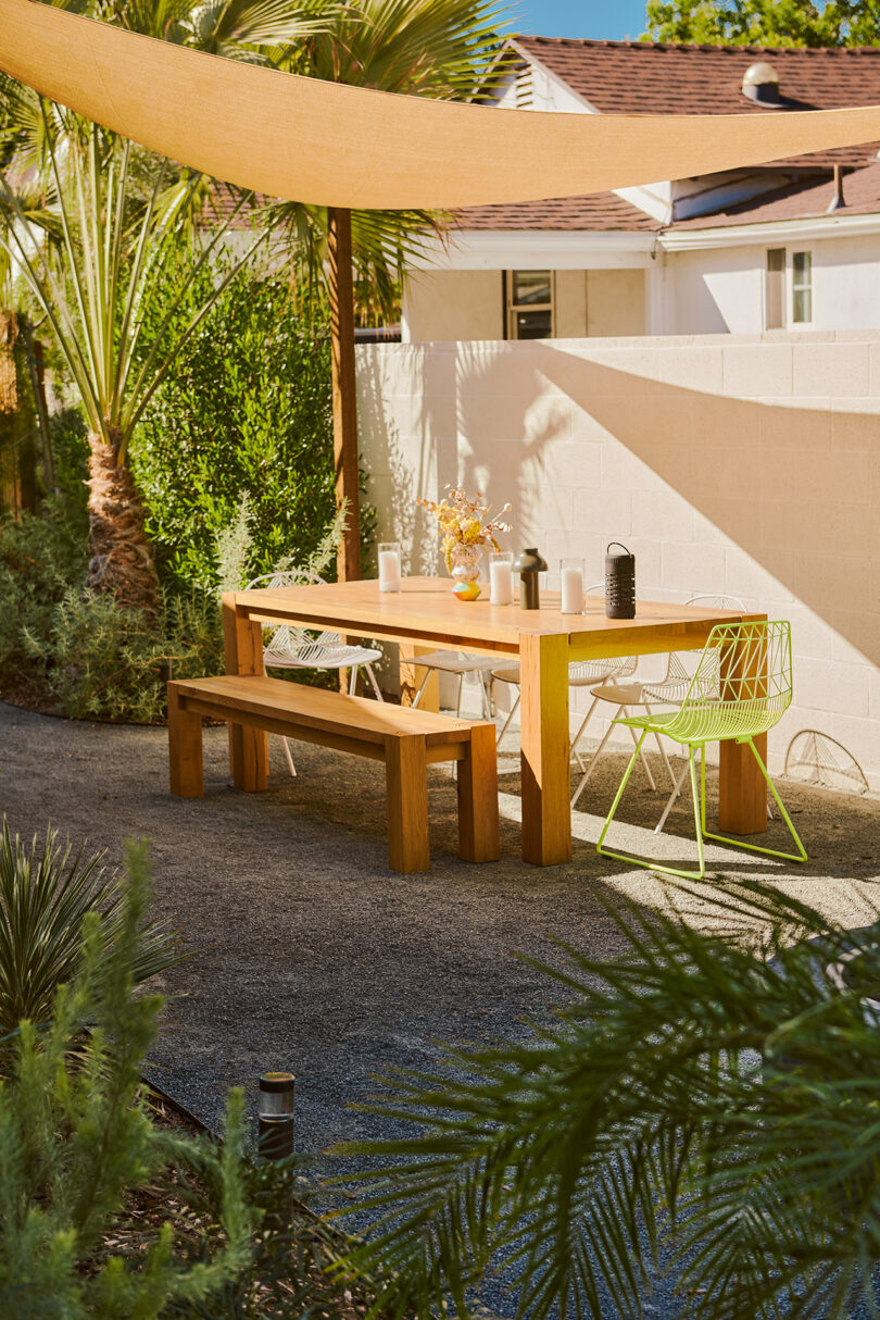
Photo: Michael Irwin
Studio Anand Sheth teamed up with Bay Area-based landscape architect Dune Hai to create a resourceful and color-driven garden as an extension of this Los Angeles couple’s first home. The result is an outdoor living room concept that came to life as if it always existed within the tranquil hills of Eagle Rock.
Inspired by the forms of the Burle Max rooftops in Brazil, they carved curves into linear cedar elements to allow earth and plantings to take up more space. Now, living greens – from Fan Palms to Monkey Flower to Silver Feather Grass – thrive between the outdoor “rooms” for living, dining, warming, and (eventually) soaking.

Photo: Nicholas Ruiz
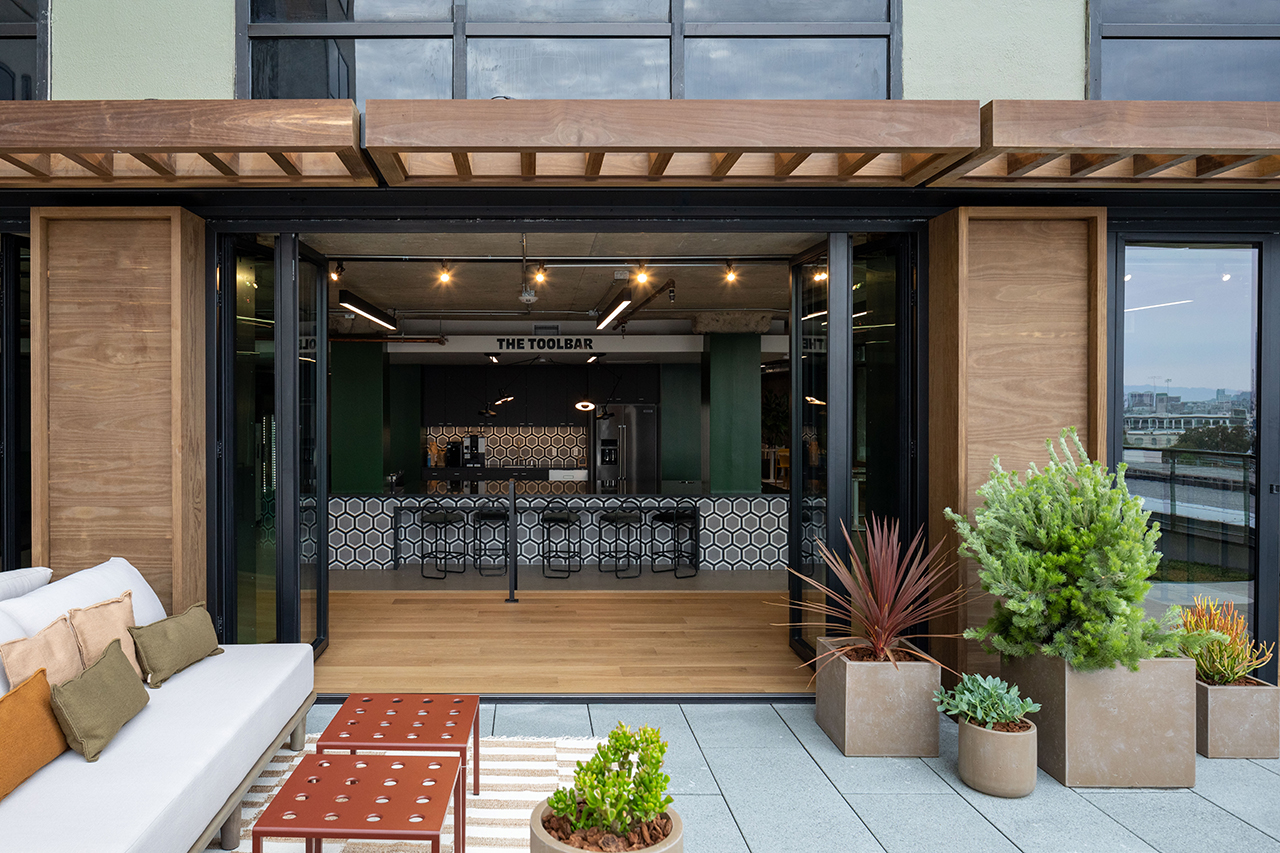
The firm’s design of Retool’s Mission District headquarters encourages observation, personal connection, and reflection. Consideration of the potential internal happenings inspired the space’s design foundation: a new perspective of “the workplace,” company culture, and – most importantly – its people.
We transformed 72,000 square feet of commercial office space across four floors of a historic industrial building. Careful design decisions tie the four-floor design program together with purpose and ease — art from architectural artists like Rowan Bouroullec, Natascha Madeiski, Sohan Murthy and Tauba Aerbach fill the walls. All conference rooms feature a painted wainscot application using Farrow and Ball colors that coordinate with Maharam Fabrics upholstery. We added accessories like accent pillows, rugs, coasters, planters, and Japanese toolboxes to complete the space.
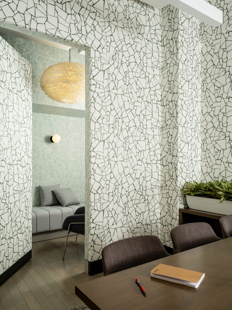
Photo: Joseph Kramm
The New York iteration of Retool’s workplace design features a palette of wall finishes from repeat vendors and Abnormal Anonymous, smartly reused furniture, and strategic lighting upgrades throughout. The firm broke the typical formal office reception in favor of welcoming guests and employees into a working lounge, outfitted with a second custom neon sign by NY-based Ali Feeney over brand-reminiscent wallpaper. The lunchroom and meeting rooms adopted a unique painted wainscot approach, a favorite for accenting spaces with exposed ceilings, and acoustic materials integrated into ceilings, walls, lighting, and custom curtains.
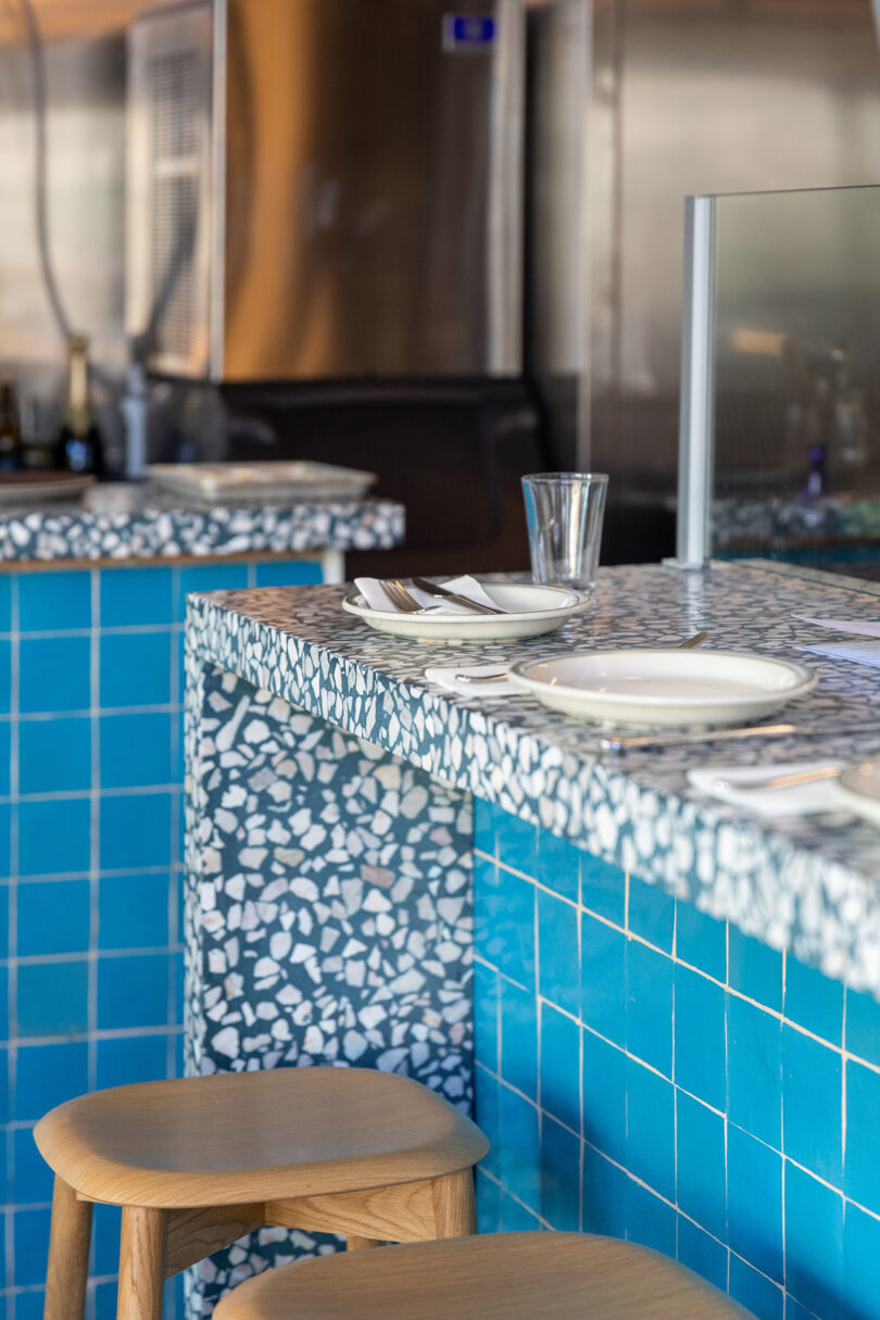
Photo: Nicholas Ruiz
Stepping inside Popi’s Oysterette evokes a family dinner setting that’s right on the Northern California coastline – think crashing waves, shimmering reflected daylight, twilight, and sandy boulders traversed in dress shoes. Founders of the popular Tacolicious restaurants spun off to create a jewel-box seafood restaurant for Top Chef alum and local “Seafood Queen” Melissa Perfit (Bar Crudo, Sister) – the buzzy corner spot slings the best oysters, seafood, and crisp wines the region has to offer.
Studio Anand Sheth developed a deep and strategic palette of seaside-inspired elements. A custom blue terrazzo by Concrete Collaborative clads dining counters providing a vibrant backdrop to the Oysterette’s offerings, while stacked azure zellige tiles create a grid of natural texture. Sconce lighting from Cedar and Moss are the pearls, too on-the-nose? The restroom is wrapped in Douglas fir panels that reference the exposed ceiling structure and new furnishings, and ceramic tiles from Zia and fluid wallpaper depicting swimmers. Hand-painted signage by Manny Fabregas adorns the exterior and hearkens back to the historic fish markets of the Marina District. The resulting experience is playful, direct, and memorable.
