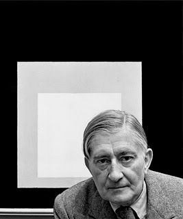
One of the 20th century’s foremost authorities on color, Josef Albers was ahead of his time in both his teaching and his painting…
Artists have spent hundreds of years pitting design against color as the most important element in painting. The influential artist, writer and teacher Josef Albers (1888–1976) placed his bet on color.
This article originally appeared in Artists Magazine. Subscribe now so you don’t miss any great art instruction, inspiration, and articles like this one.
Albers initially trained as an elementary-school teacher. He didn’t commence his artistic studies until age 32, when he studied under Johannes Itten at the groundbreaking Bauhaus school in Germany. Albers subsequently joined the faculty — a bevy soon-to-be artistic headliners including Wassily Kandinsky and Paul Klee.
After the Bauhaus was forced to close by the Nazis, Albers immigrated to the U.S. He taught at the equally groundbreaking Black Mountain College in North Carolina and later became the head of the design department at Yale.
Over the course of his teaching career, Albers developed a methodology that emphasized experiential learning, challenging his students with exercises that disrupted their perceptual strategies and helped them see the world with fresh eyes.
Context Is King
For Albers, the perception of color and how it appears to the human eye had little resemblance to the physical properties outlined in scientific prismatic systems. Color, he theorized, was relational — and infinitely mutable.
Rather than basing the study of color on rigid systems, Albers offered his students a sequence of simple exercises for observing how the perception of color changes in certain contexts. His research culminated in the 1963 publication of Interaction of Color, which is still considered an essential text for art students — it boasts its own iPhone app.
In the End, An Artist
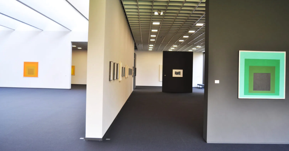
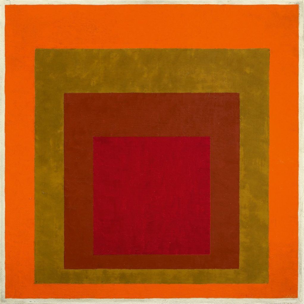
Albers’ studio work was as accomplished as his research. His Homage to the Square series comprises hundreds of paintings that rigorously explore chromatic relationships with nested squares. Painted on Masonite with a palette knife and oil colors, these hard-edged abstractions were initially viewed as impersonal and anathema to the large-scale gestural works of his contemporaries.
Eventually, the world caught up to Albers, and his influence can be seen in Minimalism, Color Field painting and Op Art. Albers’ art and teaching sought to define what he called the “normal human eye” and determine what it can and cannot perceive. When artists understand those limitations, they can create work powerful enough to expand the perceptual range of those who encounter it.
Where’s the Color?
Well, it was certainly with Albers. It’s also with the prismatic power of every stroke you create with pen and wash. Explore these streaming videos to discover how to use this medium and what color-centric art awaits.
Article written by Michael Gormley and published in Artists Magazine. Get a subscription to keep the two-minute art history rolling in. Updated August 2023
Enjoying this article? Sign up for our newsletter!