Althea McNish: Colour is Mine at the William Morris Gallery, London

Chosen by Adam Nathaniel Furman, artist and designer
A brilliant celebration of one of the greatest – but not exhibited enough – British textile designers, this show is the kind of celebration of the power of craft and design that we need to see more of. The wonderful exhibition design by the amazing Bushra Mohamad/Msoma Architects and Nana Biama-Ofosu/YAA Projects was an exemplary instance of how small projects can be brilliant platforms for showcasing the very best of upcoming new talent. The show, while small, was an iconic marker of a new approach to architecture in the UK by two of its brightest and most interesting young stars.
Runout by artist and designer Mac Collins

Chosen by Dr Samuel Ross, product and fashion designer
Mac’s vernacular conveys a chapter of intergenerational British-Caribbean experiences that mediate what it is to partake within British society whilst navigating knowing that your genealogy, is not that of your birthplace.
His ebonised ash timber sculpture ‘Runout’ seeks to combine the study of geography, essence and belonging through form, select treated materials and familiar yet lucid objects – including the domino and what appears as a deity-influenced form – relevant to West Africa’s Kingdom of Benin.
Mac Collins is a recipient of the 2021 Black British Artist Grants programme, founded by Samuel Ross
Kibu headphones by Morrama Lab and Batch.Works

Chosen by Minnie Moll, chief executive, Design Council
These headphones for children are my pick of the year as the circular manufacturing company Batch.Works and design consultancy Morrama Lab have truly put the planet at the heart of their design. They have considered modularity to allow them to be easily repaired and adapted to fit as children grow. Materiality is addressed with parts 3D printed from biodegradable plastic, and circularity by developing a tracking method for recycled components. We need more ingenious designs like this for products that respect our planet.
A House for Artists by APPARATA

Chosen by Joseph Henry, urbanist and co-founder of Sound Advice
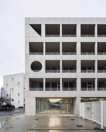
A House for Artists is an incredible piece of architecture by emerging practice APPARATA, supported by the Mayor of London, London Borough of Barking & Dagenham and Create London. We never think about the role of the public sector in design but this project is a demonstration of how it can use design and design thinking to be innovative to deliver social impact. The creative industries are one of the most important sectors in the UK, but we have a lack of infrastructure in place to support the people who produce the amazing work that enriches our lives. A House for Artists is a great blueprint for how we can deploy designs at a strategic level through mission driven partnerships.
Alex Goad’s Reef Design Lab

Chosen by Shelley Simpson, designer and founder of Mud Australia ceramics
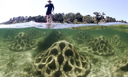
We spend a lot of time near and in the sea so we are very aware of the impact of climate change on the ocean and harbour where we live in Sydney. Alex Goad is from the latest generation of designers who have inherited this mess and are practically oriented towards fixing it. The erosion mitigation units installation in Corio Bay at Geelong, Victoria, uses 200cm wide units of ecoblend concrete and seashell aggregate to poetically address and resolve site-specific erosion and habitat damage in coral reefs. All of his work has a real-world practical application but also makes you question how we got here.
The British Pavilion at the 18th Venice Architecture Biennale

Chosen by Charlene Prempeh and Lewis Gilbert of creative agency A Vibe Called Tech
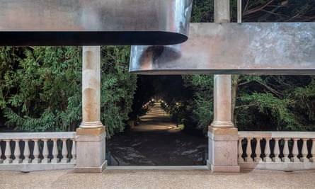
“There is reason, after all, that some people wish to colonize the moon, and others dance before it as an ancient friend,” was the James Baldwin quote that served as the provocation for Dancing Before the Moon, the British Pavilion presentation at the 18th Venice Architecture Biennale. Individually the collective of curators are brilliant – Jayden Ali designed the hugely celebrated Fashion Masculinities at the V&A, Joseph Henry is currently the Loeb fellow at Harvard, Meneesha Kellay is the senior curator, contemporary at the V&A and Sumitra Upham is head of programmes at the Crafts Council – and together, there was a certain alchemy that made the exploration of spatial practice for diasporic communities both gleeful and momentous.
Women’s portrait busts at Trinity College Old Library, Dublin

Chosen by Katy Hessel, art historian and author of The Story of Art Without Men
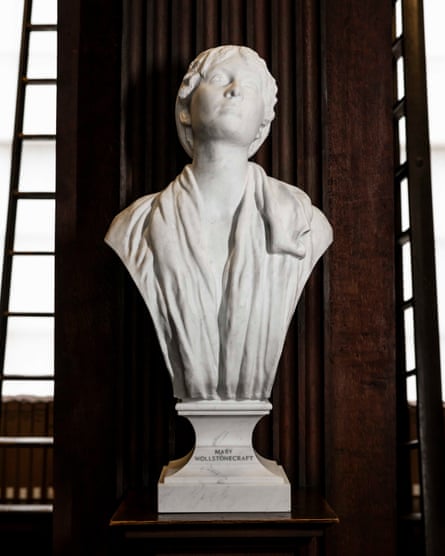
On St Brigid’s Day (1 February) four portrait busts of women, for the first time, were installed in Trinity College’s Old Library, alongside 40 marble busts of men (a collection that began in 1743). Represented are: scientist Rosalind Franklin; dramatist Augusta Gregory; mathematician Ada Lovelace; and feminist rights activist Mary Wollstonecraft. What I love about this is that each bust, constructed by a woman artist, corresponds to the trailblazing woman’s accomplishments – for example, the crystals worn by Rosalind Franklin reference her use of X-ray crystallography to research the structure of DNA, and Lovelace’s 3D-scanned portrait has appropriately been constructed using techniques enabled by computer programmes.
Power Out of Restriction (POoR) Collective

Chosen by artist and designer Yinka Ilori
I want to nominate socially minded design practice POoR Collective’s work. There is something extremely powerful about giving a voice to the voiceless, especially in spaces where their voices are the fabric of a community. It’s been beautiful to see them win the Emerging Design Medal at the London Design Festival this year and their work on projects such as the Malorie Blackman exhibition at the British Library. Public space is important more than ever I’m excited to see what the future of public spaces look like with their intervention”
after newsletter promotion
Shanfeng Academy by OPEN Architecture, Suzhou

Chosen by Jen Roberts, CEO, Design Miami
Great design should shape the way we live for the better. That’s why my design of the year comes from OPEN Architecture – a practice that continually challenges the way we interact with the spaces around us. The Shanfeng Academy, designed as a cultural and sports centre for Mountain Kingston Bilingual School in a new district of Suzhou, China – is a strikingly thoughtful project. The building, designed as a multi-use space with a high density of users, takes fascinating influence from Chinese landscape drawings. Within these drawings, viewers will observe deliberately empty spaces. Inspired by this concept, Shanfeng Academy is separated into five individual buildings, with deliberately empty voids between them in the form of gardens offering the moments of calm and deep peace that are so often missing from daily life.
Part Exchange furniture by Andu Masebo

Chosen by Jermaine Gallacher, interior designer and editor
What I really like about Andu’s work is that there is always a story behind it – who doesn’t love a good story? For a commission at the V&A Museum, his project Part Exchange transformed a 25-year-old Alfa Romeo, which had belonged to five different owners, into what I am sure will soon be recognised as iconic furniture.
My favourite piece is the daybed, which is upholstered in the original Romeo interior fabric and executed beautifully, with two bolster cushions at either end and proper piping along its edges. It’s couture upholstery that wouldn’t look out of place in Museum Fortuny.
The coffee table is essentially the car’s bright red bodywork. It’s a chunk of glossy sexiness that, quite frankly, I wish was sat in the middle of my sitting room. The whole collection not only cleverly uses materials that were otherwise destined for the scrap yard, but each piece also functions, looks beautiful and tells a story – for me, that is good design.
Crab Museum, Margate

Chosen by fashion historian and curator Amber Butchart
This brilliant free attraction – which can be added to a glowing list that also includes the Turner Contemporary and the mysterious Shell Grotto in our seaside town of Margate – celebrates the decapod in its many forms. It’s devised and run by a team of crab enthusiasts who have backgrounds in archaeology, geography, sound art and education. The museum uses humour (Claw Learning Studio, for example) to tell engaging stories about biodiversity and natural history, with a sneaky not-so-subtle running thread of radical commentary on climate change and capitalism. All that from crabs! It’s shrimply the best.
Right to Repair Europe campaign

Chosen by Henrik Taudorf Lorensen, CEO of TAKT
Rather than choosing a thing, I’ve opted for a campaign. Right to Repair Europe believes repairing products should be a simpler, cheaper alternative to tossing them into landfill. These are the values we built TAKT on — creating furniture designed to be repaired using readily available spare parts that we keep in stock. This year, the campaign scored a major success when the European Parliament voted in their favour, approving a ban on contractual, hardware or software techniques that obstruct repair. Progress!
Maarten Baas’s Play Time exhibition

Chosen by designer Faye Toogood
Dutch design Maarten Baas’ first solo exhibition in Los Angeles was at the Carpenters Workshop Gallery in April during Frieze LA, and featured his Children’s Clocks. This new body of work is part of his Real Time series – a set of clock designs inspired by theatre, film and art. Baas’ work is centred around playfulness, childlike expression and purposely naïve shapes, and Children’s Clocks takes this idea one step further. These 101 unique pieces, each crafted in Baas’ signature clay, were a collaboration. He worked with children in the Netherlands, asking them each to create one of the 720 drawings illustrating the time on these clocks.
Living Breakwaters by Kate Orff at Scape Studio

Chosen by Luke Pearson RDI And Tom Lloyd RDI, founders of Pearson Lloyd
We are fascinated and inspired by design that addresses the big challenges in our societies. Our design of the year is Kate Orff and Scape Studio’s Living Breakwaters project, conceived following Hurricane Sandy, which is a bold ecological vision to reduce the risks of storm surge on the coast of Staten Island and to revive its coastal ecology at the same time. The design will build an oyster reef habitat within the structure of the breakwater system to protect local communities. Living Breakwaters shows us how landscape design can help repair a fractured society whilst implementing climate resilient infrastructure.
Picasso Celebration: The collection in a new light at Musée Picasso, Paris

Chosen by Tony Ellwood, director of the National Gallery of Victoria
Sir Paul Smith’s design and interpretation of Picasso at the Musée Picasso, Paris, was both refreshing, unexpected and boundary pushing. Smith managed to respect the powerful, singular Picasso while also allowing his voice and his playful energy to coexist in harmony. Not an easy undertaking! This emerging trend for designers to be given their voice alongside prominent visual artists is enabling these disciplines to be read as equal, and for design to not be an embellishment or footnote to the art gallery experience. Smith demonstrated its potential and I hope this elevation of design in public art spaces evolves in even more ambitious ways.