From an early age, co-owner and principal of Studio Heimat, Alicia Cheung Lichtenstein, has used clothing as an outlet to express creativity and style. “I was lucky enough to go to Italy with my high school when I was 15. I loved fashion, and I recall being so mesmerized by all the chic Italian women I would see. During our downtime from tours, I would sketch the outfits they wore and make notes to make the look complete – color references and fabric styles. My drawing abilities weren’t great, so I needed descriptive notes. Those women, those outfits – were art to me,” she said.
A love of designing her room each time her family moved, then dorms and apartments in college, brought a creativity of 3D space into the picture. Alicia shared, “I made a diorama in an arts elective class in 10th grade. I loved utilizing all the walls, playing with color blocking, and fitting in unexpected little easter eggs throughout. Looking back, this may have been a telltale sign that I loved creating moments of delight.”
Alicia’s passions led her to study Textiles and Clothing at UC Davis, and have been helping inform the aesthetics of her work ever since. In 2009, she met her current business partner and co-owner of Studio Heimat, Eva Bradley, while working for tastemaker and influential designer Ken Fulk Inc. The two bonded over a mutual desire to create beauty through design and curation, then in 2015 made the big leap and opened their own firm.
Studio Heimat’s culture is driven by a bottomless curiosity, working towards excellence, and collaboration. Alicia’s goal at the female- and minority-owned firm is to create soulful spaces that tell a story through clean lines while elevating the status quo, and adding a bit of edge to every project. Studio Heimat continues to grow, thriving at its highest level when collaborating with clients, architects, and builders to create thoughtful, comfortable, and beautiful spaces that cultivate a sense of well-being – that feeling of “Heimat.”
Today, we’re happy to have Alicia Cheung Lichtenstein join us for Friday Five!
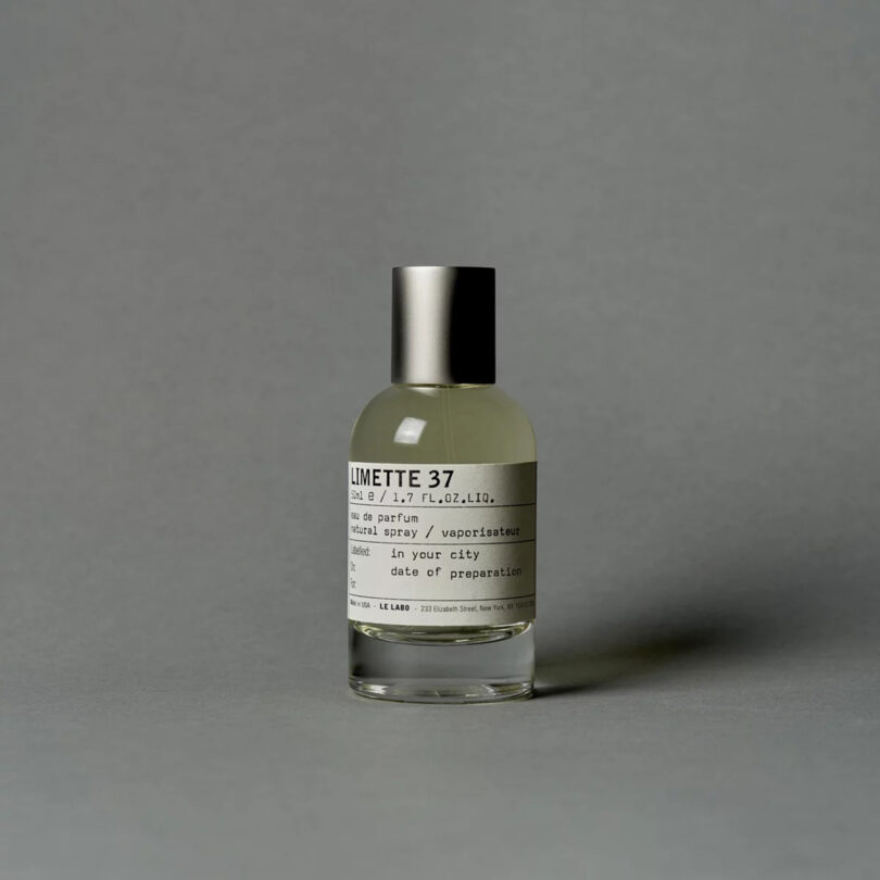
1. Rotating Le Labo Scents
I have a collection of Le Labo perfume, and each scent is unique and kind of colors the day ahead. They’re running their City Exclusives right now, and my favorite is Gaiac10 – quiet luxury in a bottle. Plus, I always get complimented when I wear Le Labo, no matter the scent.
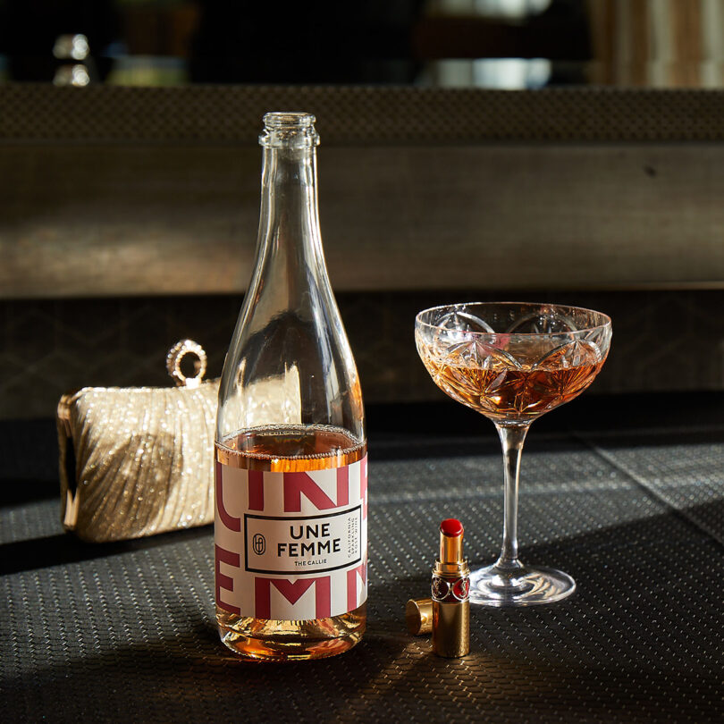
We’re having bouts of nice weather in San Francisco, and when it’s nice out I love to have a bubbly rosé to drink. It makes the days feel lighter, and makes whatever I’m doing that much more enjoyable.

Photo courtesy TimeOut
I go to Chrissy Field and walk towards Fort Point. It’s a beautiful walk, it grounds me. I often listen to the waves or a gratitude meditation to get my mind right before heading into the studio.

Photo: Henrik Kam
Mixing in a bit of science and art, I love taking my kids to these museums. Seeing the world anew from their perspective keeps me present and smiling, most of the time. (wink)
I’ve recently stepped up my coffee game at home and I love this machine. I’ve been making my own version of Blue Bottle’s Orange Blossom NOLA. It’s really refreshing and a perfect treat.
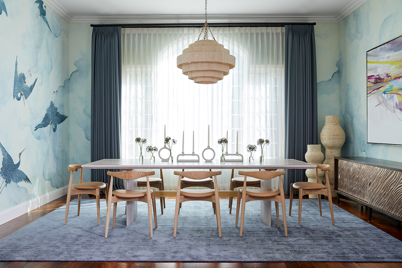
Work by Alicia Cheung Lichtenstein + Studio Heimat:
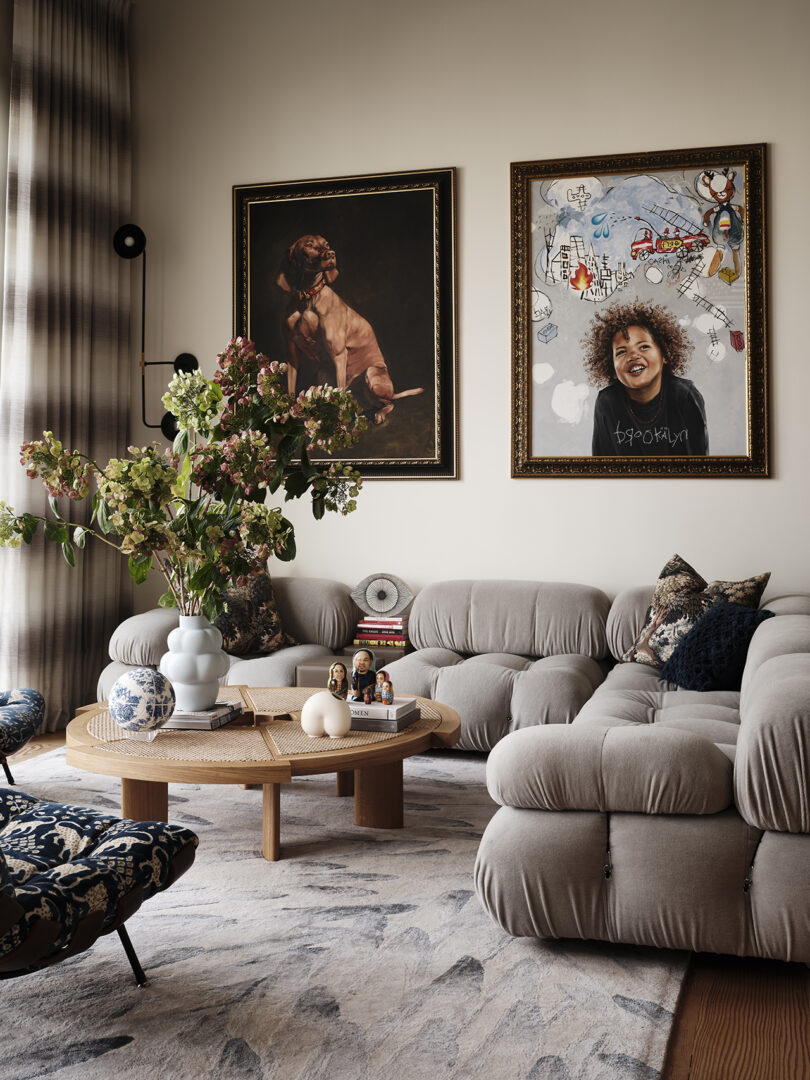
This project is also the home of Studio Heimat co-founder Eva Bradley. Eva and her husband, artist Cory Bradley, purchased the historic Victorian in San Francisco with plans to transform it into a family home. Studio Heimat added curvilinear furnishings to soften the hard lines of the original interior architecture. The artwork, vintage pieces and portraits painted by Cory, line the walls. The Mario Bellini sofa fits perfectly into the sunken living room and fulfilled Eva’s vision for the family’s favorite spot of the home. Photo: Frank Frances
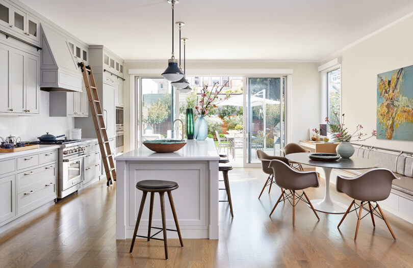
A longtime client of Studio Heimat was a newlywed looking for a new home. The couple found this property a few blocks from their current location and wished to renovate it with a family in mind. This contemporary space has stunning views of the city and the Bay, and features a growing art collection. Like most designers, Studio Heimat worked to marry two different design aesthetics – especially under a time crunch of a new baby arriving – during the pandemic. The result is an understated, warm, functional interior with custom millwork and unique design details. Photo: John Merkl
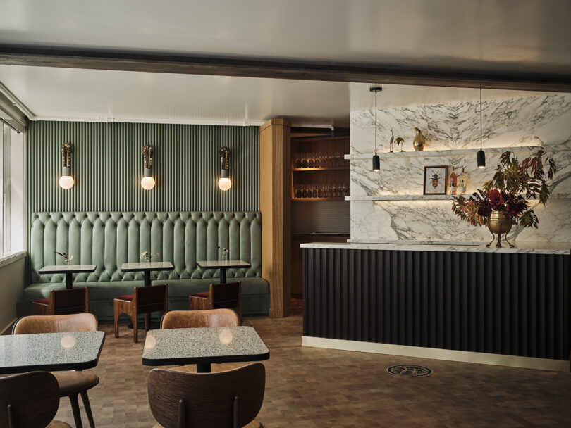
Studio Heimat brought both the Urban Tasting Room and Lyon & Swan to life with a design inspired by the Eco Terreno Winery & Farm, the landscape, and the brand’s regenerative farming practices. They chose color palettes, materials, and works of art reminiscent of the Cloverdale property, but elevated for the San Francisco audience. Each level is its own design adventure with moments of discovery throughout. The Urban Tasting Room is reflective of the Eco Terreno winery with hand-painted murals of the vineyards, bee motifs, and a lion’s head plaque as a nod to Mark Lyon. The color palette includes the deep red of a Burgundy wine and sage green found throughout the Eco Terreno farm. Photo: Frank Frances
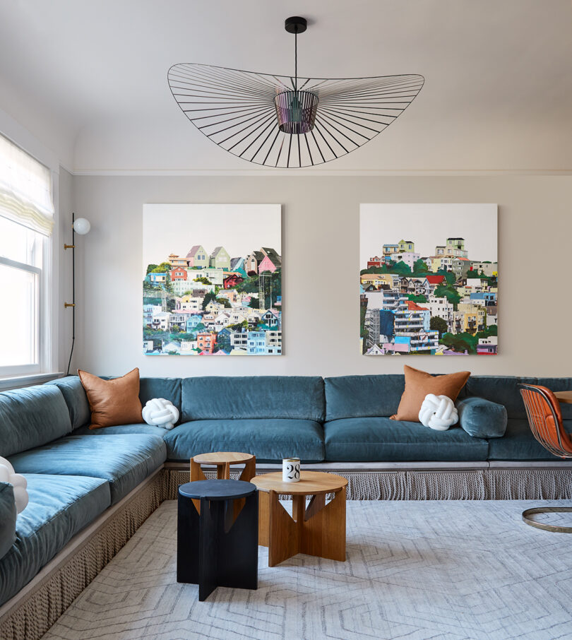
Studio Heimat invested in a triplex on a quiet block in Nob Hill, San Francisco a few years back. The team took their time renovating two of the three units for rentals, and Alicia and her family occupy the top unit. The historic home, originally built in 1906, was very outdated, and they worked to keep as much of the original detail as possible – such as original floors, moldings, and ceiling height. The interiors were a study of mixing and layering cultures and time periods, creating an eclectic space for contemplation. With a young, growing family in mind, Alicia needed space for play and snuggles, and she wanted functionality without compromising style. Bold choices in wallpaper, prints that transcend trends, and an extra-large custom built-in sectional maximize the space. Cozy velvet fabric and unique pendant lights in the living room and principal bedroom bring in some flare. Photo: John Merkl
This post contains affiliate links, so if you make a purchase from an affiliate link, we earn a commission. Thanks for supporting Design Milk!
